Style is subjective but the "hypnokit" is fire. Urban as an idea and urban as an experience are different.
2018 Jersey Thread
- Thread starter joe
- Start date
You are using an out of date browser. It may not display this or other websites correctly.
You should upgrade or use an alternative browser.
You should upgrade or use an alternative browser.
- Status
- Not open for further replies.
Leave the shirt. Take the shower curtain.
He doesn't use that shower curtain often.
Wait for it. Wait for it. Wait for it.
Just periodically.
He doesn't use that shower curtain often.
Wait for it. Wait for it. Wait for it.
Just periodically.

probably poor like all the other chinese wholesale sitesAnyone ever use SPAM? If so, how was the quality of the jersey?
if it's gonna be navy and orange, then gimmie hoops! like the stripes of this flag:


You know, I'd really just enjoy our current primary kit inverted. So the dark blue on the stripes becomes the blue of the body and the sky blue on the body becomes the blue on the stripes.
Orange third kit only worn once then never spoken of again?
We had those. They were the Earth Day Parley Ocean Plastic Grey Jerseys.
I would love it if the designer somehow sneaks in a peeping Lampard as a hidden shout out to the forums.
Adidas is feeling nostalgic this year with all the retro-inspired world cup kits which look pretty good so far. So why not go with a faux retro style for NYC and throw it back to the original Open Cup winners Brooklyn Field Club. City football heritage and we can get some more use out of the alternate logo and keep the jersey clean and simple?
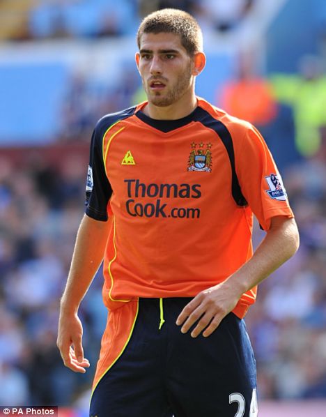
I would totally support an orange jersey. I have a flaming orange (with some black and yellow) Man City jersey that I really love. Not a huge fan of the matching shorts though.Orange third kit only worn once then never spoken of again?

Change the black and yellow to our sky blue and navy and I'd buy one instantly.
To save some taps: http://www.footyheadlines.com/2017/07/2018-world-cup-kit-overview.html?m=1Adidas is feeling nostalgic this year with all the retro-inspired world cup kits which look pretty good so far. So why not go with a faux retro style for NYC and throw it back to the original Open Cup winners Brooklyn Field Club. City football heritage and we can get some more use out of the alternate logo and keep the jersey clean and simple?
I sincerely dislike faux-retro. The kits they are imitating were most likely trying to be cutting edge at the time so it feels like we are violating the spirit of their conception. It also lacks creativity.
I do like iconic, though - IMO faux-retro is a missed opportunity to create an artefact of the times we live in. Decades from now, they will look back at these kits and say "dang, kit designers in 2017 must have been super lame". Is that all we have to say for ourselves?
Sorry for the rant.
Last edited:
Agreed. Just seems lazy to me as well. You had a chance at an event that a majority of the world gets entranced with for nearly a month, and you're just using a monochromatic version of a kit worn in 1990 (in Germany's case). Try something crazy or slightly altered. Or, just keep it clean and simple. Just don't recycle something in a half ass way.To save some taps: http://www.footyheadlines.com/2017/07/2018-world-cup-kit-overview.html?m=1
I sincerely dislike faux-retro. The kits they are imitating were most likely trying to be cutting edge at the time so it feels like we are violating the spirit of their conception. It also lacks creativity.
I do like iconic, though - IMO faux-retro is a missed opportunity to create an artefact of the times we live in. Decades from now, they will look back at these kits and say "dang, kit designers in 2017 must have been super lame". Is that all we have to say for ourselves?
Sorry for the rant.
However, I'm still a sucker and will be getting the German kit. Auf Gehts.
Adidas is feeling nostalgic this year with all the retro-inspired world cup kits which look pretty good so far. So why not go with a faux retro style for NYC and throw it back to the original Open Cup winners Brooklyn Field Club. City football heritage and we can get some more use out of the alternate logo and keep the jersey clean and simple?
well according to this they did wear blue,
https://en.wikipedia.org/wiki/Brooklyn_Field_Club
OR the NY Skyliners, they even played in the old yanke stadium, although in reality it was was Cerro from Uruguay
https://en.wikipedia.org/wiki/New_York_Skyliners
Now I'm pissed we missed out on a reboot of the USMNT denim kits.Adidas is feeling nostalgic this year with all the retro-inspired world cup kits which look pretty good so far.
Now I'm pissed we missed out on a reboot of the USMNT denim kits.
interesting i always thought nike made that jersey
- Status
- Not open for further replies.
Similar threads
- Replies
- 104
- Views
- 5,638
- Replies
- 38
- Views
- 2,369
- Replies
- 9
- Views
- 1,156
- Replies
- 0
- Views
- 385
