
That was one of my favorites. Maybe they make a transfer offer for Callens based on his playoff performance.
English Football League 17/18
- Thread starter LeeNYCFC
- Start date
You are using an out of date browser. It may not display this or other websites correctly.
You should upgrade or use an alternative browser.
You should upgrade or use an alternative browser.
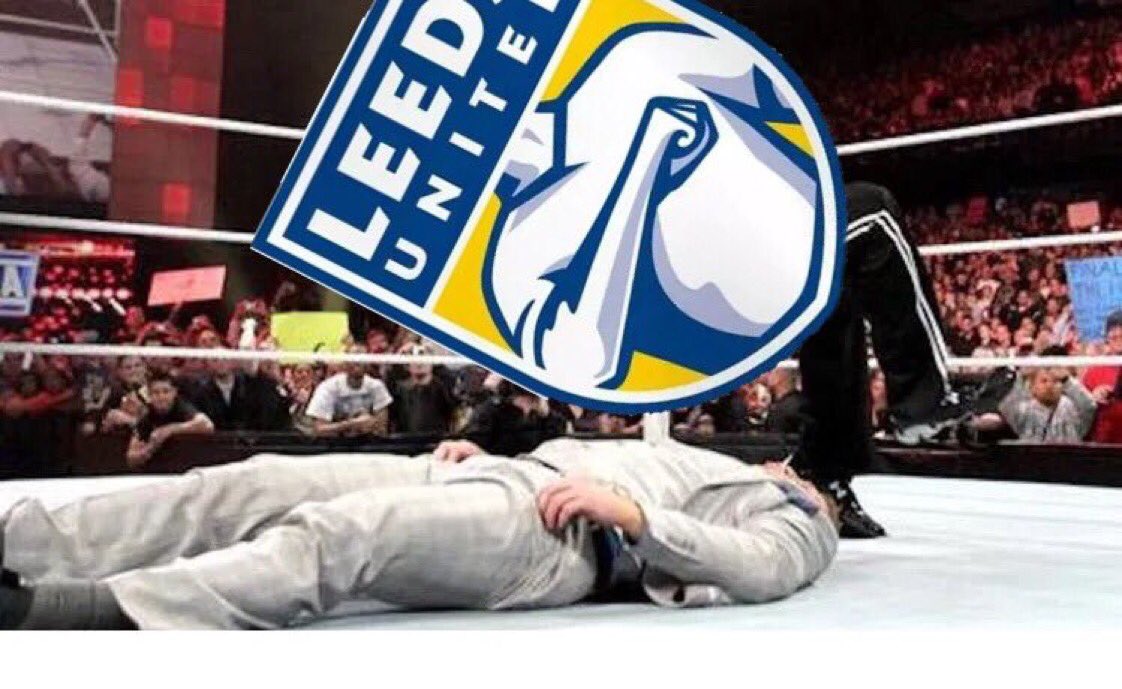
It looks like Leeds might walk back from the design.
I admit I'm a bit taken aback and confused by the universal hatred. I don't love it myself, but I also don't think it's objectively horrible, and I found the video promoting it kind of neat. I thought if I were a Leeds fan and attuned to the history and such it might seem cool. Can someone explain why nearly everyone despises and mocks it so much? Is the art too representational? You don't see many people on badges, with or without their heads. Again, I'm not surprised that some or even many hate it, but I don't get why nearly everyone does.
I admit I'm a bit taken aback and confused by the universal hatred. I don't love it myself, but I also don't think it's objectively horrible, and I found the video promoting it kind of neat. I thought if I were a Leeds fan and attuned to the history and such it might seem cool. Can someone explain why nearly everyone despises and mocks it so much? Is the art too representational? You don't see many people on badges, with or without their heads. Again, I'm not surprised that some or even many hate it, but I don't get why nearly everyone does.
I do find it laughably bad. The Leeds salute huh? So this would be like if the West Ham badge was a guy in a claret and blue shirt doing the crossed Iron salute or if the Lazio badge was a guy in a sky blue shirt giving a fascist salute...
Word. I found the video a little cheesy, personally. I do think some people like the crest, based on the likes and retweets, but it takes a lot of guts to stick one's neck out in an avalanche of bitingly humorous negativity.It looks like Leeds might walk back from the design.
I admit I'm a bit taken aback and confused by the universal hatred. I don't love it myself, but I also don't think it's objectively horrible, and I found the video promoting it kind of neat. I thought if I were a Leeds fan and attuned to the history and such it might seem cool. Can someone explain why nearly everyone despises and mocks it so much? Is the art too representational? You don't see many people on badges, with or without their heads. Again, I'm not surprised that some or even many hate it, but I don't get why nearly everyone does.
I think that whenever one tries to break the mould it has to be an absolute hit, whereas reactions tend to be kinder to mediocre yet conventional attempts.
Then again, this is the same club of the smiley crest of decades ago.
I'm curious how people feel / felt about Bournemouth's crest.
BTW as a a Leeds Fan , Christopher, have you ever read Promised Land a Norther Love Story or it's American title Promised Land The Reinvention of Leeds United , by Anthony Clavane? It's arguably the best football related book I've ever read and while it goes well beyond football in it's exploration of the City of Leeds culture and the immigrant experience (hence making it self interesting to non Leeds fans such as myself) I still think it would be of particular interest to someone who supports them.
I haven't! Read and watched the Damned United, but will put your recommendation on the backlogBTW as a a Leeds Fan , Christopher, have you ever read Promised Land a Norther Love Story or it's American title Promised Land The Reinvention of Leeds United , by Anthony Clavane? It's arguably the best football related book I've ever read and while it goes well beyond football in it's exploration of the City of Leeds culture and the immigrant experience (hence making it self interesting to non Leeds fans such as myself) I still think it would be of particular interest to someone who supports them.
Lol. Thanks for this. I love pointing out Lazio being crazy racist fascists.Lazio badge was a guy in a sky blue shirt giving a fascist salute
What about this recent one? I think I kind of like it. But it would be easy to make fun of.

For comparison, the old one was wayyyy too busy. It’s a badge, not the club’s Wikipedia page.

This one looks like what you would see as a shield that some "knight" fights under at Medieval Times.For comparison, the old one was wayyyy too busy. It’s a badge, not the club’s Wikipedia page.
Lol. Thanks for this. I love pointing out Lazio being crazy racist fascists.
I know there's no team that's 100 percent this or that. I'm sure there are some decent Lazio fans but I do remember a few years ago checking out one of their forums (don't remember why if there was a transfer I was following or what not) and someone did actually have a Hitler avatar and no one seemed to be questioning it.
I think maybe they could have found a way to keep the swords in there somehow but it is an improvement IMOWhat about this recent one? I think I kind of like it. But it would be easy to make fun of.
It looks like Leeds might walk back from the design.
I admit I'm a bit taken aback and confused by the universal hatred. I don't love it myself, but I also don't think it's objectively horrible, and I found the video promoting it kind of neat. I thought if I were a Leeds fan and attuned to the history and such it might seem cool. Can someone explain why nearly everyone despises and mocks it so much? Is the art too representational? You don't see many people on badges, with or without their heads. Again, I'm not surprised that some or even many hate it, but I don't get why nearly everyone does.
I think it's a combination of a few things:
- It looks like clipart, or a cartoon. Fans want something that looks professional and serious, they don't want to be represented by something that looks tacky or light-hearted
- British* fans tend to be overly traditionalist about what they like and dislike about their football teams. They tend to react very negatively to the idea that things like badges need "modernising", which is exactly what Leeds' board said when they released this. There has been a growing trend from the boards of football clubs to believe that football crests need to be modernised in line with current corporate logo design, and this is something that is generally taken by fans to be a detestable attitude and one that is bound to encourage mockery from opposition fans, and anything a club board does which encourages mockery is doubly unforgiveable
- I'm sure Leeds fans appreciate the sentiment, but another thing that is particularly important to British* fans is that a club's badge should represent the civic community, rather than specifically its match going crowd. Virtually every team in Europe has a history of being founded by a group of locals who wanted a kickabout, and from this has developed an incredibly strong attitude of the club belonging to its city or area, not to the men and women who claim to be shareholders. For Leeds fans, this means it has always been important to them to have the white rose of Yorkshire on their badge, but once again their board has turned away from that motif and instead put what is undoubtedly a tribute to the fans but also is a design which just looks silly out of context and says nothing about who Leeds really are - that is to say, historically the most successful club in Yorkshire, at least in recent memory
*I say British fans specifically here as I don't know to what extent these attitudes also apply to Americans. I think I've seen enough to suggest that most who read this will at least respect the sentiments, but from the discussion I've seen on this forum of the virtues of other MLS badges, I get the feeling that there are some points on design for which cultural values are not quite the same, although I'd struggle to be more specific. At any rate, my point is I'm just trying to give the viewpoint from this side of the Atlantic, since that's where the majority of the backlash was coming from for obvious reasons
Last edited:
*I say British fans specifically here as I don't know to what extent these attitudes also apply to Americans. I think I've seen enough to suggest that most who read this will at least respect the sentiments, but from the discussion I've seen on this forum of the virtues of other MLS badges, I get the feeling that there are some points on design for which cultural values are not quite the same, although I'd struggle to be more specific. At any rate, my point is I'm just trying to give the viewpoint from this side of the Atlantic, since that's where the majority of the backlash was coming from for obvious reasons
The crests for American clubs simply don't have 80 or 100 years weight behind them, so if a change is made, the sacrifice isn't the same.
I do think that some connection to the community is evident in the best ones, such as our crest's nod to subway design, Dallas' longhorn steer, or the new LA crest's reference to old film design. Contrast that with the Red Bulls, which is nothing more than a corporate logo and a relative failure.
I think it's a combination of a few things:
- It looks like clipart, or a cartoon. Fans want something that looks professional and serious, they don't want to be represented by something that looks tacky or light-hearted
- British* fans tend to be overly traditionalist about what they like and dislike about their football teams. They tend to react very negatively to the idea that things like badges need "modernising", which is exactly what Leeds' board said when they released this. There has been a growing trend from the boards of football clubs to believe that football crests need to be modernised in line with current corporate logo design, and this is something that is generally taken by fans to be a detestable attitude and one that is bound to encourage mockery from opposition fans, and anything a club board does which encourages mockery is doubly unforgiveable
- I'm sure Leeds fans appreciate the sentiment, but another thing that is particularly important to British* fans is that a club's badge should represent the civic community, rather than specifically its match going crowd. Virtually every team in Europe has a history of being founded by a group of locals who wanted a kickabout, and from this has developed an incredibly strong attitude of the club belonging to its city or area, not to the men and women who claim to be shareholders. For Leeds fans, this means it has always been important to them to have the white rose of Yorkshire on their badge, but once again their board has turned away from that motif and instead put what is undoubtedly a tribute to the fans but also is a design which just looks silly out of context and says nothing about who Leeds really are - that is to say, historically the most successful club in Yorkshire, at least in recent memory
*I say British fans specifically here as I don't know to what extent these attitudes also apply to Americans. I think I've seen enough to suggest that most who read this will at least respect the sentiments, but from the discussion I've seen on this forum of the virtues of other MLS badges, I get the feeling that there are some points on design for which cultural values are not quite the same, although I'd struggle to be more specific. At any rate, my point is I'm just trying to give the viewpoint from this side of the Atlantic, since that's where the majority of the backlash was coming from for obvious reasons
Just look how passionate some fans are about keeping depictions If native Americans on their uniforms and apparel and you’ll see that in America too tradition trumps logic. We may change, but we expect certain constants.
So we basically kicked the can down the road:
https://www.leedsunited.com/newsmobile/club-news/23062/club-statement-crest-update
Soooo much pressure to get the centenary crest right now.
https://www.leedsunited.com/newsmobile/club-news/23062/club-statement-crest-update
Soooo much pressure to get the centenary crest right now.
Are you submitting anything to be a part of the democratic vote?? Boaty McBoatface crest to celebrate the centenary??So we basically kicked the can down the road:
https://www.leedsunited.com/newsmobile/club-news/23062/club-statement-crest-update
Soooo much pressure to get the centenary crest right now.
https://www.efl.com/news/2018/february/earlier-closure-of-transfer-window-agreed-by-efl-clubs/
Some interesting rule changes happening in the EFL.
Some interesting rule changes happening in the EFL.
Aston Villa threatened with wind up order because of missed tax payments.
They are in huge trouble. Stories like this is why I don’t think Pro rel will work here as it is right now.
They are in huge trouble. Stories like this is why I don’t think Pro rel will work here as it is right now.
All downhill once Guzan left...Aston Villa threatened with wind up order because of missed tax payments.
They are in huge trouble. Stories like this is why I don’t think Pro rel will work here as it is right now.
Similar threads
- Replies
- 275
- Views
- 27,256