
My son, stay in school. The chicago fire was a huge disaster in the 1800s, with a great legend of Mrs O'leary's cow kicking over a lamp which burned the whole city down. Probably the best name for a team in the league as far as meanings go.i dont really see the connection with Chicago (suburbs) and a fire department
self explanatory
they need a rebrandment. no "FC" belongs in texas.
wtf is a dynamo
theres no royality in salt lake. wtf is up with the crown
Mls Teams That Should Get A New Logo
- Thread starter CP_Scouse
- Start date
You are using an out of date browser. It may not display this or other websites correctly.
You should upgrade or use an alternative browser.
You should upgrade or use an alternative browser.

No issue with the name but the logo could use a remake. It is also my understanding that the writer (don't remember his name) who wrote the story of the cow retracted that article saying it was fabricated.My son, stay in school. The chicago fire was a huge disaster in the 1800s, with a great legend of Mrs O'leary's cow kicking over a lamp which burned the whole city down. Probably the best name for a team in the league as far as meanings go.
N
Nicholas Constantino
Guest
I think the Chicago Fire logo is nice looking, and fitting. I'm not a fan of clubs constantly revamping their logos, and I like most of them in the league.
If philly would move the crest on their kit it would be 100% better! I hate putting the crest in the middle of a kit.Really? I like LA. Also, chicago, montreal, philly and SKC. Ours is the best.
They just did last yearWould have been a perfect time for SJ to do it with the new stadium opening. Oh well
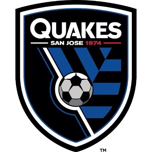
I don't hate the Quakes new logo. Revs desperately need a new logo, Dynamo could use one as well. I'm fine with Chicago's (it works with the team name, although it's a little too obvious).
I'm more disappointed in their overall rebrand than the logo, although it looks like something made in MS Paint with ClipArt.I don't hate the Quakes new logo. Revs desperately need a new logo, Dynamo could use one as well. I'm fine with Chicago's (it works with the team name, although it's a little too obvious).
Half of the league is red, so lets have SJ rebrand and add red to their uniforms!
I felt like the Quakes definitely upgraded, but still missed the mark. That logo is going to look dated relatively quickly. Looks great monochrome, though.Actually SJ just rebranded LAST YEAR, and it was terrible:
Old logo

New logo:
As for Salt Lake, I think at this point most of the league and especially the fans have embraced the name. A top brand in their own market and recognized league-wide as a premiere club. There are tons of Reals that are not Royal. I think only one or two in Spain are actually created by royal decree.
BTW thought this might be helpful:

Seeing all the logos together really shows that a lot need a change. Seattle, Montreal, Real SL, New England, LA, and Houston all need something new. I hate that the teams in Los Angeles use LA like that instead of writing it out. L and A just look so awkward next to eachother. The Kings logo is terrible too. But then again, I pretty much hate everything about Los Angeles in general...
Here's my rankings of logos
1. NYCFC. Classic. You won't be changing that.
2. Crew SC: Rebrand absolutely worked.
3. Vancouver: Simple yet clever and distinct.
4. Toronto FC: Bold with a different color palette.
5. Montreal: I'm a sucker for a fleur de lis.
6.Sporting KC: They need to do more with the "S" and "C" interlocking, but it's solid.
7.. Portland: again simple. They're lower here because of the cartoony axe which may get dated
8. Philly: Love the color scheme and the use of the "Don't tread on me" snake
9. DCU: This ones gets a little too simple for my taste.
10. Galaxy: Futuristic look works well with the name of the franchise
11. Orlando City: It's a nice looking lion, but the Sun-shaped mane on a lion is a little overdone.
12. San Jose: I forget what this logo looks like, even though it looks fine
13. Colorado: Same thing. The badge is just a badge with a mountain and a soccer ball.
14. RSL: I remember this logo, but it's just RSL with a crown and a soccer ball.
15. FC Dallas: A bull for a texas team. Very original.
16. Chicago Fire: Just a fire badge. It works, but you see the same logo on your local fire truck.
17. Houston: graphic designer wanted to get away for a long weekend, just wrote "DYNAMO" in big letters
18. Seattle Sounders: Let's just take our landmark, put Sounders FC over it and call it a day
19. New England Revolution: Let's have the American flag as drawn by a four year old, with a soccer ball!
20. RBNY: YOUR LOGO IS AN ADVERTISEMENT YOU'RE A DISGRACE TO MLS
I'm not talking just the logo, they need a new name. Feels minor league baseball-ish (insert kermit drinking tea)They just did last year
I'm not talking just the logo, they need a new name. Feels minor league baseball-ish (insert kermit drinking tea)
Most of the MLS team names are kind of minor league-ish, since the better names have already been used by other pro leagues.
The designer just drew that up and released it. It hasn't been officially adopted by DC United.

I think that looks worse than their current logo.
Worse than this?I think that looks worse than their current logo.

I'd agree it's not amazing, but practically anything would be better than the current one that looks like it's 20 years old
It is 100% worse than the crayon logo. Just my opinionWorse than this?
I'd agree it's not amazing, but practically anything would be better than the current one that looks like it's 20 years old
Hearing that they are desperate to incorporate the new england flag from the revolution which is a green christmas tree in the corner of a plain red field, and I think the only conclusion is that boston is uncivilized and has no taste , and shouldn't be consulted in matters of style.It is 100% worse than the crayon logo. Just my opinion

http://data:image/png;base64,iVBORw0KGgoAAAANSUhEUgAAATYAAACjCAMAAAA3vsLfAAAAk1BMVEW/CjD///8AmmO8ABy/Bi/yztb02N4Al10AmF/L5toAlVoAk1YAmF4Ak1UAnGbe8erz+/jU7OPo9/I9rIBVtI1ct5J4w6S23c2u28kRoGwrpnbu+PWm1sJvvp6NzLLm9vCk18N/wqXE5tkhqXkAj029ACLqrrtKsYidzbYhoG7N6N6Nz7bA39A1qHqm18Rlu5dYvZjoZ+7oAAAEjElEQVR4nO3cWW+rOACG4cRzZmzsgCEsYck+mclykmb+/68b9kCAgCz1pv4e6Uit2nPzymAbnM7m3+OvX79mPxmyKUE2JcimBNmUIJsSZFOCbEqQTQmyKUE2JcimZHqJxwrZapNDeNwMka0yMYP9pITQ6d2QLSPPabW02xbZCpMiHCNGcnyDbLkJCZKNIBXuSmSbTcn2ZVHywsQF2cazrclJCN7qFk9YieiezTmuVs4+qqtZLuPMG71Sdc+W2TYGG/FlktgYbaMct3mNEjppUtA9m31YMNLCrAmrXs2zhREnHeI5epVqnU2eRTdadqGysQGncTZ7y1hvtWzZe3aQrdf9QYeiZXc4EnyaGnTNZj+54JxS2jvgGOfCXPg3ZHuTODdjddlugs21W83a7MO7cXOGL1Rds1UMt2+4xcPjDNnSMXcW/bOCOfIESedsMui/s2Vo9HENom82GVifplJCzwaydaJtPkcj2RrkObgG0TOb8VyMRcsHHDkska0SuieT82zVNnhry/D0x5xse/en+mU7/vfcXkrecLfr79XmwUzzZB56wumXrWH1cbSts19JpJQJsjVtex4aNe9s5+Fdqb7Zdv74VDq4ndc22yqaMJdy67BDthfp9T+g7IbrX4NomU0G5sfJoIWKoDviNMxm+GLKWrcZrrNd0C2b3MfVo/DpAy7bLiT6ZkvufsSraNTreUDZwhrvGnj7iYg+2WwjiKtmhPE4PCw+V4uenhtfI8silmVF1yiw9ct2C+L6jsY4eezn99GLdJuOz52UTkbuWkccdMlmXNyFEIKn/yx/7cznzshYyy5Mr2dC0Stbfpk6t+NNFoNmOV4t7fbo2Y5ql61BWpPmUXYdeHmlZzYnmrj6GDpHo2U2I5q+dGO9p8d1zHasrlDquUO1XsORe3hMmdmXswG1Qqfc0NfzQ/UF8y/1uTcaHZFt7hepmEiXr3Gehi3CuCgU76uNgZDSrR+SmAfdszlxsegVrlM93mWWTMp9VrSU1+LnzG2eGeTvpxs0y7Yubms82qffrPIq3N3Nl2U2S85tv9iB8SA7AVdtxxgJEm2zOR4tG2SPHh0rz/NMe1TZSLZMC+M8J/1Kv7bvfkw5TTf14hrqmc0+5Dcuytz8lIKdnzUqPp3WyjZPtsUb++JjHUvnK/DPrnt2f9saZltZp+yVMqsO+wU8S1imKbPRclMgNyy9Oml3BtUv29xZXy7rusSdF5Npkckqb/31hWiHrilOg4dnNMrWFnHh1RvOZ/lMiT0av7ELD38PjTdds62uh9f7AVlvCdjb+Br6gIKu2VoPHf1XtufQf0C2d4ZJanx4GkC2tuapZ3ZFttmkbOvWC3o+6c8MIJvz9q7ZnPJnVLTPZnc+mGBN+ECp9tm6x7WoO/TiBdkqnkk7RN/zXGRrSI5Gj+PocNM8mypkQ7YeyKYE2ZQgmxJkU4JsSpBNCbIpQTYlyKYE2ZQgm5I/v8e/s5+d7Y/v8c/PrgYAAAAAAAAAAAAAAAAAAAAAAAAAAAAAAAAAAAAAAAAAAAAAAAAAAAAAAAAAACr+B7ZIXPv3DMWyAAAAAElFTkSuQmCC
Similar threads
- Replies
- 77
- Views
- 4,645
- Replies
- 9
- Views
- 955
- Replies
- 24
- Views
- 2,045