My Take On The Jerseys

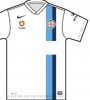
Seeing all the marketing, and other designed elements, it's easy to say that the sky blue will be their primary color. I would bet good money that the home jersey is all sky blue, or at least partial.

On a side note, just got a call from NYCFC about my season tickets, and I mentioned to the account executive that I designed some jerseys. He asked me to send them to him, and that he will pass them around. Maybe we influence the jerseys a little. He also mentioned that the main hold-up for the jersey reveal is the sponsor. They're still working through that.
 
  • Like
Reactions: BxLio91
It's worth mentioning that the only reason that Melbourne City got the white kit with the stripes (incidentally Manchester City's third kit from the previous season) was that the Australian FA rejected their application to use an all sky blue kit.
 
I definitely love the orange socks! It would be giving the kit a destinctive feature which would be unique the world over. And it would also be practical as it is a signal color you can spot well from the distance. So you could actually make out the legs of our players better during the game.
 
Personally, I dig white uniforms. I just saw this on FB and thought it would be pretty cool as is or perhaps a darker shade of blue. (Uruguay btw)
060614-Soccer-Uruguay-team-JT-G1.jpg
 
  • Like
Reactions: deedsy
This popped up in my twitter feed a little bit ago and thought the people in this thread would like it:
https://twitter.com/Paul5Hart/statuses/475933373043445760

If you click, it's a City fan who has redesigned the MCFC badge based on the NYCFC and Melbourne Heart badge. It's really cool that the badge NCYFC picked is now being used as a template across the City Group. Speaks well to the taste of the fans.
That's actually really cool. I think a lot of these high-horse ManC fans are gonna be a little bummed when they are also rebranded as a X City Football Club with the circular badge. After seeing the MelC badge it seems this will become the CFG trademark.
 
  • Like
Reactions: NYCBlue
That's actually really cool. I think a lot of these high-horse ManC fans are gonna be a little bummed when they are also rebranded as a X City Football Club with the circular badge. After seeing the MelC badge it seems this will become the CFG trademark.
Actually, most City fans will be delighted with a circular badge as City's old badges were circular
Manchester-City@2.-old-logo.png Manchester-City@3.-old-logo.png
and most hate the current bollocks for several reasons: The tacky latin motto, the eagle (used on a united shirt in a 50s cup final), and three f***ing meaningless stars.
Manchester_City_FC.png

This popped up in my twitter feed a little bit ago and thought the people in this thread would like it:
https://twitter.com/Paul5Hart/statuses/475933373043445760

If you click, it's a City fan who has redesigned the MCFC badge based on the NYCFC and Melbourne Heart badge. It's really cool that the badge NCYFC picked is now being used as a template across the City Group. Speaks well to the taste of the fans.
I have seen many CFG style designs for the new city logo and I have quite liked them, however this one is awful, sorry. It has too much going on, too many colours, the text is poor and black is hideously overused. All just my opinion of course.

These ones I have seen elsewhere and I find they are far better:
MCFCITY_zpsf624aa1a.jpg
eras3.png
but particularly this one:
heritage_zpsbda878fc.jpg
 

Attachments

  • mancity01zs7.png
    mancity01zs7.png
    267.1 KB · Views: 61
That's actually really cool. I think a lot of these high-horse ManC fans are gonna be a little bummed when they are also rebranded as a X City Football Club with the circular badge. After seeing the MelC badge it seems this will become the CFG trademark.

You know, it would really help
Actually, most City fans will be delighted with a circular badge as City's old badges were circular
View attachment 322 View attachment 323
and most hate the current bollocks for several reasons: The tacky latin motto, the eagle (used on a united shirt in a 50s cup final), and three f***ing meaningless stars.
View attachment 324


I have seen many CFG style designs for the new city logo and I have quite liked them, however this one is awful, sorry. It has too much going on, too many colours, the text is poor and black is hideously overused. All just my opinion of course.

These ones I have seen elsewhere and I find they are far better:
View attachment 326
View attachment 328
but particularly this one:
View attachment 327

I like the first & third one. Middle one is just a redo of the old one. Third one seems to be an off shade of blue from MCFC's. Interesting in that they all seem to basically be the same design: ship, three lines.

And yeah, the whole "we have an eagle and stars because..uh...AMER....wait we're English uh..." needs to go.
 
You know, it would really help


I like the first & third one. Middle one is just a redo of the old one. Third one seems to be an off shade of blue from MCFC's. Interesting in that they all seem to basically be the same design: ship, three lines.

And yeah, the whole "we have an eagle and stars because..uh...AMER....wait we're English uh..." needs to go.
The third one is also a redo of an old one
Manchester-City@3.-old-logo.png

but it is so well designed/updated, it fits in with CFG and city fans would absolutely love it.
 
You know, it would really help


I like the first & third one. Middle one is just a redo of the old one. Third one seems to be an off shade of blue from MCFC's. Interesting in that they all seem to basically be the same design: ship, three lines.

And yeah, the whole "we have an eagle and stars because..uh...AMER....wait we're English uh..." needs to go.
because they are:
a. relevant to the city of Manchester
b. (ship) is the only thing running through all of our crests
c. the only redeeming factors of the current badge