You are using an out of date browser. It may not display this or other websites correctly.
You should upgrade or use an alternative browser.
You should upgrade or use an alternative browser.
2016 Mls Jersey Thread
- Thread starter ferrarinycfc
- Start date
what is it with teams not using their colors for jerseys. How is san jose associated with red?
what is it with teams not using their colors for jerseys. How is san jose associated with red?
That's a very good question. It looks like a fire jersey with a Quakes patch on it. I can understand when teams go with colors not associated with any team in their league for a 3rd kit, like the man city green kits or the arsenal gold kits to keep it interesting. What I dont understand is when a team with established colors uses different colors that are classically associated with other teams in the league. Makes no sense.
Let's hope the never do this with us: "New York is Blue and Wh...... umm...ah...red and back today we guess..."

Montreal home kit leaked. The adidas stripes are only on the arm and not the shoulder?
http://gofootyourself.com/2016/01/26/breaking-news-imfc-2016-jersey-leaked-by-an-imfc-player/
http://gofootyourself.com/2016/01/26/breaking-news-imfc-2016-jersey-leaked-by-an-imfc-player/
BossNYC
Registered
Chicago Quakers no more?
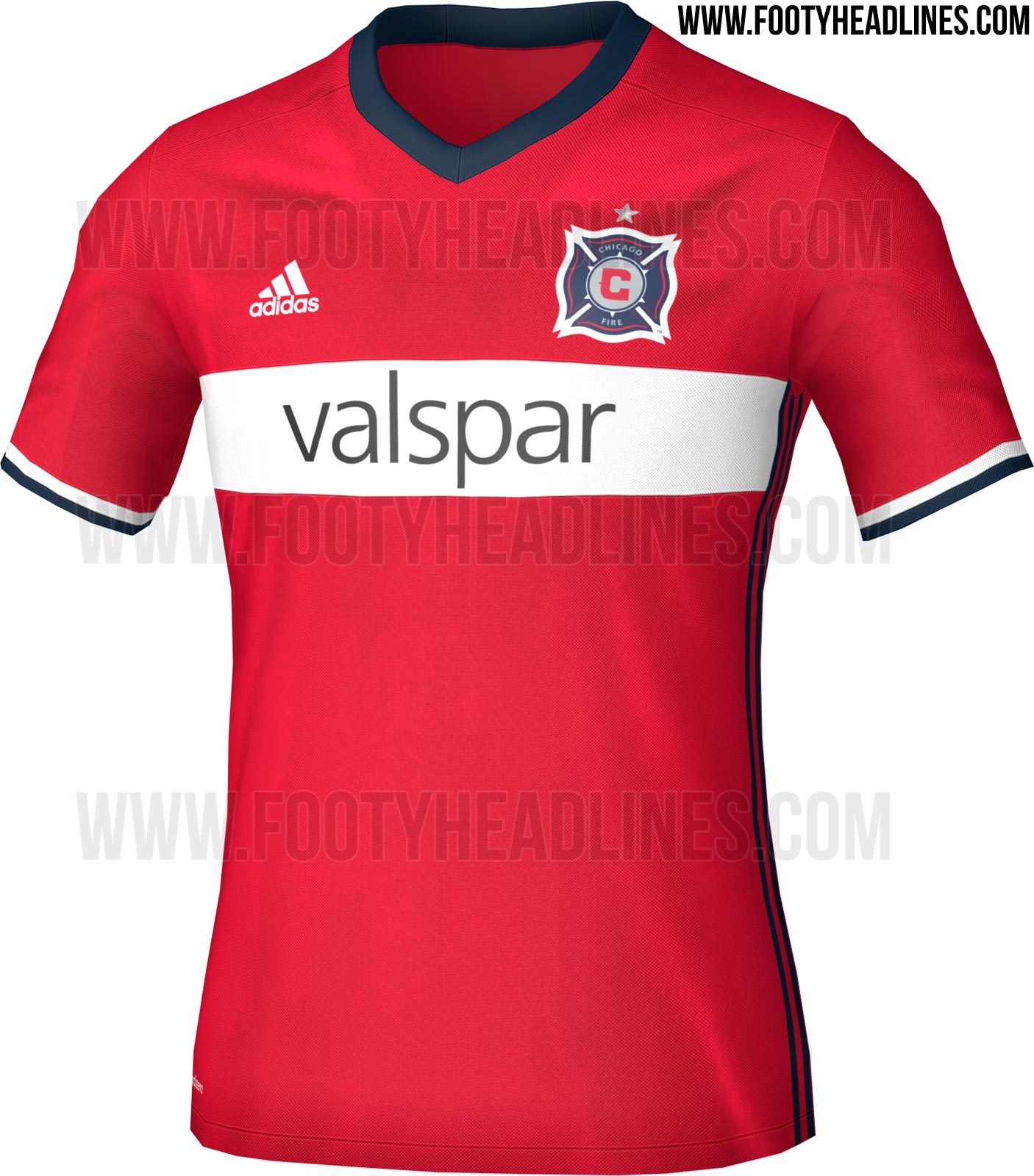

I'm going to take a wild guess and say Jersey Week is a thing of the past. I was just on mlssoccer.com and noticed they have an entire page dedicated to 2016 Jerseys.
http://www.mlssoccer.com/topic/jers...der&utm_medium=Jerseys&utm_campaign=TextLinks
For whatever reason, at the moment they only have something on Chicago (perhaps the others haven't been officially released yet?). It appears as if they'll add to the page as newer jerseys are released.
http://www.mlssoccer.com/topic/jers...der&utm_medium=Jerseys&utm_campaign=TextLinks
For whatever reason, at the moment they only have something on Chicago (perhaps the others haven't been officially released yet?). It appears as if they'll add to the page as newer jerseys are released.
I'm just glad that MLS teams can / have to avoid having sports betting website jersey sponsors. That shit looks so tacky on EPL jerseys, partly due to godawful graphic design and partly because the whole idea of being sponsored by bookies is pretty gross.
Montreal home kit leaked. The adidas stripes are only on the arm and not the shoulder?
http://gofootyourself.com/2016/01/26/breaking-news-imfc-2016-jersey-leaked-by-an-imfc-player/

what is it with teams not using their colors for jerseys. How is san jose associated with red?
I think San Jose has used red/white color scheme on their away kits for a few years now. Also there is a tiny bit of red in their crest (the year 1974) which, as previously mentioned in this thread, is an homage to their NASL days.

ferrarinycfc
Registered
Quakes new away:

It seems like everyone else is going super simple this year.
Thats probably the replica version.
This one would be the authentic. Pretty sure every MLS team has a jersey sponsor now.

21Architect
Registered
I'm just glad that MLS teams can / have to avoid having sports betting website jersey sponsors. That shit looks so tacky on EPL jerseys, partly due to godawful graphic design and partly because the whole idea of being sponsored by bookies is pretty gross.
America: where you can spend your entire paycheck on the lottery, race track betting and scratch offs but you can't bet $15 on a Mets game.
I like that jersey a lot. Love the Clash call out!Thats probably the replica version.
This one would be the authentic. Pretty sure every MLS team has a jersey sponsor now.
Not complaining, but those shorts are kind of see through.
MagnusPax
Registered
I thought LA said that was a training jersey.
Anyone see the new timbers jersey? It's heinous.
Similar threads
- Replies
- 19
- Views
- 1,058