
2016 Mls Jersey Thread
- Thread starter ferrarinycfc
- Start date
You are using an out of date browser. It may not display this or other websites correctly.
You should upgrade or use an alternative browser.
You should upgrade or use an alternative browser.

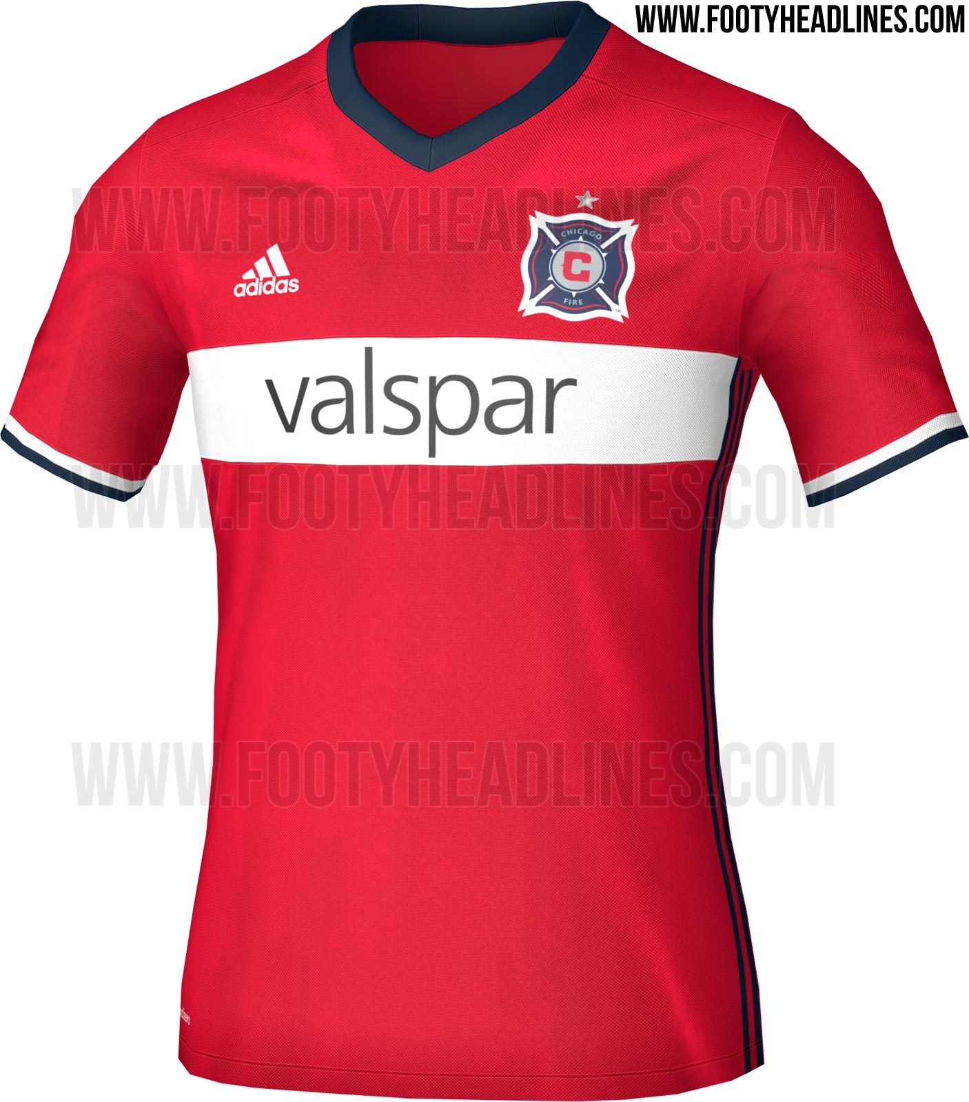
No shoulder stripes? If true, love it.
Yep. That's the one thing I hate about Adidas. That said, all they've done is transferred them to the flanks, which - while an improvement - is not good enough to absolve them of the sin.
Yep. That's the one thing I hate about Adidas. That said, all they've done is transferred them to the flanks, which - while an improvement - is not good enough to absolve them of the sin.
"Somewhere on the outside there must always be three stripes, so everyone knows that THIS IS ADIDAS!." - Founder of Adidas
Correct. But don't they have designers who could make them feel a little less 70's chic?"Somewhere on the outside there must always be three stripes, so everyone knows that THIS IS ADIDAS!." - Founder of Adidas
The most ridiculous part is the Adidas logo is always there prominently on the right side opposite the team badge, just like every other jersey manufacturer. But that's not enough for them.
The three stripes are a small price to pay for something that you can actually wear and not feel like a schmuck. Keep in mind the league could still be pumping out these masterpieces:

Owww!! My eyes! It buuuurrrnnnsssss!!!!!!!!!!!!!The three stripes are a small price to pay for something that you can actually wear and not feel like a schmuck. Keep in mind the league could still be pumping out these masterpieces:
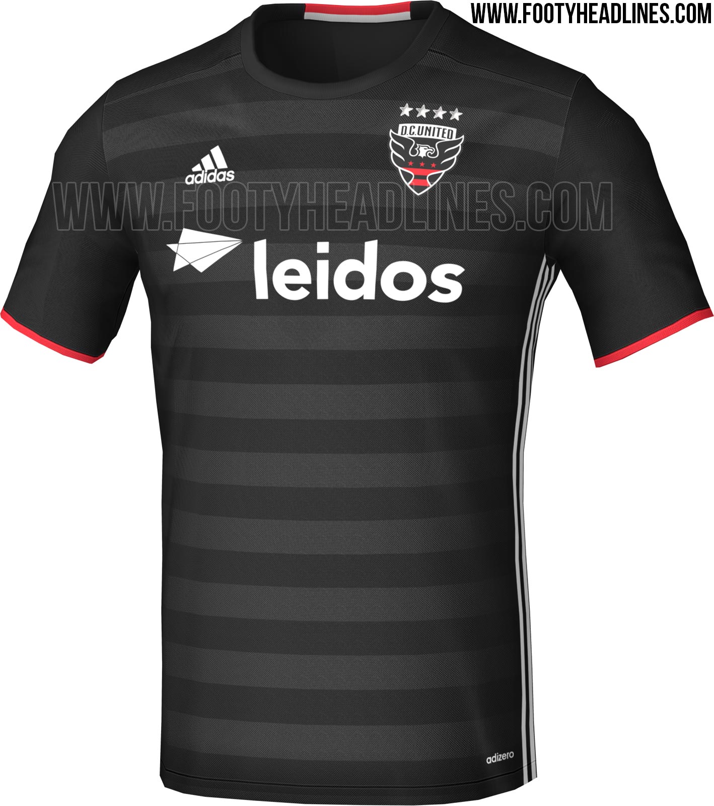
You realize that the DC & Crew jerseys were Adidas, right? I'm not sure how they got those two so right and flubbed the KC one..... definitely two different designers on the team.the DCU and Crew ones were never awful. Even the Burn were OK.
In fairness, there are some awful kits from the 90s in Europe.
And that Burn jersey is Nike and is exactly the same as the Mutiny and just barely different from the Metrostars & Galaxy.
For me, the Colorado jersey was one of the acceptable three. The rest can all go in the trash.
The three stripes are a small price to pay for something that you can actually wear and not feel like a schmuck. Keep in mind the league could still be pumping out these masterpieces:
I think Nike have hired better designers since then. And all those 90s trends are way over.
The three stripes are a small price to pay for something that you can actually wear and not feel like a schmuck. Keep in mind the league could still be pumping out these masterpieces:
I don't think that the manufacturer has anything to do with the picture you just quoted. That's much more symptomatic of the era they were designed in. The 90s was a decade of terrible, terrible football fashion for every manufacturer around the world.
http://www.highsnobiety.com/2015/06/10/football-kits-90s/
The three stripes are a small price to pay for something that you can actually wear and not feel like a schmuck. Keep in mind the league could still be pumping out these masterpieces:
They need to bring these back!!! I love how horrific they are. Nostalgic.
New RSL kit.
Not sure if i like the collar but its a nice jersey.
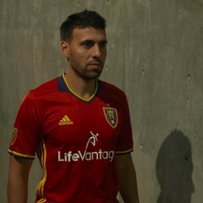
http://www.footyheadlines.com/2016/01/real-salt-lake-2016-home-kit.html?m=1
Not sure if i like the collar but its a nice jersey.
http://www.footyheadlines.com/2016/01/real-salt-lake-2016-home-kit.html?m=1
Similar threads
- Replies
- 4
- Views
- 190
- Replies
- 10
- Views
- 777
- Replies
- 0
- Views
- 450
- Replies
- 32
- Views
- 1,022