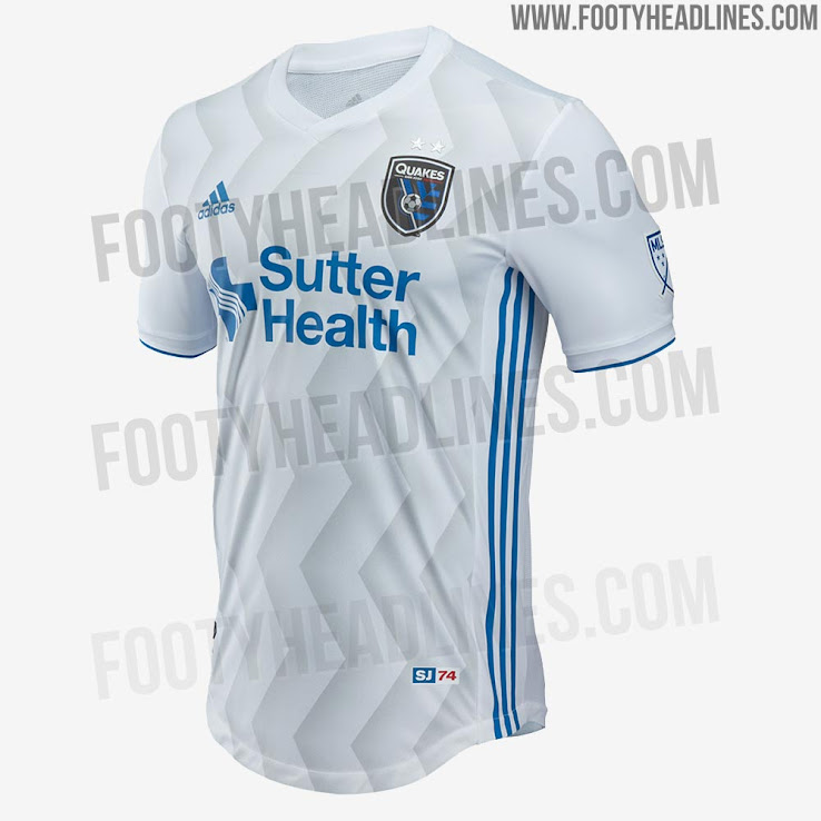
2018 MLS Jersey Thread

That Dynamo jersey is nice. A nice spacex logo, sponsor would take it over the top.

Putting more thought into it, these Dynamo jerseys would sell so much if they get Elon on board. Especially w how many people worship the guy. One tweet about the jersey from him would sell em out like those flamethrowers lol
 
Last edited:
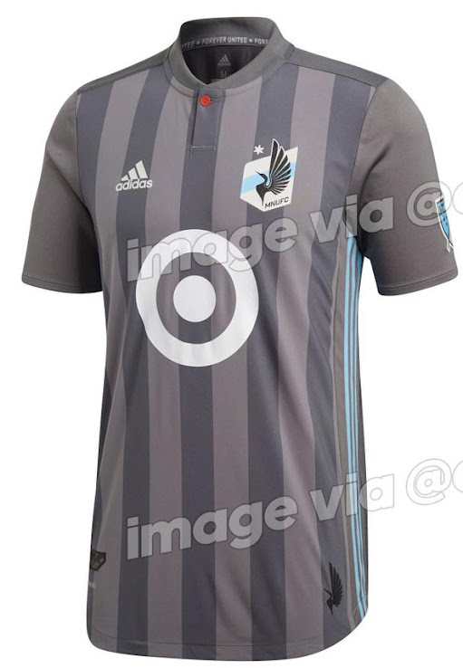
minnesota-united-2018-home-kit%2B%25282%2529.jpg
Why the fuck is the button red? Originally liked the leaked photo of the replica, authentic one looks like ass. Striping on the kit looks weird vs. the gray of the sleeves.
 
Why the fuck is the button red? Originally liked the leaked photo of the replica, authentic one looks like ass. Striping on the kit looks weird vs. the gray of the sleeves.
I think it's supposed to reference the red eye of the loon, which I guess is the bird that is in their crest, and their mascot.

That's actually kinda smart and would look good if they got the rest of the colors right.

Unfortunately with the messy grey tones and the bright blue target, I'm reminded of a baboon's arse.
 
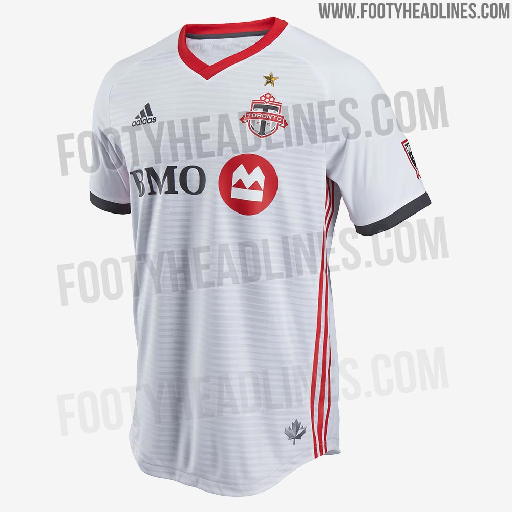
Man I love all of TFC's jerseys. Crisp, clean, a lot of conviction. Kind of the opposite of every other other team, who seem to spazz out and grab the wheel every season.

And def the opposite of MNUFC who, like LionNYC LionNYC mentioned, will just look like convicts in pajamas. Actually wouldn't be surprised if Target took advantage of cheaper, lobby-loved prisoner labor so it all kinda fits I guess.

Unfortunately, convicts are not the group of people most closely associated with dark grey striped pajamas.

I think the design is very unfortunate.
 
Unfortunately, convicts are not the group of people most closely associated with dark grey striped pajamas.

I think the design is very unfortunate.
Sheesh.... that hadn’t even occurred to me when it first leaked, but it’s way too similar and a tragic mistake by the designers et al. And the target is equally damning in context. Ugh....
 
  • Like
Reactions: Christopher Jee
Holocaust victims.
This is seriously OT but here we are. FWIW, in the color photos I've seen of Nazi camp prisoner uniforms from museums and such, they're not grey. They're mostly blue. But we've seen mostly B&W shots from the era and grey seems to make sense that we all think they mixed-tone grey.
 
This is seriously OT but here we are. FWIW, in the color photos I've seen of Nazi camp prisoner uniforms from museums and such, they're not grey. They're mostly blue. But we've seen mostly B&W shots from the era and grey seems to make sense that we all think they mixed-tone grey.

I agree, was just answering Christopher Jee Christopher Jee . As a grandchild of holocaust victims, I find nothing offensive about this jersey in that regard. As to the aesthetic, that's totally offensive but only to my eyes and sense of taste.

Now if the team played in Birkenau with those jerseys, that's a whole other issue, but they play in Minneapolis. So it never occurred to 99% of people to think of it, and let's all move on.
 
2018 Vancouver Whitecaps "Unity Jersey" Jersey

This is pretty nice kit for an Adidas/MLS team franchise partnership. Also very smart marketing on their part.

WFC18-027-JerseyLaunch-Microsite-Header-1280x700 - Copy.jpg


WFC18-027-JerseyLaunch-Microsite-Infographic-1280x700 - Copy.jpg
 
  • Like
Reactions: ferrarinycfc
Revealing the black kit with metallic silver lettering, Sporting KC see the new design as an evolution on previous metallic kits.

"This kit is an evolution of our previous argyle kits, showcasing a high-end Reflex Black with metallic accents," said John Moncke, Sporting KC vice president of brand revenue in a team release. "Five years ago we launched the black argyle kit, then followed that up with a clean white and metallic argyle kit in 2015. This time we used a new black reflective argyle detail on the hem and back that looks amazing.

"We continue to have a great collaboration with the adidas team. The process of designing this kit began two years ago, and we worked on the details weekly."


And it shows! Great design and great execution!!!

DVdwSegVQAAu4ba.jpg


SKCjersey18alt.jpg