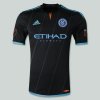
Official Away Kit Discussion
- Thread starter NYCFC_Dan
- Start date
You are using an out of date browser. It may not display this or other websites correctly.
You should upgrade or use an alternative browser.
You should upgrade or use an alternative browser.
- Jul 14, 2014
- 795
- 955
- 143
- 37
I really like this jersey, def gives us that more unique feel than the home.
As far as when it will be released, I was one of the people who emailed the club about my disappointment in the home. They called me and gave me their reasons and told me to keep and eye out for the other jersey and that he wouldn't be surprised if it surfaced before jersey week.
As far as when it will be released, I was one of the people who emailed the club about my disappointment in the home. They called me and gave me their reasons and told me to keep and eye out for the other jersey and that he wouldn't be surprised if it surfaced before jersey week.
People will get over the home jersey, it's actually beautiful so who cares. People were saying the Crew rebrand looks like Dortmund but they got over it because it's awesome looking.
I think it's great. I love that the MLS badge is highlighted in orange.
I guess I go against the grain here. I like the colors of the leaked away jersey, but somehow they managed to make a black jersey look messy. It looks like they just threw random style elements at a black jersey and called it a day. The orange neck accent just looks out of place, and the shoulder stripes plus diagonal black stripes just looks weird.
I don't dislike it, but it actually makes me appreciate the simplicity of the home jersey, which I may prefer at this point despite its connotations.
I don't dislike it, but it actually makes me appreciate the simplicity of the home jersey, which I may prefer at this point despite its connotations.
I guess I go against the grain here. I like the colors of the leaked away jersey, but somehow they managed to make a black jersey look messy. It looks like they just threw random style elements at a black jersey and called it a day. The orange neck accent just looks out of place, and the shoulder stripes plus diagonal black stripes just looks weird.
I don't dislike it, but it actually makes me appreciate the simplicity of the home jersey, which I may prefer at this point despite its connotations.
I have a feeling they went diagonal to avoid the issues with the shoulder Adidas stripes. I agree that Drainyoo's design was cleaner.
And your point about simplicity is key. For a first home kit, you want simple and then you can play with that base design with future kits. Maybe add the orange neck accent next year; some stripes. Pinstripes one year, etc.
Just on FUT now and NYC and Orlando kits are on, but it's just a white template ATM. I might buy one, but they're ridiculously expensive.
I have a feeling they went diagonal to avoid the issues with the shoulder Adidas stripes. I agree that Drainyoo's design was cleaner.
And your point about simplicity is key. For a first home kit, you want simple and then you can play with that base design with future kits. Maybe add the orange neck accent next year; some stripes. Pinstripes one year, etc.
They'll probably market the diagonals as a reflection of the new MLS crest.
This is typical for Inaugural jerseys.
Drainyoo it's on FIFA 15 Ultimate Team.
You can purchase the kits and when you equip to the players it doesn't load so you can't get a good up close high quality image. It's definitely one of those leaked for publicity things, since the jerseys aren't even rendered to players, which I'm fine with
Got it. I hope this is real because I love it. A great companion to the home kit. If this is the real deal, then NYCFC has the best looking set of kits in MLS, and probably worldwide.
I guess I go against the grain here. I like the colors of the leaked away jersey, but somehow they managed to make a black jersey look messy. It looks like they just threw random style elements at a black jersey and called it a day. The orange neck accent just looks out of place, and the shoulder stripes plus diagonal black stripes just looks weird.
I don't dislike it, but it actually makes me appreciate the simplicity of the home jersey, which I may prefer at this point despite its connotations.
I agree; a lot of clashing elements in the away kit. Overall I like it, but that's not an option in the poll so I went with "neutral". I'll certainly pick one up at U90 but I prefer the home kit.
Last edited:
I made a mockup based on the screens posted from FIFAUT so we can drool in better quality. Hope this is it. Love the horizontal stripes.
View attachment 853
That looks fucking sick. Great job again
I made a mockup based on the screens posted from FIFAUT so we can drool in better quality. Hope this is it. Love the diagonal stripes.
View attachment 853
Its good that most people like this, I happen to think its ugly. Not my preference for a shirt but its ok, I wont be quitting the team and calling the front office anytime soon.
Similar threads
- Replies
- 197
- Views
- 12,426
- Replies
- 11
- Views
- 2,205
- Replies
- 88
- Views
- 9,811
- Replies
- 97
- Views
- 9,415

