
I see your point, but the shorts make it stand out. I think if they were to wear darker shorts on the field, it would look bland. But those shorts pop out.The textured look is nice for fans wearing it casually but it seems like it will look kind of bland on the field. I didn't think I'd be saying this but I think our secondary is a better look.
2016 Mls Jersey Thread
- Thread starter ferrarinycfc
- Start date
You are using an out of date browser. It may not display this or other websites correctly.
You should upgrade or use an alternative browser.
You should upgrade or use an alternative browser.
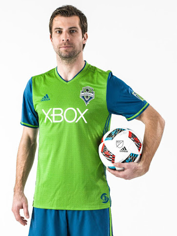
That's a rough color combo.... 1980's arcade flashback.....Seattle Primary
Ugh... RB and their ass-tag is part of the equation - that alone seriously skews the results.A meaningless accolade but I think, top to bottom, MLS has the best uniforms in the world.
But I take your point and agree that for the most part MLS is at the top of the heap with the exception of a few questionable kits. It could be a correlation to the notion that the US fan has a lot of disposable income relative to other league's fans, and thus demands a more stylish jersey.

Didn't see Houston posted
Nice
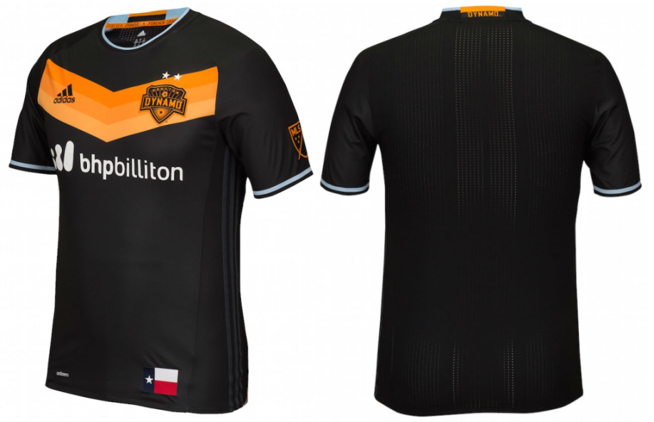
I particularly like the black on black stripes, like Real Madrid's white on white.
I'm pretty upset they claimed the black and orange before us but I appreciate the hell out of that uni. Huge sucker for black on black. Classic looking but still subtly aggressiveI particularly like the black on black stripes, like Real Madrid's white on white.
They get an Adidas template jersey -- and an old one at that (2013-2015 Germany and others) and we're jealous!?!?!Didn't see Houston posted
Nice
They get an Adidas template jersey -- and an old one at that (2013-2015 Germany and others) and we're jealous!?!?!
I dont think folks are jealous. We just think it's pretty nice. At the wnd of the day, im gonna wear only NYCFC and support my team and my city no matter what jersey.
Can the season start already???!!!!
I don't think one person said they were "jealous". Appreciation doesn't have to go hand in hand with envyThey get an Adidas template jersey -- and an old one at that (2013-2015 Germany and others) and we're jealous!?!?!
It would look a whole lot nicer, in my opinion, if the stripes on ge sided were the same blue color as the sleeve cuffs and the collar area of the jersey.Didn't see Houston posted
Nice
USA Copa America Secondary Shirt
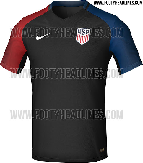
Not sure why black has become part of the USA mens and womens identity.
I like the new crest though.
Not sure why black has become part of the USA mens and womens identity.
I like the new crest though.
USA Copa America Secondary Shirt
Not sure why black has become part of the USA mens and womens identity.
I like the new crest though.
I don't love the new crest, but anything was an improvement. I want to old classic crest back, but I understand they don't use if for copyright reasons, which is silly.
As for the jersey, it's not hideous. Not a fan of black primary for usmnt, but at least they got the red white and blue in there that the women lacked. I'll be buying one, that's for sure.
Also, glad they took the stars out of our crest. Were the designers that clueless? 13 small stars or 50 small stars (don't know how that works), but not 3 large stars in your crest when you never won anything.
Not sure why black has become part of the USA mens and womens identity.
I'm not sure if I should blame Nike or US soccer, but their new black, volt and white color scheme rubs me the wrong way. when was it not cool to represent your country and show your flag / colors?
Couldn't agree more.I'm not sure if I should blame Nike or US soccer, but their new black, volt and white color scheme rubs me the wrong way. when was it not cool to represent your country and show your flag / colors?
But as the old saying goes (or the old saying for old guys like me) "Money talks, bull shit walks."
Nike inserting black into uniforms (even teams that traditionally don't wear black) has been going on for years. No reason to think it's going to change.
Care to save me some googling?I want to old classic crest back, but I understand they don't use if for copyright reasons
Since the Azzurri have been sporting blue. But I agree, not a fan of the black kit. My last US jersey is one from 98. I haven't picked up a new one as I haven't particularly liked any of them. I may pick up the current blue kit prior to CopaAmerica.I'm not sure if I should blame Nike or US soccer, but their new black, volt and white color scheme rubs me the wrong way. when was it not cool to represent your country and show your flag / colors?
Care to save me some googling?
I'd have to google myself. But I read somewhere that the classic crest was also used by the us military since around WWI or WWII (and there are many photos showing it) and can't be copywriten in that form. So if they were to put it on all the jerseys it would show up on hats and shirts everywhere without ussoccer earning a dime.
EDIT: Did a little googling and it's because it's been around since before 1923. Micro changes would help, but nothing to stop bootlegger from just using the original and no one really caring it's slightly different.
Last edited:
Similar threads
- Replies
- 4
- Views
- 197
- Replies
- 10
- Views
- 786
- Replies
- 0
- Views
- 468
- Replies
- 32
- Views
- 1,034