
http://www.si.com/planet-futbol/pho...seys-kits-away-home?xid=socialflow_twitter_si
All the 2017 jerseys including our own new hotness.
All the 2017 jerseys including our own new hotness.
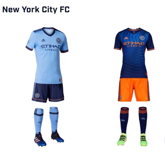
Orange shorts!http://www.si.com/planet-futbol/pho...seys-kits-away-home?xid=socialflow_twitter_si
All the 2017 jerseys including our own new hotness.
Dear god why...http://www.si.com/planet-futbol/pho...seys-kits-away-home?xid=socialflow_twitter_si
All the 2017 jerseys including our own new hotness.

http://www.si.com/planet-futbol/pho...seys-kits-away-home?xid=socialflow_twitter_si
All the 2017 jerseys including our own new hotness.

http://www.si.com/planet-futbol/pho...seys-kits-away-home?xid=socialflow_twitter_si
All the 2017 jerseys including our own new hotness.
is there a second page and im too dumb to find it or did the league shrink to five teams?http://www.si.com/planet-futbol/pho...seys-kits-away-home?xid=socialflow_twitter_si
All the 2017 jerseys including our own new hotness.
its fine.....its not like you guys are wearing it unless you are being a full kit wanker.
Well, it appears we've had the first good idea on the forum ever. Congratulations all, it's a great day!looked like a one-piece
and free shipping for orders over $60 . . . might be a done deal.In case anyone didn't see Goodfella's post in the Swag thread: 20% off at Modell's this weekend. Authentic comes out to $96 shipped. Too good to pass up!
https://www.modells.com/search.do?query=new+york+city+fc
if we win the cup, it's automatic full kit wanker for me.I would actually respect the confidence of someone willing to go FKW in this.

In case anyone didn't see Goodfella's post in the Swag thread: 20% off at Modell's this weekend. Authentic comes out to $96 shipped. Too good to pass up!
https://www.modells.com/search.do?query=new+york+city+fc
I think the secondary jersey is ass.
That being said, the orange shorts pull it all together. It's a distinctly unique NYCFC kit. You can't complain about the crappy unitard look, or the City Blue, or the lack of orange, etc. and then complian about the shorts.
I think it actually looks awesome and this is from a guy that HATES any uniform that isn't clean and classy.
It's funny, I agree that it's a "look." It's just not an NYC look.
Compare to the Yankees absolutely clean and classic jerseys, the Giants and their gray pants and facemasks that are effectively throwback elements, and even the black and white color scheme of the Brooklyn Nets. The Rangers have very clean and classic jerseys as well.
And then here we are, with loud design elements and bright colors. WTF.
New York is an old, gritty city with clear city-wide design styles. The Adidas designers don't seem to have considered this at all.
I liked the original home kits with light blue shirt and white shorts and stripes. I get wanting to differentiate from Manchester City, but we are doing it poorly, because now we are differentiated from "New York" too.
Buying straight from MLS is the worst to be honest. Upper 90, Lids and Modells are ALWAYS having sales.So our retail partner is immediately offering a better deal than MLS store and the cityzens discount code. Must try to remember this for next year......
