It's terrible.
It's a fucking disaster.
There's more shit covering that jersey than you get from an incontinent elephant.
It's a fucking disaster.
There's more shit covering that jersey than you get from an incontinent elephant.
It's coming.I swear, if they say the lighting bolt represents the Third Rail...
Don’t hold back… tell us what you really thinkIt's terrible.
It's a fucking disaster.
There's more shit covering that jersey than you get from an incontinent elephant.
Normally I would wait until the official reveal, but in the present spirit of extremist takes on this jersey I am declaring it to be the second best in team history. Home 2019 was the best.
All other opinions are wrong, and have a nice day.
Normally I would wait until the official reveal, but in the present spirit of extremist takes on this jersey I am declaring it to be the second best in team history. Home 2019 was the best.
All other opinions are wrong, and have a nice day.

Actually it's a fact.
Haha.Actually it's a fact.
But coming from me who thinks hypnokit was the best kit we ever had, I think this one's so bad that it's awesome and you can't convince me otherwise.
Haha.
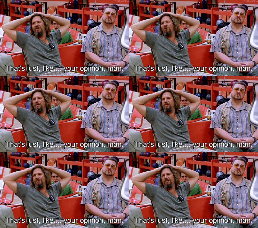
I have no opinion on this yet until I see it on an actual player. But I couldn't resist using that Big Lebowski gif.
I love the double wide collar. Take that away and it’s 100% a template kit and a straight rehash of 2015.Looking back, even on recent Jersey’s I thought were okay… I think the design team is kinda bad at their job. It’s like… you have to make an effort to not just come up with a nice, sharp, clean, good looking classic kit. The home Jersey almost hit the mark but they just had to give it the double wide collar.
Everyone keeps saying lightning.P.P.S. THIS is what a Lightning based Jersey should look like.
I actually like it, kinda. I dont like the sleeves. I'm trying to decide what id prefer.