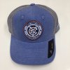
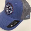
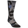
yessssss i need a new beanie this works
New Swag
- Thread starter Goodfella
- Start date
You are using an out of date browser. It may not display this or other websites correctly.
You should upgrade or use an alternative browser.
You should upgrade or use an alternative browser.
where you getting these images? that hat......for some weird reason i like it...i usually dont get hats in that style
I'm getting really pumped on the new jersey. Grey and sky blue look amazing together.
This was last years 2017 Adidas Anthem Squad Hoodie of quality. Not for sale to the general public unfortunately.
But in is high quality photo it looks nice and comfy. I would call it a Light Soft Gray, all the MLS teams had the same colorway, obviously to keep costs down.
View attachment 7968
Pretty sure I saw this in the team store last year...
Last edited:
Last edited:
Monochromatic, Blacked-out NYCFC Metallic Vinyl Auto Decal. No colors, hooray! They also make colored ones.
View attachment 7994
still has that old MLS logo
Lol at least steam or iron that shit. Zero fucks given from design to merch.
Is this from next season's Black Mirror Night?
Sky blue is tricky, from a design standpoint. Looks good with dark or muted colors. I like it with navy blue and the dark gray, and black is ok. Not good with orange or light gray.
I like the monochrome crest. As long as it's one single color, on another single contrasting color background. I don't like the polo with a monochrome crest on a dark patch, on a sky blue shirt. That defeats the whole point.
I like the monochrome crest. As long as it's one single color, on another single contrasting color background. I don't like the polo with a monochrome crest on a dark patch, on a sky blue shirt. That defeats the whole point.
Similar threads
- Replies
- 20
- Views
- 1,683
- Replies
- 72
- Views
- 1,848
- Replies
- 38
- Views
- 2,556
- Replies
- 0
- Views
- 1,061


