You are using an out of date browser. It may not display this or other websites correctly.
You should upgrade or use an alternative browser.
You should upgrade or use an alternative browser.
Major League Soccer Trolls The World With New Logo
- Thread starter BrooklynGinger
- Start date
I happen to love the logo. Especially when compared to the older one, that thing was/is horrific. Is it generic looking? Yes, a bit. But it's not corny and does look sharp with the colors of the different clubs.


jerseyhotspur
Registered
I agree.I'm warming up slightly to the simplicity of the font and lines, but I still don't like the slash sticking out and all the empty space in the logo.
This morning I was scratching my head, but since the (customizable) MLS logo is designed to put the focus on your TEAM (instead of the LEAGUE), I'm ready to pick up the bandwagon on it's next stop.
It's definitely an upgrade and forward thinking.
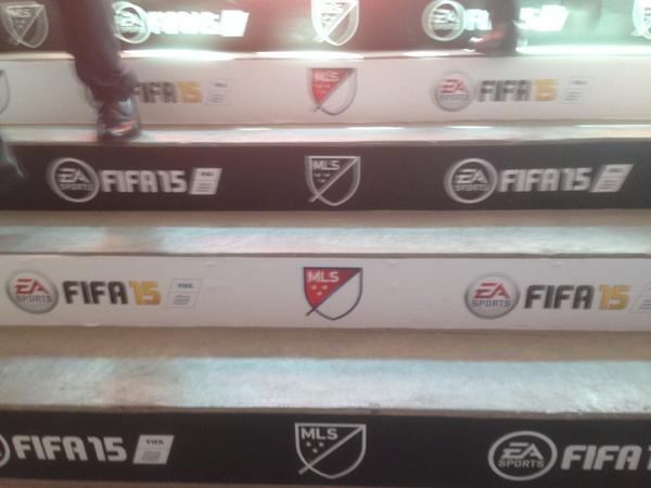
I don't like it at all in it's plain form against a white background on a computer screen but I think it does look excellent when designed into the jerseys. I wonder if they will allow Fox/ESPN to have a logo with their colors to go with their broadcasts next season.
Honestly, No they don't really look alike except for somewhat similar colors.

Look familiar?

MyBoyVilla
Registered
Same shield. Same slash across the middle (think bird). When I saw the logo in Timbers colors, I immediately though Norwich. From afar, I think it can be mistaken.Honestly, No they don't really look alike except for somewhat similar colors.
MyBoyVilla
Registered
Taken from the SI article, if that is how it will look on the jersey's I'm a fan. I was never a fan of the old logo, it looked like a copy of the MLB logo. This looks like a serious attempt to become known as a football league.
It does look a lot better. If the idea is to match it with the team's jersey, I can understand that. The logo will look better in the team's colors on the sleeve.
But I still think the original logo, the red and white, is plain awful. That's the only reason they need the team color gimmick to salvage it.
MyBoyVilla
Registered
http://www.twiigs.com/embed?pid=122441
Poll right now shows
5% Love
30% Like
21% Indifferent
27% Don't Like
15% Hate
That is not overwhelming support
Poll right now shows
5% Love
30% Like
21% Indifferent
27% Don't Like
15% Hate
That is not overwhelming support
Agree. It looks so much better on JerseysI don't like it at all in it's plain form against a white background on a computer screen but I think it does look excellent when designed into the jerseys. I wonder if they will allow Fox/ESPN to have a logo with their colors to go with their broadcasts next season.
So not sure if anyone here does design work. But from a Design angle it's Pretty well done. The Colors are vibrante and work. It makes it's point, Elements working togeather. Plus they were smart making it Customizable (this is something I work with A LOT). And knock the "White Area", but it works. Symbolize and Subtle things like that are a Logo's best friend, saying a lot with a little.
And talk about Clip Art....the Old "Cleat and Ball" logo looked like a Special Ed Art Class project. I had flashbacks to my 1995 Packard Bell looking at that.
And talk about Clip Art....the Old "Cleat and Ball" logo looked like a Special Ed Art Class project. I had flashbacks to my 1995 Packard Bell looking at that.
jerseyhotspur
Registered
But I still think the original logo, the red and white, is plain awful. That's the only reason they need the team color gimmick to salvage it.
Yeah, the team colorways are "flat", but it's a departure from the official red, white and blue logo which has GRADIENTS (in the slash and "first half"). I haven't used gradients since the late 90's dot com days.

MyBoyVilla
Registered
First and second half. Makes me laugh every time.

NYCFCFan10
Registered
Look familiar?
This is what I thought! The shape on the right looks like the bird to me.
I kinda wish they'd have a downwards bend in the "slash" and have a sliver of white, the blue line and then more area for the red.
Then I saw it here:
Now I'm fine with it.
This is what I thought! The shape on the right looks like the bird to me.
I kinda wish they'd have a downwards bend in the "slash" and have a sliver of white, the blue line and then more area for the red.
Then I saw it here:
Now I'm fine with it.
I agree, I think it looks very good in presentable form.