2026 NYCFC Kit Thread

View attachment 14381

I like it, although I will admit with the stated connections to the NYC flag, I'm a bit disappointed the only place Orange shows up is in the socks.
 
I like it with the white shorts and orange socks. Matching the flag is very cool.
View attachment 14381View attachment 14382

Matching the flag is great. But they really should have tried harder to match the blue.

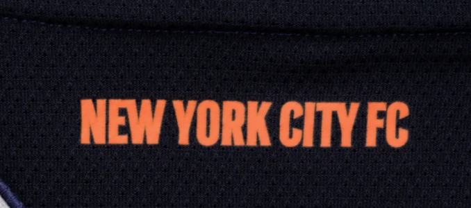
There is also a touch of orange on the back under the collar.

1770741404430.png
 
Last edited:
i do like it, but man at that price? sheesh ill see if they do any sales end of year.

I like it. Some orange would be nice but not bad.
Second kit ranking
1) 2015 Black is still rhe GOAT
2) 24-25
3) Bolt Kit
4) This one
5) Gotham
6) Hypnokit
7) 20118-19 gray-blue abomination

ETA: prices are out of control.
 
Last edited:
I like it. Some orange would be nice but not bad.
Second kit ranking
1) 2015 Black is still rhe GOAT
2) 24-25
3) Bolt Kit
4) This one
5) Gotham
6) Hypnokit
7) 20118-19 gray-blue abomination

ETA: prices are out of control.

for me, the 24-7 kit is #1.
2. bolt
3. this kit
4. gotham
5. black 2015
6. gray wings (only because i have it with long sleeves!)
7. hypno

1770742248734.png
 
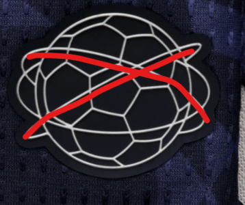
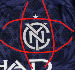
I still just see donuts or pool floats. What are those supposed to be? I do like the metallic touches and the logo, I like the shade of blue even if not exactly correct, and I think it will look ok overall on person/on field. I can probably come around if I can move on from picturing this on Homer Simpson.
 
I still just see donuts or pool floats. What are those supposed to be? I do like the metallic touches and the logo, I like the shade of blue even if not exactly correct, and I think it will look ok overall on person/on field. I can probably come around if I can move on from picturing this on Homer Simpson.
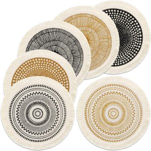
Woven mats or trivets?

1770748268754.jpeg

But they’re so subtle it mostly doesn’t matter. I think it will be fine on the field.
I see no connection between the design and the stated theme.
 
Woven mats or trivets?

View attachment 14385

But they’re so subtle it mostly doesn’t matter. I think it will be fine on the field.
I see no connection between the design and the stated theme.

Just a theory, but to me it looks like an art deco-y interpretation of the unisphere with a traditional pentagon panel soccerball in place of the globe. For example, the an interpretation of what the jock tag looks like.

1770749177094.png1770749148418.png
 
Back
Top