jaycrewz
Registered
So lately Ive been thinking about NYCFC's branding. I enjoy the fact that first division football is finally in the city of NY, but I dislike the lack of individuality in our teams colors and kit design.
Today I decided to give a look over the redesign given to Melbourne Heart, who became Melbourne City Football Club following their purchase by City Football Group. http://en.wikipedia.org/wiki/Melbourne_City_FC
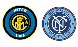
I liked that they were able to avoid having light blue dominate their home kit. Also, they retained red and white in their away kit...keeping with their traditional colors as Melbourne Heart. However, what bothered me was the badge. The middle of their badge pays homage to the heritage of the city and keeps the old colors. But the outer rim is clearly the NYCFC design pawned off onto Melbourne.
They were not given any originality on the outer portions of their badge. The colors and font are exactly the same. And the two old Melbourne Heart hearts on the Melbourne City badge, are in the same spot as the "5 boros" pentagon on the NYCFC badge.
So this got me thinking. "Since Melbourne City's badge isnt that original...and NYCFC's jersey isnt original at all...I wonder if the stories are true about how our badge was designed. Is it truly paying homage to the subway token of the past?" So I decided to find out if Manchester City ever had a different crest in the patch that may have influenced the two new City Football Group teams.
If you look at my attached pic, the bottom left Man City badge was the first they used. It was introduced in 1965. The bottom right badge was introduced in 1972. Man City's current eagle badge was adopted in the late 90s.
Anyways....maybe Im just being paranoid about originality, individualism, and identity...but do you feel our badge is truly unique? Do you buy the story about how they came up with it? I know the only thing in common with Manchester City's old badge is the circle and curved lettering...but it got me wondering how much thought they put into it....since clearly they didnt put tremendous thought into Melbourne's new badge.
This all said, I very much like the circular badge better than the dark blue shield choice the fans were given during the vote period for our badge.
Today I decided to give a look over the redesign given to Melbourne Heart, who became Melbourne City Football Club following their purchase by City Football Group. http://en.wikipedia.org/wiki/Melbourne_City_FC
I liked that they were able to avoid having light blue dominate their home kit. Also, they retained red and white in their away kit...keeping with their traditional colors as Melbourne Heart. However, what bothered me was the badge. The middle of their badge pays homage to the heritage of the city and keeps the old colors. But the outer rim is clearly the NYCFC design pawned off onto Melbourne.
They were not given any originality on the outer portions of their badge. The colors and font are exactly the same. And the two old Melbourne Heart hearts on the Melbourne City badge, are in the same spot as the "5 boros" pentagon on the NYCFC badge.
So this got me thinking. "Since Melbourne City's badge isnt that original...and NYCFC's jersey isnt original at all...I wonder if the stories are true about how our badge was designed. Is it truly paying homage to the subway token of the past?" So I decided to find out if Manchester City ever had a different crest in the patch that may have influenced the two new City Football Group teams.
If you look at my attached pic, the bottom left Man City badge was the first they used. It was introduced in 1965. The bottom right badge was introduced in 1972. Man City's current eagle badge was adopted in the late 90s.
Anyways....maybe Im just being paranoid about originality, individualism, and identity...but do you feel our badge is truly unique? Do you buy the story about how they came up with it? I know the only thing in common with Manchester City's old badge is the circle and curved lettering...but it got me wondering how much thought they put into it....since clearly they didnt put tremendous thought into Melbourne's new badge.
This all said, I very much like the circular badge better than the dark blue shield choice the fans were given during the vote period for our badge.