N
Nicholas Constantino
Guest
Juventus away and third are my favorite this year.
These two?Juventus away and third are my favorite this year.
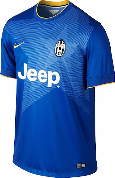
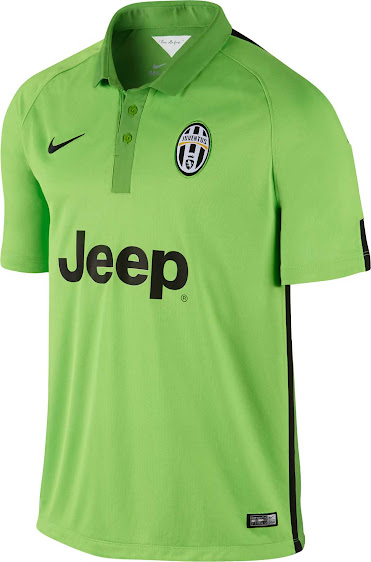
I thought a lot of people like the sky blue jersey and white shortsSo do MCFC fans want white shorts under sky blue tops? Ecch. Those abominations we wore last night look like toddler pajamas.
Yup they're my favoriteThese two?


I like the blue, but the star is throwing me off - the green is quite bright
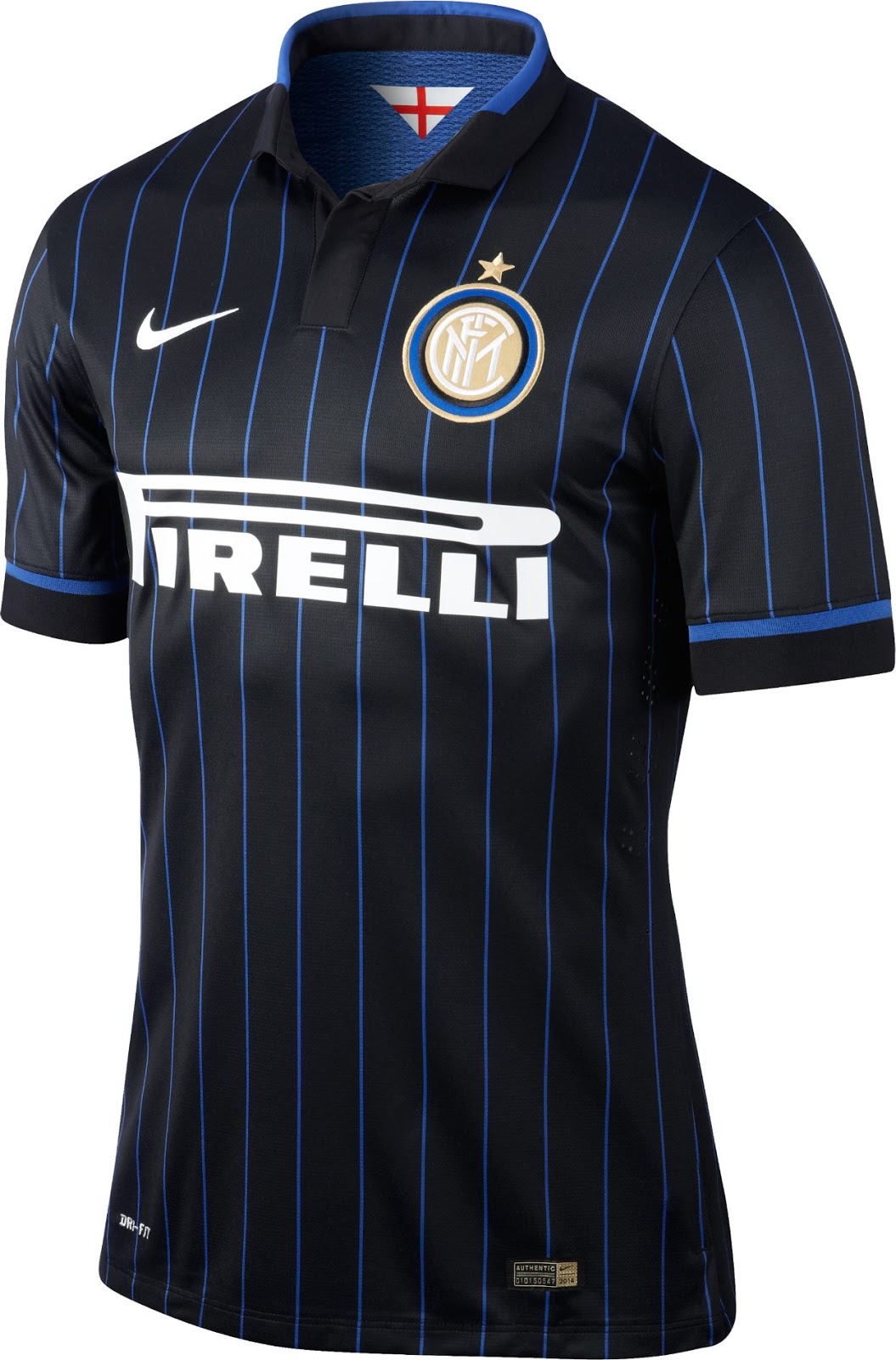
I was hoping our jersey looked more like this.Inter Milan's is pretty slick too - kinda hope we end up with a pinstripe jersey one year
No wonder a ton of them just started showing up on EBAY....In case anyone is looking for a Centennial, Ross Dress for Less has authentics for about $30.
For a good price? Link?No wonder a ton of them just started showing up on EBAY....
Well, there's no accounting for taste. And that includes mine.I thought a lot of people like the sky blue jersey and white shorts
Well that's THEIR colors.So do MCFC fans want white shorts under sky blue tops? Ecch. Those abominations we wore last night look like toddler pajamas.
Are you thinking of the Dutch Boy?Well, there's no accounting for taste. And that includes mine.
FWIW I hated the way it looked, and for reasons unrelated to branding, MCFC, etc. Sky blue with white just screams baby boy to me.
Maybe, but actually I think the Dutch Boy usually is portrayed in a darker blue.Are you thinking of the Dutch Boy?
These two?


I like the blue, but the star is throwing me off - the green is quite bright
That's AC Milan (2014-15) and...Beautiful...
And this never gets old to me...
They used a throwback crest.That's AC Milan (2014-15) and...
I don't recognize the crest
Naw, the first jersey I recognized, but wasn't sure about the second gold one. I did a reverse image search and found out it's Pumas UNAM's jersey - just not sure what year - and it's flippin sweet, though!They used a throwback crest.