kind of. during the fascist regime, the dictators favorite club was madrid.
Madrid CF became Real Madrid CF by royal decree of King Alfonso XIII in 1920. So yeah, that's legit. It had nothing to do with Franco.
kind of. during the fascist regime, the dictators favorite club was madrid.
I saw this, it's hard to imagine what they were thinking back then… Definitely a lot of better logos now, the only one I really don't like is the Revs
Here's my rankings of logos
1. NYCFC. Classic. You won't be changing that.
2. Crew SC: Rebrand absolutely worked.
3. Vancouver: Simple yet clever and distinct.
4. Toronto FC: Bold with a different color palette.
5. Montreal: I'm a sucker for a fleur de lis.
6.Sporting KC: They need to do more with the "S" and "C" interlocking, but it's solid.
7.. Portland: again simple. They're lower here because of the cartoony axe which may get dated
8. Philly: Love the color scheme and the use of the "Don't tread on me" snake
9. DCU: This ones gets a little too simple for my taste.
10. Galaxy: Futuristic look works well with the name of the franchise
11. Orlando City: It's a nice looking lion, but the Sun-shaped mane on a lion is a little overdone.
12. San Jose: I forget what this logo looks like, even though it looks fine
13. Colorado: Same thing. The badge is just a badge with a mountain and a soccer ball.
14. RSL: I remember this logo, but it's just RSL with a crown and a soccer ball.
15. FC Dallas: A bull for a texas team. Very original.
16. Chicago Fire: Just a fire badge. It works, but you see the same logo on your local fire truck.
17. Houston: graphic designer wanted to get away for a long weekend, just wrote "DYNAMO" in big letters
18. Seattle Sounders: Let's just take our landmark, put Sounders FC over it and call it a day
19. New England Revolution: Let's have the American flag as drawn by a four year old, with a soccer ball!
20. RBNY: YOUR LOGO IS AN ADVERTISEMENT YOU'RE A DISGRACE TO MLS
I think you missed the part when he referred to Utah not having any royalitts. Which I pointed out, as a non-word, didn't exist in Madrid either.Madrid CF became Real Madrid CF by royal decree of King Alfonso XIII in 1920. So yeah, that's legit. It had nothing to do with Franco.
I saw this, it's hard to imagine what they were thinking back then… Definitely a lot of better logos now, the only one I really don't like is the Revs
Some of those were hideous. But MLS was trying to appeal to the soccer moms and kids crowd so they had these types of logos.
NE is still 20 years behind as well.

That got that sweet ass lenticular crest. I want it.I notice the SKC crest is a little different on the shirt this year with a checkerboard pattern in it
I'd go with:Here's my rankings of logos
1. NYCFC. Classic. You won't be changing that.
2. Crew SC: Rebrand absolutely worked.
3. Vancouver: Simple yet clever and distinct.
4. Toronto FC: Bold with a different color palette.
5. Montreal: I'm a sucker for a fleur de lis.
6.Sporting KC: They need to do more with the "S" and "C" interlocking, but it's solid.
7.. Portland: again simple. They're lower here because of the cartoony axe which may get dated
8. Philly: Love the color scheme and the use of the "Don't tread on me" snake
9. DCU: This ones gets a little too simple for my taste.
10. Galaxy: Futuristic look works well with the name of the franchise
11. Orlando City: It's a nice looking lion, but the Sun-shaped mane on a lion is a little overdone.
12. San Jose: I forget what this logo looks like, even though it looks fine
13. Colorado: Same thing. The badge is just a badge with a mountain and a soccer ball.
14. RSL: I remember this logo, but it's just RSL with a crown and a soccer ball.
15. FC Dallas: A bull for a texas team. Very original.
16. Chicago Fire: Just a fire badge. It works, but you see the same logo on your local fire truck.
17. Houston: graphic designer wanted to get away for a long weekend, just wrote "DYNAMO" in big letters
18. Seattle Sounders: Let's just take our landmark, put Sounders FC over it and call it a day
19. New England Revolution: Let's have the American flag as drawn by a four year old, with a soccer ball!
20. RBNY: YOUR LOGO IS AN ADVERTISEMENT YOU'RE A DISGRACE TO MLS
I'd go with:
1. NYCFC: Timeless. Awesome Inter Milan/Yankee style insignia, great colours, nice use of the pentagons and the orange. Classic circular shape.
2. Columbus: Was in need of a re-brand, and was done to perfection. Very Dortmund-y. Again, classic circle shape.
3. Orlando: Nice, simple, effective design. Nice colour scheme, classic shield shape.
4. Dallas: Very American, very Dallas. Still a stylish design and simple but not boring.
5. Philly: Cool snake, nice overall feel. Slightly odd colours but they work well.
6. Vancouver: Simple, unique shape and design, but the imagery is effective clear.
7. Toronto: Cool geometric shapes, very neat. Maybe a little too busy but a good crest in general.
8. DC United: Shape is good, cool eagle. Doesn't really need the soccer ball.
9. Montreal: Nice enough. Nothing special, some good elements but a little bit too much going on. Just above average.
10. SKC: Nice and simple, a bit boring all in all though. The shape is a bit bulged for me as well.
11. RSL: Pretty nice logo, the whole 'Real' thing hasn't got anything to do with the badge.
12. Chicago: Nice and representative, not really a very soccery badge though.
13. Portland: Meh. Nothing special, was better before the rebrand.
14. Colorado: Again, nothing particularly interesting. Could do without all of the borders though.
15. LA Galaxy: Very simple, with no meaningful insignia. 3D effect and 'futuristic' font are both tacky.
16. Dynamo: Nothing meaningful at all, horrible colour scheme, very generic. Pretty much on a par with LAG.
17. Quakes: Better than before, but awful none the less. Looks like a 90s soccer video game.
18. Seattle: Weird shape. No clever references/insignia - Just a fat picture of their 1 landmark.
19. Revs: A bit crap and totally outdated. Time for a re-brand.
20. New Jersey: Consider your sentiments seconded.
Pretty much everyone from Chicago downwards could do with a new crest (or in NJRB's case, new ownership)
Yeah we should get tigers, birds and soccer balls in there. Oh and devils and dragons are really cool too!some of the MLS logos today really suck
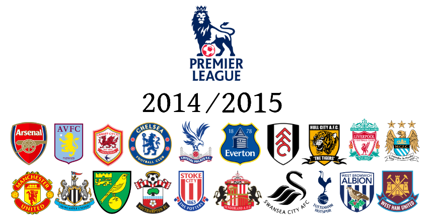
Definitely 13/14. That Everton crest was only used one season. But it does make the point that if you put them all together the EPL badges are not that much nicer than MLS.Yeah we should get tigers, birds and soccer balls in there. Oh and devils and dragons are really cool too!
PS this graphic's date is wrong I think, oh well, not the point.
Excluding NYCFC, Orlando, Philly, Crew and Dallas, the PL badges are far better than MLS. I don't like Spurs, Stoke Arsenal, Hull, MCFC or Fulham but overall they are better.Yeah we should get tigers, birds and soccer balls in there. Oh and devils and dragons are really cool too!
PS this graphic's date is wrong I think, oh well, not the point.