Aaaaayyyyyyyyeeeeeeeeee! That makes two people!I like the over the top outrage more than anything.
PS
I like the jersey.


Aaaaayyyyyyyyeeeeeeeeee! That makes two people!I like the over the top outrage more than anything.
PS
I like the jersey.
Totally agree. That austere navy plus bright orange was so close to being a winner. Maybe a city blue to navy blue ombré effect for a bit of variation. I'm still hoping that somebody at the club is leaking this stuff in order to collect feedback :/This is an embarrassment. You had a simple, beautiful concept: navy blue with orange accents, maybe even the light blue accents. And yet NYCFC and Adidas decide to make a ripple effect on the kit like they're playing with some Powerpoint effects from 1995. This is the second year with an absolute travesty of an away kit (And yes, I'm straight up saying the black kit with its 5 random stripes and random orange V was awful). If this was a third kit, then fine, but our only away kit? I cannot wait for the Adidas contract with MLS to end.
There are better ways to conduct focus groups than a leak like this, and it's too close to opening day to rerun the line. Unfortunately, this appears to be what we're using this year.Totally agree. That austere navy plus bright orange was so close to being a winner. Maybe a city blue to navy blue ombré effect for a bit of variation. I'm still hoping that somebody at the club is leaking this stuff in order to collect feedback :/
All true but in the end the black away Jersey clearly out numbered the light blue home jersey by a large margin at all games even when the team rarely wore the black jersey. They intentionally chose a city replica for the primary jersey as a branding move and it backfired.
I wonder if any part of the circles and the more aggressive design of the new jersey is a move to push more fans towards the light blue primary. I know I sound like a conspiracy theory but it has some logic. Main stream fans typically buy the primary but last year it back fired, so release a secondary this year that's too aggressive for the more conservative adult fans and they can either wear the year old Black kit and be out of date or convert to the light blue one.
This is an embarrassment. You had a simple, beautiful concept: navy blue with orange accents, maybe even the light blue accents. And yet NYCFC and Adidas decide to make a ripple effect on the kit like they're playing with some Powerpoint effects from 1995. This is the second year with an absolute travesty of an away kit (And yes, I'm straight up saying the black kit with its 5 random stripes and random orange V was awful). If this was a third kit, then fine, but our only away kit? I cannot wait for the Adidas contract with MLS to end.
Those five stripes were barely visible when players played, and I take those five stripes over these anyway
You must have been watching in 4K 3D immersive technology. I couldn't see the stripes at all except for close up shots. Even in person, they had to be two feet away from me to see the stripes. Maybe the circles will disappear on camera.
Completely agree with this. Even if that actually is the new shirt design for this season, which we're not even 100% sure of at this point, there's no way to tell from a casual photo how prominent the circles are. I have an away jersey from last year and didn't even realize it had those diagonal stripes until I got it into good light a few days after I'd bought it. So yes, the new shirt may have circles but we'll just have to see how it looks in real life (if that's even really the shirt, of course).I like the over the top outrage more than anything.
PS
I like the jersey.
OK, but we'll only have 1 star above the logo, and CFG won't be happy about a horse/rook image. And no collar please....Am I the only one who would prefer a classic looking kit with a collar? This in light blue for a home kit next year would be sick:
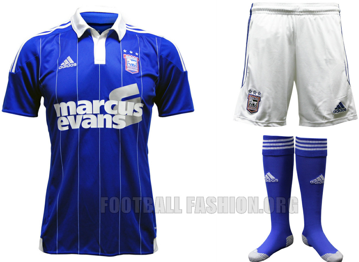
I love collars on jerseys. But given that we'll never have a white one, I don't know about that.Am I the only one who would prefer a classic looking kit with a collar? This in light blue for a home kit next year would be sick:
Am I the only one who would prefer a classic looking kit with a collar? This in light blue for a home kit next year would be sick:


Im not a pro. When I play its fine. Why would any player hate it?Ask any player that's ever played in a collar and they'll tell you they hate it.
Evidently it's heavy & rubs/irritating when sweaty.Im not a pro. When I play its fine. Why would any player hate it?