Sublimated pigeons for the win. The Pigeon Kit.I think the Portland kit is the first time I’ve seen such extensive use of sublimated graphics on an MLS kit. Would be cool if we get something like that in the future that is some kind of NYC homage.
You are using an out of date browser. It may not display this or other websites correctly.
You should upgrade or use an alternative browser.
You should upgrade or use an alternative browser.
2022 MLS Kit Thread
- Thread starter Gotham Gator
- Start date
This was posted earlier but this is my favorite so far.
The Seattle color combo is one of the best in MLS, so it's very difficult for them to make bad jersey designs imo!
This was posted earlier but this is my favorite so far.
Which reminds me:The Seattle color combo is one of the best in MLS, so it's very difficult for them to make bad jersey designs imo!
I like the Portland design but hate the colors.
That's the first Union-related social media content in 3 months that didn't complain about the Conference Final not being rescheduled.
I think something about that is stitched into the collar.That's the first Union-related social media content in 3 months that didn't complain about the Conference Final not being rescheduled.
agreed! they're being so ambiguous to the true colors - the shop has the Dynamo jersey as black, not a brown-ishWhy would they make a jersey video that makes it impossible to discern the colors on the jersey. Yes, I saw the subsequent tweet with a better lit image.
The Dynamo jersey tweet contains a slideshow of 4 images. The 1st and 3rd present the jersey to look primarily grey wiht brown while the 2nd and 4th make it appear dark blue.
Once again I am asking MLS art directors to have their photographers properly color correct when they are trying to sell product.
Once again I am asking MLS art directors to have their photographers properly color correct when they are trying to sell product.
Moments after you posted I raised this again. Look at the 4 images in the tweet. It also appears blue. I have no idea what color it is.agreed! they're being so ambiguous to the true colors - the shop has the Dynamo jersey as black, not a brown-ish
Yeah that is very weird!The Dynamo jersey tweet contains a slideshow of 4 images. The 1st and 3rd present the jersey to look primarily grey wiht brown while the 2nd and 4th make it appear dark blue.
Once again I am asking MLS art directors to have their photographers properly color correct when they are trying to sell product.
I like the kit, though
The Dynamo jersey tweet contains a slideshow of 4 images. The 1st and 3rd present the jersey to look primarily grey wiht brown while the 2nd and 4th make it appear dark blue.
Once again I am asking MLS art directors to have their photographers properly color correct when they are trying to sell product.

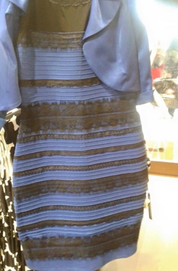
For the record, it’s white and gold. If anyone sees anything different, fuck you, you’re opinion is invalid. Thank you, have a good day.
RSL Real Salt Lake
In a bizarre twist, they just used clean untinted properly balanced lighting and so you can see the kit colors. What's that about?
In a bizarre twist, they just used clean untinted properly balanced lighting and so you can see the kit colors. What's that about?
This is definitely best read with a Roy Kent voice. Especially if you imagine him teaching colours on Sesame Street.For the record, it’s white and gold. If anyone sees anything different, fuck you, you’re opinion is invalid. Thank you, have a good day.
Similar threads
- Replies
- 88
- Views
- 5,766