2025 NYCFC Kit Thread

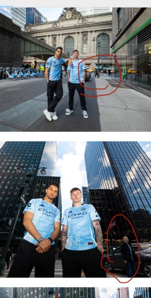
So three disappointing things...

1) The only way to get the 10th anniversary patch is buying the kit during the first two home games or the pop-up event.

2) The Apple TV logo patch will be unique for the player's kits. So the ones to buy will just be the standard black Apple TV text.

3) The tag says "Since 2015". The club was founded in 2013.

1) will they charge more for the anniversary patch?

2) boooooo

3) so... 13th anniversary?
 
I'm pretty certain they mean 10th year in the league.
-edit-
yeah:

"New York City FC today unveiled the Excelsior Kit, its 2025 home jersey, as the club celebrates 10 years since it played its first-ever MLS game."
 
I wonder when do they do these photo shoots. Just looking for context clues, people in the background are pretty bundled up. But the videographer at the Edge is in just a hoodie. The plants on the skyline have no leaves whatsoever so ever. So my guess is either November or January cause December would be just too chaotic in midtown with tourists plus everyone is on break. Either way the players and Kitman are probably freezing their nipples off in just the Jersey on top lol.
 

Attachments

  • IMG_7300.jpeg
    IMG_7300.jpeg
    466 KB · Views: 5
  • IMG_7301.png
    IMG_7301.png
    1.3 MB · Views: 5
  • IMG_7302.jpeg
    IMG_7302.jpeg
    446.5 KB · Views: 5
1739394990830.png

The Apple TV logos that will appear on player kits. Ours it the third row on the right. It's nothing special or great.
 
View attachment 13745

The Apple TV logos that will appear on player kits. Ours it the third row on the right. It's nothing special or great.
Nothing says NYCFC like circles so here's an arc.

The difficulty is none of the club specific variants use text as an element and the only non-text design elements in our badge or basic kit are pentagons and circles. I guess they went with part of a circle. A pentagon might have been a better choice. I'm not sure how many people associate pentagons with NYCFC. Using it in this Apple logo might have strengthened the association. Or they could not force a "no text element" rule on these Apple things.

WRT Lion's 3 disappointments: the limited sale pf the anniversary patch and complete unavailability of these Apple logos on consumer releases is BS. But measuring club life from actual play is more meaningful.

I don't plan to buy this but I mostly like the design.
 
View attachment 13745

The Apple TV logos that will appear on player kits. Ours it the third row on the right. It's nothing special or great.
That's odd, because I saw this elsewhere and there was a partial NYCFC logo on our patch. I'll see if I can find it.

ETA: I must have been mistaken.
 
Last edited:
View attachment 13745

The Apple TV logos that will appear on player kits. Ours it the third row on the right. It's nothing special or great.

Some Exec: Hey, so I need a special version of our apple TV+ logo for each team of the MLS
Graphic Designer: On it!
*Graphic Designer uses the apple logo as a mask over a section of each club's crest.
Graphic designer: I am good.
Some Exec: I LOVE IT
 
Some Exec: Hey, so I need a special version of our apple TV+ logo for each team of the MLS
Graphic Designer: On it!
*Graphic Designer uses the apple logo as a mask over a section of each club's crest.
Graphic designer: I am good.
Some Exec: I LOVE IT

And then there's San Diego. The one below NYCFC. Nothing but some odd coloring on the apple outline.
The oddity is some are immediately identifiable, and others unrecognizable even with study.
They are in alpha order, which in MLS is always quirky and rarely consistent.
 
And then there's San Diego. The one below NYCFC. Nothing but some odd coloring on the apple outline.
The oddity is some are immediately identifiable, and others unrecognizable even with study.
They are in alpha order, which in MLS is always quirky and rarely consistent.

the coloring around san diego's apple logo mirrors their badge's outline coloring.

they all seem to be a simple mask of the existing badge or a slight modification cause they couldn't find a section of the badge that made sense. like Minnesota and Philly, they had to create something. The crew one doesn't make sense to me at all. colors yes, but why diamonds?
 
And then there's San Diego. The one below NYCFC. Nothing but some odd coloring on the apple outline.
The oddity is some are immediately identifiable, and others unrecognizable even with study.
They are in alpha order, which in MLS is always quirky and rarely consistent.
What’s the one between Portland and Salt Lake?
 
Nothing says NYCFC like circles so here's an arc.

The difficulty is none of the club specific variants use text as an element and the only non-text design elements in our badge or basic kit are pentagons and circles. I guess they went with part of a circle. A pentagon might have been a better choice. I'm not sure how many people associate pentagons with NYCFC. Using it in this Apple logo might have strengthened the association. Or they could not force a "no text element" rule on these Apple things.

WRT Lion's 3 disappointments: the limited sale pf the anniversary patch and complete unavailability of these Apple logos on consumer releases is BS. But measuring club life from actual play is more meaningful.

I don't plan to buy this but I mostly like the design.

If this jersey was less than $200, I'd consider it. But I don't want a jersey without the star so there's no chance I'm buying the replica, and the authentic is just insanely expensive. $200 is a crazy price to pay for a jersey. I don't understand how they get off charging that.
 
If this jersey was less than $200, I'd consider it. But I don't want a jersey without the star so there's no chance I'm buying the replica, and the authentic is just insanely expensive. $200 is a crazy price to pay for a jersey. I don't understand how they get off charging that.
An authentic without a name is $150. I only buy kits without a name nowadays.
 
Is Maxi making some joke or is he unable to work Google translate sufficiently to get the brother/sister distinction correct? He's been here 8 years. I wouldn't get hermano/hermana wrong, even though I never studied Spanish, never been to Latin America and spent all of 3 weeks in Spain.
If it's a joke, what's the joke?

I’m going to bet it’s an inside joke about kitman’s man bun. Perhaps when Maxi came to the club in 2016 he thought Kitman was a woman from behind and they had a laugh about it and it stuck?
 
I’m going to bet it’s an inside joke about kitman’s man bun. Perhaps when Maxi came to the club in 2016 he thought Kitman was a woman from behind and they had a laugh about it and it stuck?
Yeah, some inside joke is my best guess also. Maxi's not dumb.
 
arrested development michael GIF
 
Back
Top