franchise646 Registered Oct 31, 2014 2,262 2,617 273 38 Dec 8, 2015 #2 That is an upgrade, now all that is left is New England Reactions: LionNYC
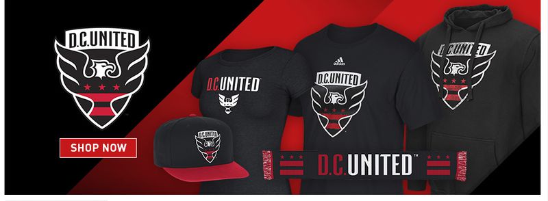
NYCFCFan10 Registered Mar 23, 2014 2,476 2,408 243 Dec 8, 2015 #3 For those that don't know, it's the District of Columbia flag in the middle. It's not just a random design choice.
For those that don't know, it's the District of Columbia flag in the middle. It's not just a random design choice.
LionNYC Registered Staff member Elite Donor Seasoned Supporter Jan 2, 2015 20,556 35,195 303 New York, NY Dec 8, 2015 #4 NYCFCFan10 said: For those that don't know, it's the District of Columbia flag in the middle. It's not just a random design choice. Click to expand... But they won four MLS Cups, not three. Reactions: NYCFCFan10
NYCFCFan10 said: For those that don't know, it's the District of Columbia flag in the middle. It's not just a random design choice. Click to expand... But they won four MLS Cups, not three.
Gavin23 Registered Feb 21, 2015 854 1,476 123 New York City Dec 8, 2015 #5 Its a good logo. There old one was so dated.
Goodfella Beers, Banter, Footy. Elite Donor Donor May 19, 2014 2,467 5,799 323 Dec 9, 2015 #6 not a huge change. meh
BossNYC Registered Apr 10, 2014 490 457 63 33 Dec 9, 2015 #7 I think I prefer it without the shield lines on the sides. The way it looks on the girls shirt looks cleaner. Reactions: Goodfella
I think I prefer it without the shield lines on the sides. The way it looks on the girls shirt looks cleaner.