Counterpoint: the new letters - on that hat - look short fat and stupid, and that's no way to go through life.Counterpoint: I like this one better than the original. The old one to me looks like someone with no experience took a graphics program and used the line tool to draw the letters. Like the Y, for example. It's three straight lines with three more straight line serifs tacked on each end cap. The new one looks like a designer was given the old logo and asked to fix it. The old letters are too thin, are so dissimilarly sized, and are just sort of tossed together. The new letters have much more weight to them, feel physically connected, and are "organically" shaped. In other words, they're not stick figures stuck together, they're solid letters with weight to them, and have gentle curves implying the serifs rather then bonking you over the head with them.
In short, the new logo was designed where the old one was just kind of thrown together.
")

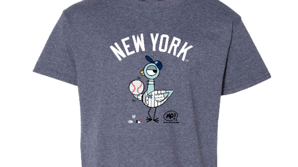
Serious question though - because I'm curious and peoples' varied tastes can be interesting: would you prefer the 24/7 jersey with this version of the monogram?