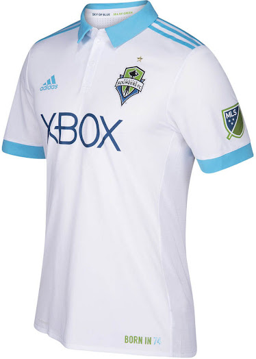
I actually meant that the logo on the white jersey would be be better in the light blue to match the stripes. #6:05ampost
FWIW I was intentionally suggesting white on white - but light blue would also be an improvement.
I actually meant that the logo on the white jersey would be be better in the light blue to match the stripes. #6:05ampost
I actually meant that the logo on the white jersey would be be better in the light blue to match the stripes. #6:05ampost
While we're clarifying, I actually think that white on white -- set off by material, shadow or slight variation in tone -- can be quite attractive. But it would be so impossible to see from distance that I doubt Target would be willing to pay for it.FWIW I was intentionally suggesting white on white - but light blue would also be an improvement.
One word: drop shadows.While we're clarifying, I actually think that white on white -- set off by material, shadow or slight variation in tone -- can be quite attractive. But it would be so impossible to see from distance that I doubt Target would be willing to pay for it.
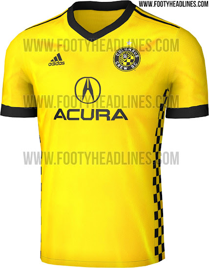
Those are hot!New logo. New primary kit. Those checkered boxes down the sides are awesome.
New logo. New primary kit. Those checkered boxes down the sides are awesome.
Yeah, those may be the best pair in the league. And getting a new, and classy, sponsor doesn't hurt either.The Crew went from first to worst to first again in the jersey wars the last 3 seasons. Glad they are back on track, last year hurt my eyes.
Yeah, those may be the best pair in the league. And getting a new, and classy, sponsor doesn't hurt either.
edit: since they got a new sponsor, they were able to redo both jerseys..... something to think about. Does the Sheik have any other companies besides Etihad?
Edit part deux: eh, the black is the same, didn't notice it also had the black on black checkers.
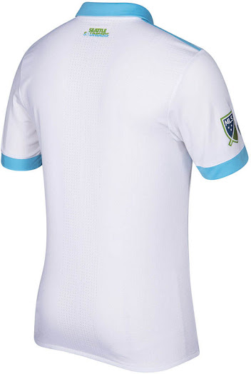
best kit 2017Seattle Away kit.


I really really liked Seattle's uniforms last year, wish they hadn't changed them. These aren't bad though.God damn. When the Crew do it right, they hit it out of the park. Best kits in the league.
I like the Seattle look, but I wish they would have matched the badge to the blue and white of the shirt itself. Looks pretty bad with the green in there.