New York City FC Unveil a Refreshed Visual Identity Ahead of Club's 10th Season Home Opener

Shwafta

MLS Cup Attendee
Elite Donor
Jan 16, 2018
7,428
10,423
303
26
Long Island

basically they added some colors, looks rather cool ngl.
 
I like the added colors, custom font, etc. but not sure we need a full on rebrand to New York City FC vs. NYCFC, should be used interchangeably. Like they renamed the whole site to NewYorkCityFC.com vs. NYCFC.com odd choice?
 
  • Like
Reactions: Schwallacus
not sure we need a full on rebrand to New York City FC vs. NYCFC, should be used interchangeably

Five syllables of all letters with no spoken rhythm is bad. Six syllables of mixed words and letters is worse.

I'll defer judgment on the visual changes until I get used to them. I will say that 8 colors is a little much. Two blues, white and black, 2 greens (the yellow is at least borderline green) plus orange and purple? At least they left red out.

They claim the type comes from old pre-unified subway signage. I'm old enough that I remember when the IRT, IND and BMT still existed and it helped you get around to know the differences (though they were unified and there was a single fare). But I don't recognize that font from any of them. Can anyone place it?
 

basically they added some colors, looks rather cool ngl.

i like it. though i find a few things strange and forced.

they took the classic navy from the NYC flag and just made it darker so they could relate it to the night. ok. white for clouds? lame. neon yellow? is that from a bus marquee? i do like the copper green though.

"smoke em out" except any new yorker would know these are steam stacks and not smoke. doesn't seem very NYC to make that mistake but "steam em out "doesn't have the same ring to it.

i agree with Higgs1 Higgs1 about the nycfc to newyorkcityfc seems strange.

overall - i think it's nice and now i have some source material to make some merch for myself. :D
 
Five syllables of all letters with no spoken rhythm is bad. Six syllables of mixed words and letters is worse.

I'll defer judgment on the visual changes until I get used to them. I will say that 8 colors is a little much. Two blues, white and black, 2 greens (the yellow is at least borderline green) plus orange and purple? At least they left red out.

They claim the type comes from old pre-unified subway signage. I'm old enough that I remember when the IRT, IND and BMT still existed and it helped you get around to know the differences (though they were unified and there was a single fare). But I don't recognize that font from any of them. Can anyone place it?

they said "inspired by" so probably not directly pulled from old signage
 
  • Like
Reactions: Schwallacus
they said "inspired by" so probably not directly pulled from old signage
Yeah but it should still evoke a connection to someeone of my age and background, who was riding the subway regularly in the 70s and has a moderate interest in NYC and subway history. Otherwise why bother. I see nothing. But I'd be shocked if they're faking it. There's presumably some connection I'm just not seeing.
 
I've always hated using NYCFC and always used the full term in conversation, so I welcome the change. I really hope they drill it into the commentators and instead of saying "here we are in the 85th minute and NYCFC only has one shot on target" they say "Finally, after 85 minutes New York City has their first shot in target" It just sounds smoother and less jarring to me.
 
That's so many colors 😂
 
instead of saying "here we are in the 85th minute and NYCFC only has one shot on target" they say "Finally, after 85 minutes New York City has their first shot in target"
Model Melting GIF by bbsquirrel247
 
  • Haha
  • Like
Reactions: Kenny and Higgs1
I really hope they drill it into the commentators and instead of saying "here we are in the 85th minute and NYCFC only has one shot on target" they say "Finally, after 85 minutes New York City has their first shot in target"
LOL for the subtle dig I almost missed.

New York City means New York City. To me at least. As hard as this team, which I love, tries to meld its identity with the actual city, it’s not. It’s an investment owned by autocrats with no ties to the city, practicing transparent cookie cutter marketing.
Yes, it’s standard usage to employ geographic shorthand when discussing teams. It’s also standard to have an actual name.
Plus, a lot of NYCFC fans get bent out of shape when announcers say “New York”. If you encourage dropping the FC you’ll get “city” dropped more often as well.

Let St. Louis have ”City” in the US. It’s generic and overused by Orlando, Stoke, Swansea, Manchester, Norwich, Leicester, Melbourne, Mumbai, Montevideo, etc anyway. Manchester owns “City” worldwide for better or worse.
Bottom line I’ve always hated the club name and its variants, so I guess IDGAF whether the club prefers NYCFC or New York City FC.

I’d rather be named after some random obscure English coach from a century ago.
 
  • Like
Reactions: Vallos
LOL for the subtle dig I almost missed.

New York City means New York City. To me at least. As hard as this team, which I love, tries to meld its identity with the actual city, it’s not. It’s an investment owned by autocrats with no ties to the city, practicing transparent cookie cutter marketing.
Yes, it’s standard usage to employ geographic shorthand when discussing teams. It’s also standard to have an actual name.
Plus, a lot of NYCFC fans get bent out of shape when announcers say “New York”. If you encourage dropping the FC you’ll get “city” dropped more often as well.

Let St. Louis have ”City” in the US. It’s generic and overused by Orlando, Stoke, Swansea, Manchester, Norwich, Leicester, Melbourne, Mumbai, Montevideo, etc anyway. Manchester owns “City” worldwide for better or worse.
Bottom line I’ve always hated the club name and its variants, so I guess IDGAF whether the club prefers NYCFC or New York City FC.

I’d rather be named after some random obscure English coach from a century ago.

I personally enjoy when announcers simply refer to us as the pigeons
 
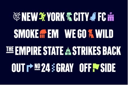
Please fill in my blanks:
Annotation 2024-03-05 155005.jpg

Logo
Player
Liberty Torch
Pigeon
_____? (can think of a dozen possibilities)
Smokestacks
_____ [Third Rail?]
ESB
Arrow
Checkered scarf?
Side Judge Flag
 
Please fill in my blanks:
View attachment 13213

Logo
Player
Liberty Torch
Pigeon
_____? (can think of a dozen possibilities)
Smokestacks
_____ [Third Rail?]
ESB
Arrow
Checkered scarf?
Side Judge Flag
Yankee stadium.
Third Rail lightning bolt.

I believe the checker pattern is a throwback to the old yellow cab checkers? but blue... there was also a mitchel & ness jersey that was blue/navy checkered too.
 
  • Like
Reactions: mgarbowski