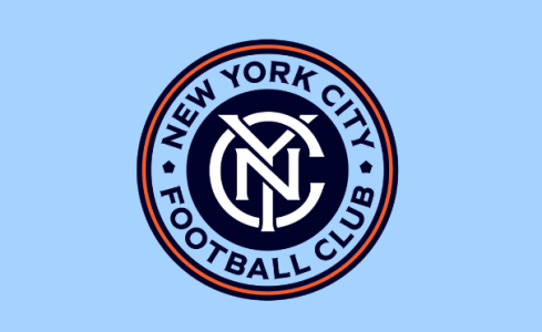
New York City FC Unveil a Refreshed Visual Identity Ahead of Club's 10th Season Home Opener

Which Logo Do You Prefer?

  • Original Logo

    Votes: 5 26.3%
  • New Logo

    Votes: 14 73.7%

  • Total voters
    19
First thought on the purple was Yankee Stadium.
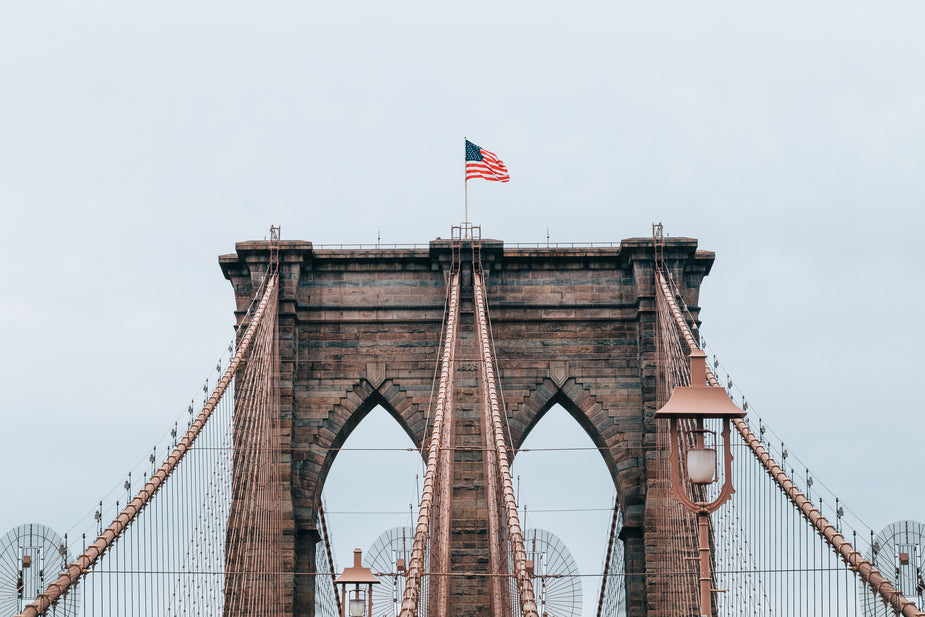
It's funny 'cause you're probably right and I didn't even consider that. I'm seeing the arches on the Brooklyn and Manhattan bridges, the Cloisters, various forts (Totten, Wadsworth, Schuyler). I tried to think of somewhere in Queens because the color is the one based on the 7 train, but Fort Totten was the only thing that came up and, I mean, it's not Fort Totten. That's way too obscure.

ETA: but another vote for the Brooklyn Bridge from DeGrozz DeGrozz while I was typing. and M moogoo supports my TR guess.
 
This will surely change the fact that when most people I speak to about the team say New York Football Club
 
  • Haha
Reactions: Davo15
I want to know how much money someone just got paid to change New York City FC to New York City FC.

These marketing people who do things like this are stealing money.
Yeah. Sometimes you need a third party to just set the record straight for everyone.

It is important though, given that we've had so many permutations of the name. It's kind of our "the" ohio state moment.
 
This feels like an elaborate distraction from the Cushing tenure *tinfoil hat*.
They could have gifted me whatever money they wasted on this.
 
mgarbowski mgarbowski I know you were more curious as the the typeface and what they based the font off of. Per the typographer's instagram:

"More specifically they are based on pre-modernist signage of the New York City subway; as train aficionados we were very happy to dive into this history. Tobias Frere-Jones drew a compact, heavy headline face (the “Express”), based on enamel signage of the Independent Subway System (IND); it borrows the small flare serifs that also appear in the other design: Nina Stössinger @ninastoessinger (proudly, originally hailing from a football city herself) drew the rounder, textier design (the “Local”), whose caps are based on the subway tile lettering also found around the IND system. Launching with the Bold, further expansion of the “Local” family is still ongoing."

Seems to be based mostly off the IND with a modernized take on it.
Thank you! I was hoping for that sort of explainer for the fonts. I can see the connection now, though the fonts still don't intrinsically evoke the subway to me. But maybe it's just that I grew up on the IRT.
 
My only qualm, which really isn’t much of a qualm at all, is I would call it “Patina Green” instead of “copper green”
 
  • Like
Reactions: Vallos
continuing with the refreshing... i don't like it.


1725891171098.png