Which Badge and Why?

Round Badge or the crest?

  • Crest

    Votes: 3 20.0%
  • Circle

    Votes: 12 80.0%

  • Total voters
    15

NYCFC_Dan

Registered
Staff member
Seasoned Supporter
Mar 17, 2014
7,360
15,002
303
34
Tampa, Florida
We are unveiling tomorrow! Exciting, but I want to know which one you selected and the big question, WHY?

I went with the Circular badge, I find it cleaner and I think showcases the primary colors much better. MORE Light blue!
I think everything fits more nicely as well. Lots of space in the crest.
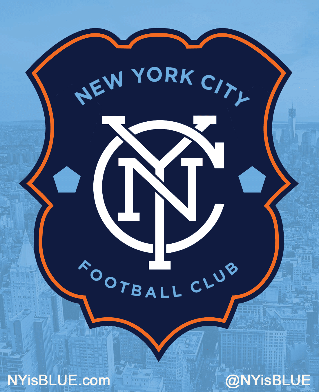
 
I prefer the crest, its more distinctive and unique. The circular badge is so common in soccer, our badge should be more original.
 
  • Like
Reactions: skelly412
I prefer the shield shape. Much more interesting to my eye than a roundel.

I can't stand the multicolored monogram, though. Or the extraneous gold color. In my ideal universe we would have had something like this:

proposedNYCFCcrest.png
 
If NYCFC sticks to one of the two options, I have to go with circle.

Though I'd be happiest with the white monogram on the shield.
 
At a hunch I´ll say that the interlocking letters will be prominent on merchandise, not necessarily attached to a badge..
 
Well it's not much of a sample group but it looks like the Circle is pulling away with it.
I really think we should expect to see a complete overhaul of badge when we get our own stadium.
Right now they want New Yorkers to see the club as a NYC club. So they have to market it that way to the average consumer. With that said both badges are perfect, they both execute this. However, they know if they're to market this club nationwide they need a unique identity. I think we will see this with our stadium.
 
We can only vote on what we see in front of us.. and there the shield badge lacks harmony IMHO
But I´d love to see some use of the shield as well.
 
We can only vote on what we see in front of us.. and there the shield badge lacks harmony IMHO
But I´d love to see some use of the shield as well.

As an official club crest I preferred the design that was ultimately chosen. But it doesn't mean the shield needs to die. Unless there are legal issues, I don't see why we can adopt the shield as an SG shield. Using the colors of the chosen monogram of course. Just a thought.
 
As an official club crest I preferred the design that was ultimately chosen. But it doesn't mean the shield needs to die. Unless there are legal issues, I don't see why we can adopt the shield as an SG shield. Using the colors of the chosen monogram of course. Just a thought.

It depends on how prominently you intended to use it. Posting it a few times on a website would be fine, I'm sure. But if you were planning on making a banner with the shield to bring to games, it might appear to NYCFC's leadership like a deliberate rejection of the chosen badge.
 
I went with the circle, the shield had too much empty space for me, plus I really fell in love with the pentagon concept since I saw it in a mock logo a while back, if it was up to me though the inner circle that encases the interlocking NYC would have been a pentagon. But I just felt the circle badge represented the city more than the shield did because it had more definitive aspects of NYC itself with the orange the pentagon the text and the shape of the old subway tokens