Why Is Man City Copying Us?
- Thread starter Billy the Butcher
- Start date
When did the change the West Ham badge? The current one is great. This new one is terrible...I like it better than the new West Ham crest. I'm okay with a minimalist approach, but the font they are using is terrible:
View attachment 3729
Needs some orange........

Did Inter rip off Real Madrid first? Both Real and Inter each developed their trademark logos in 1908, but Inter was formed in 1908 and Real was in 1902 when they first started working with inter-locking letters:You could argue that NYCFC's badge is a complete ripoff of Inter.


Ignorance is bliss. The ship and the rose are historical icons of ManchesterI like it, but I'm confused, is it a sailing club or a bunch of horticulturists ?
I'm sorry but I have to ask, is this post serious? Sarcasm sometimes doesn't come across online so I just want to make sure this was a joke, as it surely can't be seriousSo, city has decided to go back to their more traditional crest next year. The bird is gone and its back to the boat. Just so everyone remembers, New York was the first club to have the round badge in the modern CFG era. Typical, New York is setting world wide trends like usual.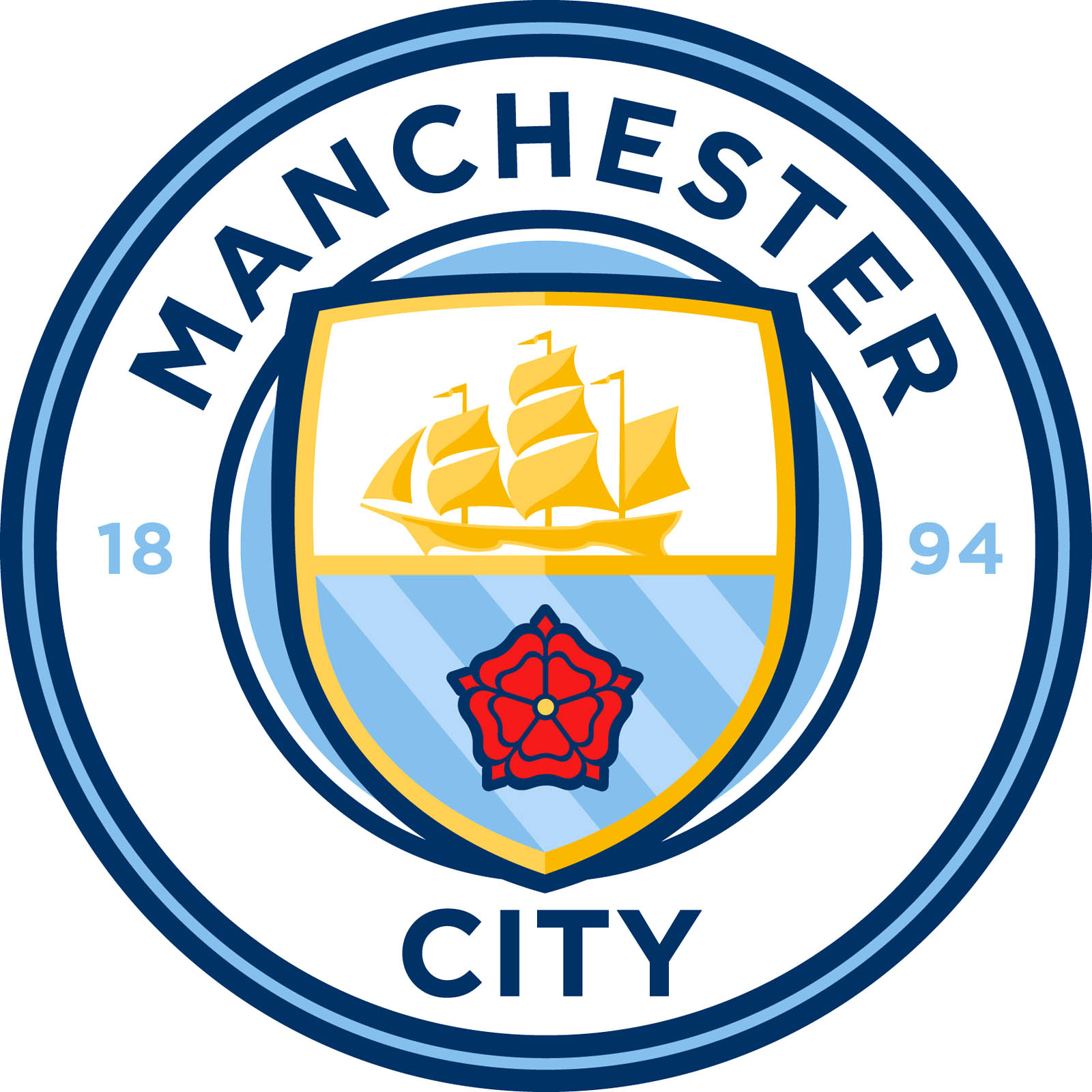
Have trouble reading between the lines do ya?Ignorance is bliss. The ship and the rose are historical icons of Manchester
My point exactly. WhoooooshHave trouble reading between the lines do ya?
If you have to ask if somebody is using sarcasm, you might as well crane your neck back because it's already sailed way over your head.
You could argue that NYCFC's badge is a complete ripoff of Inter.
You can also argue that a lot of badges look like this Man City redesign.
Its a joke...smhI'm sorry but I have to ask, is this post serious? Sarcasm sometimes doesn't come across online so I just want to make sure this was a joke, as it surely can't be serious
Whew. Had me nervous for a bit. Carry onIts a joke...smh
Seriously if this turns into anything stupid it's getting locked. Bad attempt at trolling if you ask me. We discussed 100 times about our badge being similar to Melbourne and CFG going to round badges for all clubs.
Clearly NYCFC, in its first season, achieved such high levels of awesomeness that City just had to copy our badge!So, city has decided to go back to their more traditional crest next year. The bird is gone and its back to the boat. Just so everyone remembers, New York was the first club to have the round badge in the modern CFG era. Typical, New York is setting world wide trends like usual.
My thoughts exactly.