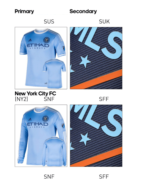
Given that Adidas in gonna Adidas, I prefer the stripes down the side to on the shoulder.I also don't like the triple stripes down the side, but what are you going to do. Adidas just won't stop.
You are using an out of date browser. It may not display this or other websites correctly.
You should upgrade or use an alternative browser.
You should upgrade or use an alternative browser.
2016 Jersey Thread
- Thread starter sbrylski
- Start date
You know. Based on the Adidas catalog leak, I'm not completely sold on this new leak. The color scheme just doesn't really match up. Especially with the navy shorts with sky blue stripes...
It also looks like we are going with the sky blue shorts with the matching top this year. Bummer. I thought the light shirt with white shorts looked great.


It also looks like we are going with the sky blue shorts with the matching top this year. Bummer. I thought the light shirt with white shorts looked great.


It all comes down to the shorts. The black jersey looked great with blue shorts, horrible with black shorts. Blue jersey looked great with white shorts, bad with blue.
When I purchase it, is there a "rip off the stupid-f**king stripes" option? Because then that would be a really good looking jersey!
Cruyff Edition
Wait. Did they actually play in black tops, blue shorts at some point? I wanted to see that all year, but don't remember actually seeing it.It all comes down to the shorts. The black jersey looked great with blue shorts, horrible with black shorts. Blue jersey looked great with white shorts, bad with blue.
I don't think there's a specific thread for this, so I'll get it started. We have a rumor:
This looks about right to me, based on some of the other minor rumors out there (navy blue, side stripes).
It also looks awesome.
Love it. Consider it bought.
No but remember that photo shoot where they were changing their shirts? One guy had the black top with the blue shorts and it looked money.Wait. Did they actually play in black tops, blue shorts at some point? I wanted to see that all year, but don't remember actually seeing it.
You might be on to something there. With our logo containing four colors (dark blue, light blue, white, orange), I can't really understand why we're going with a solid for our away jersey vs. having a traditional style pattern (e.g. Diagonal slash, stripes, hoops, checks, shirt / sleeve two tone). Really limiting.I like it, but it would be more consistent if the Etihad and adidas logos were in light blue instead of white.
I also don't like the triple stripes down the side, but what are you going to do. Adidas just won't stop.
The sleeves look very nice. I wish more of the collar were orange. It looks like just the back inside of the neck is orange, so you won't really see it when it's on.
sponsor, logo & Adidas in just orange would be FIRE.You might be on to something there. With our logo containing four colors (dark blue, light blue, white, orange), I can't really understand why we're going with a solid for our away jersey vs. having a traditional style pattern (e.g. Diagonal slash, stripes, hoops, checks, shirt / sleeve two tone). Really limiting.
sponsor, logo & Adidas in just orange would be FIRE.

You know. Based on the Adidas catalog leak, I'm not completely sold on this new leak. The color scheme just doesn't really match up. Especially with the navy shorts with sky blue stripes...
It also looks like we are going with the sky blue shorts with the matching top this year. Bummer. I thought the light shirt with white shorts looked great.


This is a really good point. There is no way they pair the navy top with orange stripes on the side with the navy shorts with blue stripes on the side.
At least, I hope not.
Last edited:
Definitely. Would have been a brilliant color combo.No but remember that photo shoot where they were changing their shirts? One guy had the black top with the blue shorts and it looked money.
I'd love it if the stripes down the sides were sky blue. Minimal orange on the sleeves and the color still works and it ties into the overall aesthetic. I'd like to see Etihad in sky blue as well.This is a really good point. There is no way they pair the navy top with orange stripes on the side with the navy shorts with blue stripes on the side.
At lewst, I hope not.
If Harrison takes 11 I will have to do some work and modify it!You're just excited to have an alternate to your Grabavoy jersey.
TBH: I did purchase a Poku black away one recently. My next question would be which player name on this new hotness.
Agreed. This is pretty sweet. Hopefully it will not prove to be the Jorge Teixeira of jerseys.Love it. Consider it bought.
You could get the coach's last name on the back since it might change every yearIf Harrison takes 11 I will have to do some work and modify it!
TBH: I did purchase a Poku black away one recently. My next question would be which player name on this new hotness.
Similar threads
- Replies
- 137
- Views
- 14,006
- Replies
- 12
- Views
- 4,180
- Replies
- 213
- Views
- 26,274
