White on top to orange would look pretty awesome too.I like the fading on Guangzhou Evergrande's shirts more - tone in tone and from light to dark. They cast a better "3D effect" on the person that wears it.

I think a shirt with such a fading from light blue to navy would look pretty slick for NYC.")
You are using an out of date browser. It may not display this or other websites correctly.
You should upgrade or use an alternative browser.
You should upgrade or use an alternative browser.
NYCFC Kit Concepts
- Thread starter Yorka!
- Start date


Vinjay
Registered
Think that Kansas kit wit the striped sleeves was considered one of the worst ever by one site I can't recall. I like it though 90's kits were better than year 2000+ kits for me. Anyone else think they had a better name as "Wiz" than that Sporting corporate makeover? I might even be one of the few who likes that original logo they had (in the very first season not the one on that shirt)
I like that Deportivo type kit as well and did suggest Argentina style. With blue and one other colour.
That other blue and white one is Melbourne H isn't it? That badge looks more like a crest for a heart disease charity than a football club.
I like that Deportivo type kit as well and did suggest Argentina style. With blue and one other colour.
That other blue and white one is Melbourne H isn't it? That badge looks more like a crest for a heart disease charity than a football club.

I love kits with collars.... Picture Blue with black stripes
Kinkladze
Registered
Think that Kansas kit wit the striped sleeves was considered one of the worst ever by one site I can't recall. I like it though 90's kits were better than year 2000+ kits for me. Anyone else think they had a better name as "Wiz" than that Sporting corporate makeover? I might even be one of the few who likes that original logo they had (in the very first season not the one on that shirt)
I like that Deportivo type kit as well and did suggest Argentina style. With blue and one other colour.
That other blue and white one is Melbourne H isn't it? That badge looks more like a crest for a heart disease charity than a football club.
It is, but the colour has been photo-shopped. The real one is a pinky red instead of blue. I'm not keen on their old identity as I don't like club names that have nicknames added to them, but the logo was quite neat to be fair. In general I prefer the 90's kits as they were less commercial, corporate and bland, which are all things that NYCFC need to consider when making their kits IMHO.
Kinkladze
Registered
I love kits with collars.... Picture Blue with black stripes
Reminds me of the Man City kit when we went up to the Prem.


Then it makes it more fitting... NYC FC go up to the MLS to wreck shit!!! lol
Matt Kelly
Registered
I get bored in class and doodle sketches of jerseys, and I thought one that would be pretty cool would be having our home jersey be white and then have a blue and orange streak bending from about lower stomach to opposite shoulder kind of like an arc across the front and then have the crest on that arc. If someone has any idea what I mean, and is good with sketching or putting things together, an idea of that would be pretty nifty.
Roberto Martinez
Registered
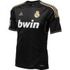
This Kits Look Sweet. Pretty cool how it resembles Manchester City. I seen many comments on the sponsorship of the kits. Etihad Airways is a pretty cool sponsor. NYCFC can't just choose another sponsor just because Etihad ain't that popular in the US. They Just can't, because the MAIN sponsor for Manchester City is Etihad, and because Man C owns 80% of NYCFC well they pretty much have control over their sponsorship.
Obviously this is more of an afterthought, but I would love to see orange GK kits.
franchise646
Registered
Man can we bring this back? It would cool to see some people ideas of what time want to see in the future.
franchise646
Registered
Cause it's more fun than the real ones.
Why? We already know what they're going to look similar to.
Yeah. The home will be a variation of what we have now. It's clear that the home will be similar to MCFC. The away is where we'll see more uniqueness. I'll start throwing out designs for that next winter.
You're partly to blame for my disappointment in the home kit.Yeah. The home will be a variation of what we have now. It's clear that the home will be similar to MCFC. The away is where we'll see more uniqueness. I'll start throwing out designs for that next winter.
You're partly to blame for my disappointment in the home kit.
Shit, sorry!
ferrarinycfc
Registered
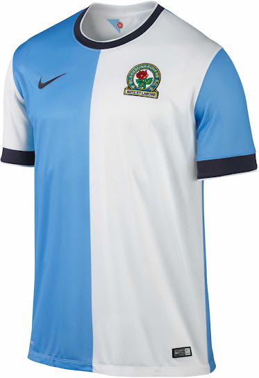
I Would like nycfc to use a two tone shirt like this 14/15 blackburn rovers shirt, however instead of white have a darker shade of light blue.
The link to man city would be there, but it would give nycfc its own identity.
Anyone can do a mock up for me ??
ferrarinycfc
Registered
so this is the new northern ireland away kit
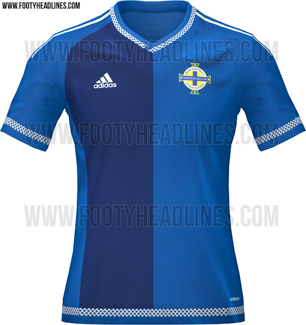
This is what i would of liked for nycfc
This is what i would of liked for nycfc

Similar threads
- Replies
- 62
- Views
- 8,744
- Replies
- 10
- Views
- 1,904
- Replies
- 22
- Views
- 7,251