That's the intent, I'm sure, but not what I get out of itI see it more of a "ripple effect" where our team is "making waves" throughout the league and beyond
You are using an out of date browser. It may not display this or other websites correctly.
You should upgrade or use an alternative browser.
You should upgrade or use an alternative browser.
2016 Jersey Thread
- Thread starter sbrylski
- Start date
What about a potential third kit next year? SKC has had a few third kits, as well as LA, Portland, Seattle*I hate to do this to you guys, but the ass clown Mike Walker (sounds like the guy in charge of all MLS team jerseys), did an interview with NYCFC.com and unfortunately this was at the end of it:
"Walker also gave the NYCFC.com team a sneak peek on the early design pitches for next season’s home kit.
“There will be a new design element, but I would expect it to be City blue,” said Walker."
Soooooo unless we can either break MLS jersey trends and come out with two jerseys in a year or go back to the black away kit (which I like more personally), we're stuck with these for at least two years
*Not 100% sure about Seattle
In design (at least in Architecture), typically a client is shown three options to choose from. The designers definitely have a favorite, and maybe even two favs with the third being something they know will be dismissed immediately. I cannot imagine what the other two options were that got axed.... or a scarier thought is that the Onion jersey was supposed to be the third/discardable option that nobody on the design team figured would be chosen.
Similar process for graphic design (I'm a design director), and my team never EVER EVER presents a design idea to a client that we're not comfortable with them selecting. If we don't love the design, and can't live with it, we never show the client. That's why I can't see how this design made it to NYCFC.
I think a bad designer with good taste would also not think it is a good design.A good designer with good taste would not think this is good design, and would not present something like this to a client. Unless of course they were forced to do it by some tasteless suit at NYCFC. That is very possible. Happens all the time.
NYCFC/City probably had a big hand in the design process.Similar process for graphic design (I'm a design director), and my team never EVER EVER presents a design idea to a client that we're not comfortable with them selecting. If we don't love the design, and can't live with it, we never show the client. That's why I can't see how this design made it to NYCFC.
All the players in the kit: https://www.facebook.com/media/set/?set=a.548643118642482.1073742036.159424124231052
Who's the lad with the hair in the last photograph?
Ironically, I maybe like the kit a little less now that we see the level of detail on that ripple thing. Overall though, i'm keeping perspective on what it means and remembering that it matters very little what my football team's away kit looks like and isn't worth getting emotionally invested..... As long as we win matches, we could play in Palermo pink, a Jorge Campos designed jersey, or the Dundee United away kit from 1994 and I wouldn't care.
That's connor Brandt. Poku looks really good in that jersey.All the players in the kit: https://www.facebook.com/media/set/?set=a.548643118642482.1073742036.159424124231052
Who's the lad with the hair in the last photograph?
Ironically, I maybe like the kit a little less now that we see the level of detail on that ripple thing. Overall though, i'm keeping perspective on what it means and remembering that it matters very little what my football team's away kit looks like and isn't worth getting emotionally invested..... As long as we win matches, we could play in Palermo pink, a Jorge Campos designed jersey, or the Dundee United away kit from 1994 and I wouldn't care.
NYCFC/City probably had a big hand in the design process.
That's my guess. From a designers point of view, the only way this design happens is if NYCFC wanted it and forced Adidas to make it. Maybe this design didn't come from Adidas, but instead it was dictated to them by some talentless suit at NYCFC.
All the players in the kit: https://www.facebook.com/media/set/?set=a.548643118642482.1073742036.159424124231052
No Mix, though - RIP
What about a potential third kit next year? SKC has had a few third kits, as well as LA, Portland, Seattle*
*Not 100% sure about Seattle
Seattle is getting 2 new kits this season (new primary and a new third).
No Mix, though - RIP
Mix was probably at US camp on photo day. No Khiry pictured either, btw.
All the players in the kit: https://www.facebook.com/media/set/?set=a.548643118642482.1073742036.159424124231052
Who's the lad with the hair in the last photograph?
Ironically, I maybe like the kit a little less now that we see the level of detail on that ripple thing. Overall though, i'm keeping perspective on what it means and remembering that it matters very little what my football team's away kit looks like and isn't worth getting emotionally invested..... As long as we win matches, we could play in Palermo pink, a Jorge Campos designed jersey, or the Dundee United away kit from 1994 and I wouldn't care.
Some of the Palermo pink kits have been nice actually.
the description on nycfc.com about how they came up with the design says "fans were at the center of the design process." So, because of the slogan on the collar, and because they got a sense fans wanted something representing the "energy and chaos of the city"..which "translates into art very well", fans were at the center? So no input after the concept went to the designers eh - or like someone said earlier, some nycfc suits just said "here make this?" Seems as if they might want to read all of these subpar/mixed reviews to reconsider how well the "energy and chaos" translated into "art."
wish the concept was more subtle like the unions new kit: http://www.footyheadlines.com/2016/02/philadelphia-union-2016-home-kit.html - I like this a lot.
wish the concept was more subtle like the unions new kit: http://www.footyheadlines.com/2016/02/philadelphia-union-2016-home-kit.html - I like this a lot.
The 3D-rendered waves feel a little tryhard, but honestly as a complete look I think this kit is pretty good. I think it will read well on the field. Overall, I like it (not saying every element is 100% awesome), and I like it better than the first season away kit.
#unpopularopinions
#unpopularopinions
All new meaning to the 'Shroom burger being sold at the concession stands.guess no more black out games like vs San Jose...on the contrary well have dizzying or hypnosis night games
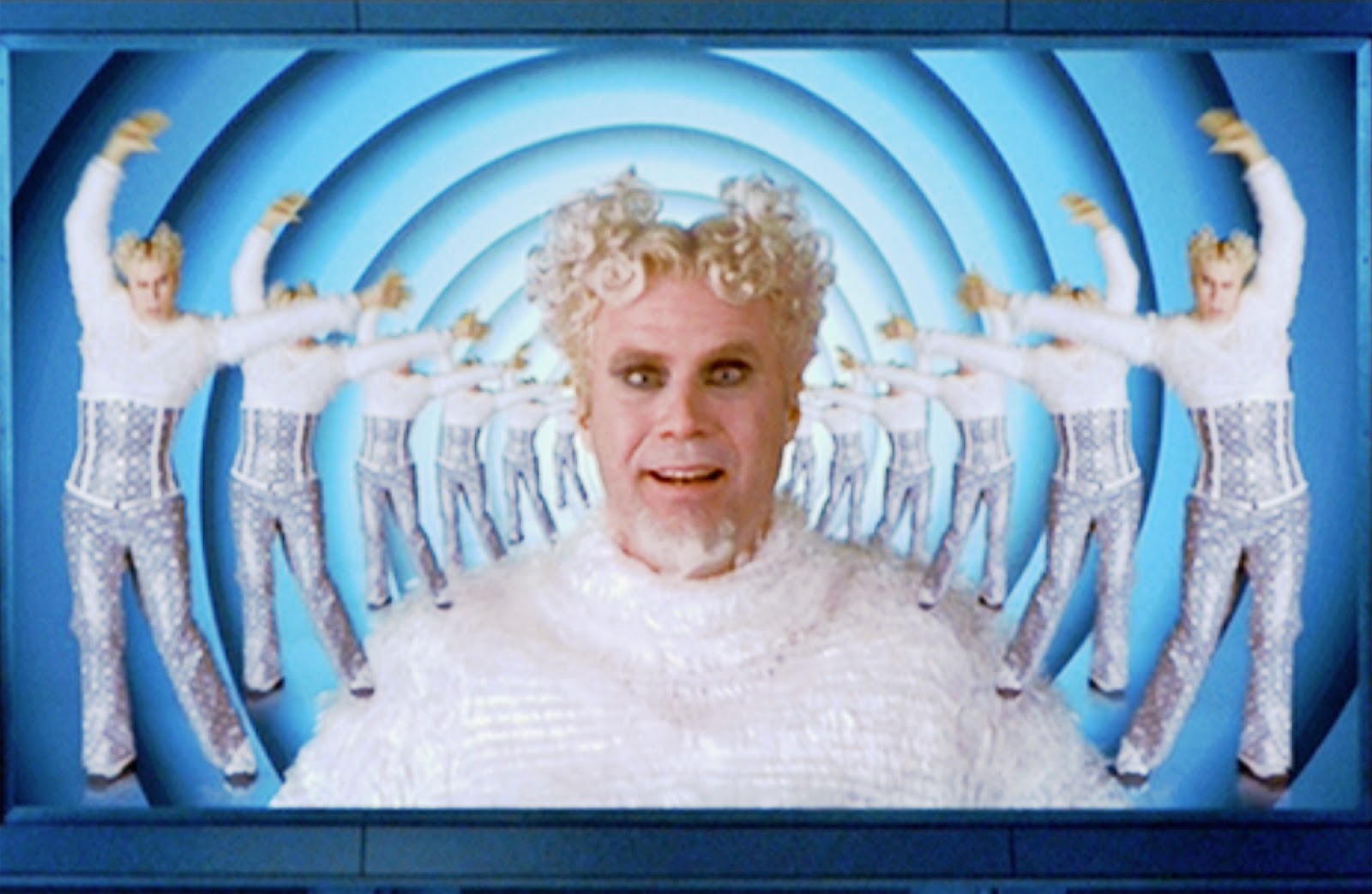
For your photoshopping pleasure...


Similar threads
- Replies
- 137
- Views
- 14,011
- Replies
- 12
- Views
- 4,180
- Replies
- 213
- Views
- 26,276