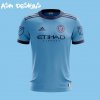
2018 Jersey Thread

Status
Not open for further replies.
100% crap content below

So if anyone isn't following along there's been a few memes going around about eating Tide Pods and some idiots have made a "tide pod challenge" which is pretty dangerous but while reading some news articles I realized the damn things are the same color as NYCFC (sort of) and made this because I want to watch the world burn with terrible content.

Untitled 2.png
 
IMO, great that is was recycled stuff and good for the environment and all that stuff. And it did look ok in pictures before the game.

Looked like crap when they were on the field IMO

What's wrong with having fun and helping to save our planet the same time?

I do agree it looked a little washed out on TV and the 90s sublimated chest graphics didn't help any, they would have to make some tweaks - easy enough to do. But I still LOVE the Gray/Sky Blue colorway in some form or another. Go PIGEONS!

IMG_1178.jpg IMG_1182.jpg
 
Last edited:
I do agree it looked a little washed out on TV, but they would have to make some tweaks. Easy enough to do. But I still LOVE the Gray/Sky Blue colorway in some form or another!

View attachment 7906 View attachment 7907

It looked crap on TV, especially considering Orlando was wearing a jersey two shades lighter. In person it looks really, really nice. But I would have liked the NYCFC logo and Etihad to have been a different shade of blue or color altogether.
 
It looked crap on TV, especially considering Orlando was wearing a jersey two shades lighter. In person it looks really, really nice. But I would have liked the NYCFC logo and Etihad to have been a different shade of blue or color altogether.

I agree, it was more of a promotional/fashion Earth Day 2017: NYCFC Raising Awareness :soccerball: Soccer Jersey. But I totally get the point of doing that, I still would've purchased one in a heart beat!

https://www.nysportsday.com/2017/04...howcase-parley-ocean-plastic-jerseys-gallery/

1240x700_parley_announcement_graphic.jpg nycfc-2017-adidas-parley-jersey-1.jpg calen-susannah-parley.png
 
Last edited:
What's your guys and gals opinion of these NYCFC Home Jerseys concepts? I'm NOT a fan of BAD retro 90s sublimated graphics! But if done right, very subtle and sophisticated could be very cool, just like Adidas's 2017 dare I say Manchester United's Gray 3rd Tribute Jersey.

The Statue of Liberty would totally work BUT it would need to be toned down in my opinion.

IMG_1920.jpgIMG_1919.jpg

c98ad2f31cea.jpg
 
Last edited:
It's that time of year again for new Jerseys. Meanwhile some of the European teams are already partially wearing next season's kits, while our team kits have not even been announced yet.

*New Kits should be announced on January 1 of the New Year :partypooper:, that would be nice.

I still do not understand MLS's and Adidas's philosophy of not having both a brand-new Home and Away Jersey each season instead of them alternating ever two seasons, it is a totally bizarre :confused: concept. That I would like to see changed ASAP.
 
Last edited:
It's that time of year again for new Jerseys. Meanwhile some of the European teams are already partially wearing next season's kits, while our team kits have not even been announced yet.

*New Kits should be announced on January 1 of the New Year :partypooper:, that would be nice.

I still do not understand MLS's and Adidas's philosophy of not having a brand-new Home and Away Jersey each season instead of them alternating, it is a totally bizarre :confused: concept. That I would like to see changed ASAP.
It does alternate each season... each MLS team gets one new kit each season, so each kit is around for 2 seasons. We got a new home kit last year, so we will be getting a new away kit this year to replace the hypnokit.

Which European teams are wearing next season's already?? Just curious.
 
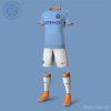
This is an absolute stunning, simple and clean classic Home Kit concept :thumbsup:! Well done :clapping: !!!

This is totally doable. This fits City Football Groups (CFG) multiple team branding perfectly, since their footing 80% of the bill. But it also represents our City in a nice sophisticated manner, as it should.

Nike Designers would nail this design and production. I think Adidas would totally botch it unfortunately.

All the City colors :artpalette: are represented that everyone seems to like. And the front panel of the Jersey either has a slight pinstripe patterning in the fabric which I prefer or subtle sublimated pinstripes.

image3 copy.jpg
 
Last edited:
Status
Not open for further replies.
Back
Top