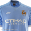
2021 NYCFC Kit Thread

It’s the kind of jersey I’d expect from an ownership that generally can’t be arsed to pay attention to this team.

Just a reminder that MLS teams don't really have that much say over their jerseys. They can ask for certain concepts, but Adidas has the majority of control.

I don't want to seem like I'm always defending the team, but in this case it's really not on the team for a boring jersey, it's on Adidas.

A design brief acquired by The Athletic contains a few interesting details. Most notably, Adidas seems to be asserting its role in the decision-making process much more specifically than before. In previous years, clubs who empowered their own design teams would sometimes go so far as to submit their own mock-ups and sketches of their desired kit designs. Adidas’ 2022 design brief says they’ll no longer accept those.

“Adidas will not execute input 1:1 based off of the images you provide,” the brief reads. “Adidas has the lead in providing design ideas and the club makes the final decision between the provided options.”

Clubs are instructed to “provide a clear and concise vision” for their 2022 uniform and a “mood board” of other design cues that represent their vision for the kit. The only thing the clubs seem to have specific control over — and this is not necessarily a change from previous years — is the trim art (they provide their own art for the graphics used on the jock tag, back of the jersey or the neck tape.)

Adidas, in turn, chooses the base silhouette for all kits, selects fabrics and graphical elements and provides a pair of “distinct design options” to clubs, based on their input.
 
Just a reminder that MLS teams don't really have that much say over their jerseys. They can ask for certain concepts, but Adidas has the majority of control.

I don't want to seem like I'm always defending the team, but in this case it's really not on the team for a boring jersey, it's on Adidas.

So how did Philly get their "fan kit"?
 
Fans gave their design input to a receptive Philly Union marketing/design department. Philly Union presented a proposal to Adidas, which didn't include a fully jersey design, but moreso images and words describing what they want. Adidas approved the proposal, took it and designed a jersey. And there you have it.

Bottom line: Club CAN propose a design to Adidas but the final say on actual jersey design goes to Adidas.

writeup on how it came to be: https://fusion.inquirer.com/soccer/philadelphia-union-jersey-2021-adidas-kit-20210203.html
 
Is there historically a correlation between teams having boring jerseys and teams doing poorly/being mismanaged on the field?
Having suffered through the first 15 years of NER, whose jerseys were almost never boring, and who have been historically neglected (25 years and no stadium, for example), I would say no. Miami Fusion had some pretty nice jerseys. And Chivas USA too.
 
You suggested a relationship between jersey quality and the way the team is managed. I don't think there's anything to that, but I figured I'd ask in case there was.
Does the ownership group of the team manage the team on the field?
 
Just a reminder that MLS teams don't really have that much say over their jerseys. They can ask for certain concepts, but Adidas has the majority of control.

I don't want to seem like I'm always defending the team, but in this case it's really not on the team for a boring jersey, it's on Adidas.


"Clubs are instructed to “provide a clear and concise vision” for their 2022 uniform and a “mood board” of other design cues that represent their vision for the kit."

They either didn't bother or submitted 1-word mood board that said "plain".
 
"Clubs are instructed to “provide a clear and concise vision” for their 2022 uniform and a “mood board” of other design cues that represent their vision for the kit."
They either didn't bother or submitted 1-word mood board that said "plain".
It's pretty obvious that part of their standing instructions to Adidas is that every few years the jersey should look as much like a standard Man City primary jersey as possible.
 
I like simple and clean. It makes it easier to wear at different non-soccer functions. I'm not a big fan of jerseys that try to "incorporate the essence and spirit" of the city. I prefer a clean shirt instead of a walking museum piece!

I know everyone wants them to incorporate more orange, but it just doesn't work imo.
Idk, I really like the last home jersey with the blue/orange stripe down the middle.
 
It's pretty obvious that part of their standing instructions to Adidas is that every few years the jersey should look as much like a standard Man City primary jersey as possible.
If I were a betting man, I'd bet that someone mistakenly typed 2011 when they meant to type "Give us the 2021 Man City jersey."

Screen Shot 2021-02-10 at 7.49.45 PM.png
 

Attachments

  • 1613004858456.png
    1613004858456.png
    697.9 KB · Views: 8
Back
Top