You are using an out of date browser. It may not display this or other websites correctly.
You should upgrade or use an alternative browser.
You should upgrade or use an alternative browser.
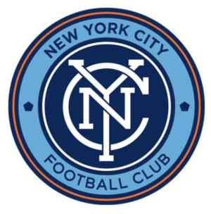
New York City FC Unveil a Refreshed Visual Identity Ahead of Club's 10th Season Home Opener
- Thread starter Shwafta
- Start date
I don't see what was wrong with our old badge, but I don't have an issue with the new one. It's not the Montreal butthole
yea - maybe i am just not used to it yet. it's not an overhaul. they are looking to simplify (got rid of the white inner circle) and increase continuity ( larger and same custom fonts throughout). i wouldn't say i hate it. just don't like the change... oh god. i'm an old man.
continuing with the refreshing... i don't like it.

New York City FC Unveil Updated Club Badge | New York City FC
New York City FC today unveiled an update to their club badge as it kicks off into an exciting, new era. Building off New York City FC’s broader visual identity refresh launched earlier this year, the updated club badge builds on the strengths of the young, but beloved brand fanswww.newyorkcityfc.com
View attachment 13491
why? it feels less like a draft version of the original badge. if anything it should of gone from this to the "original"
This is where I am on it. I had the same thought. And I'm glad I got my hat before the change.why? it feels less like a draft version of the original badge. if anything it should of gone from this to the "original"
continuing with the refreshing... i don't like it.

New York City FC Unveil Updated Club Badge | New York City FC
New York City FC today unveiled an update to their club badge as it kicks off into an exciting, new era. Building off New York City FC’s broader visual identity refresh launched earlier this year, the updated club badge builds on the strengths of the young, but beloved brand fanswww.newyorkcityfc.com
View attachment 13491
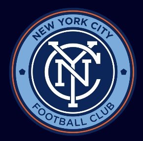
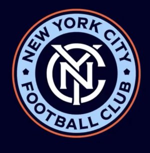
It will take some getting used to but I actually am a fan. It looks more retro to the city. I think it will be seen as more authentic NYC than the current badge
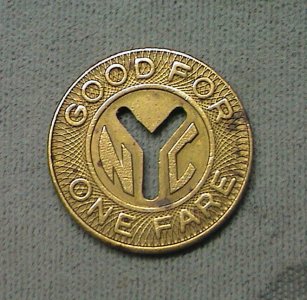
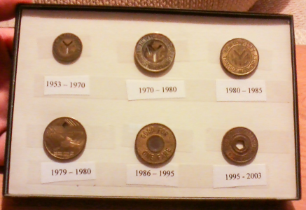
Since the design is supposed to look like the subway coin, the lettering on the new badge makes more sense as it's more in line with the "full span" that the coins had. However the white outline removal confuses me a bit...View attachment 13492View attachment 13493
It will take some getting used to but I actually am a fan. It looks more retro to the city. I think it will be seen as more authentic NYC than the current badge
why? it feels less like a draft version of the original badge. if anything it should of gone from this to the "original"
This is where I am on it. I had the same thought. And I'm glad I got my hat before the change.
it was coming though. all the new merch lately has the monogram in the new custom font.
Since the design is supposed to look like the subway coin, the lettering on the new badge makes more sense as it's more in line with the "full span" that the coins had. However the white outline removal confuses me a bit...View attachment 13494
Very true! Removing the white outline is fine with me. it doesn't do much for the design since there's already a change of color to distinguish the rings.
A continuing conversation in my house.yea - maybe i am just not used to it yet. it's not an overhaul. they are looking to simplify (got rid of the white inner circle) and increase continuity ( larger and same custom fonts throughout). i wouldn't say i hate it. just don't like the change... oh god. i'm an old man.
My wife: what are you doing on your phone?
Me: Checking the forum.
MW: Ah, what are the guys complaining about today?
(Today) Me: the lack of the white circle on the crest makes them feel old.
Edit: not saying that you’re complaining about this moogs, but it fit with how this forum acts from time to time lol
View attachment 13492View attachment 13493
It will take some getting used to but I actually am a fan. It looks more retro to the city. I think it will be seen as more authentic NYC than the current badge
If I'm being honest, until you posted the side by side I don't think I could have told you what changed. I am kind of in the Pam office these things are the same Meme zone.
ZYanksRule
Registered
The online flip-out over this (Twitter, Facebook, and Chant especially) is a bit much. This is fine. I like the old inner NYC better, I like the new outer ring better. Glad it's not a full rebrand like Chicago and Montreal. Could have been a lot worse.
It's fine. I probably like the old version better, but this is such a minor difference it's not worth getting so revved up over.
It's fine. I probably like the old version better, but this is such a minor difference it's not worth getting so revved up over.
I felt old before the new logo dropped.A continuing conversation in my house.
My wife: what are you doing on your phone?
Me: Checking the forum.
MW: Ah, what are the guys complaining about today?
(Today) Me: the lack of the white circle on the crest makes them feel old.
Edit: not saying that you’re complaining about this moogs, but it fit with how this forum acts from time to time lol
As to that-
- the original version of the interlocking NYC always made me think of Chicago even though I'm not aware of any Chicago-related logo (govt, sports, music etc) that looks like that
- the new interlocking NYC reminds me of old subway tokens even though no tokens I know of used interlocking letters or this font
- the new letters around the circle do not remind me of a subway token even though they look almost exactly like the same part of several subway tokens
- when NYCTA introduced tokens with a pentagon punched through it I had no idea and did not realize it represented the boroughs. I was just "why is there a pentagon on the token now?" I probably read it in a newspaper but it didn't stick. and first time I truly realized why was the explainer for the introduction of the NYCFC logo. I never thought the pentagon worked as a city symbol; still don't. Give me the old punched out "Y" version.
Last edited:
When I look at this, I wonder why they didn't just keep the original design and punch up the color palette.Always felt the original badge was an homage to Inter Milan, but with an NYC inspired font, it turns into a subway coin and is entirely ownable. The type top and bottom feels big/horsey, but it's most likely for legibility at small scale.
View attachment 13498 View attachment 13496 View attachment 13497View attachment 13499
[Ed. note: My hat has the updated color palette already. And it just occurred to me, it's now a collector's item. Cool.]
Last edited:
Was going to say, that you're suggesting they effectively keep it as is.When I look at this, I wonder why they didn't just keep the original design and punch up the color palette.
[Ed. note: My hat has the updated color palette already. And it just occurred to me, it's now a collector's item. Cool.]
Alex Da Silva
Registered
It took me all of 5 minutes looking at the 2 side by side to make up my mind that I like the new one better, I like the font much more, the white circle missing was weird at first but I think it would look worse with a white circle now and I don't know how to describe this but this feels like it has much more presence while the old badge felt more intricate. Nothing wrong with the old badge but I like this new one a bit more
I'm imagining some marketing company coming up with a cool new logo and presenting it with a dramatic 30-second video where parts of the old logo fall away as it slowly morphs into the new logo. Only at the 2-second mark of the video when the ring drops away NYCFC leadership was like pause it, you've done it, this is perfect!
I'm not complaining, I like our logo so minimal change is good with me but I always think it's funny to think about the amount of design iterations and meetings that likely went into such a minor change.
I'm not complaining, I like our logo so minimal change is good with me but I always think it's funny to think about the amount of design iterations and meetings that likely went into such a minor change.
Excellent post on reddit. lmao
Excellent post on reddit. lmao
mannnn im still salty at the fact they were hyping it so much and all we got was that.
Similar threads
- Replies
- 44
- Views
- 1,086
- Replies
- 4
- Views
- 1,671
- Replies
- 5
- Views
- 1,361
- Replies
- 275
- Views
- 42,656
