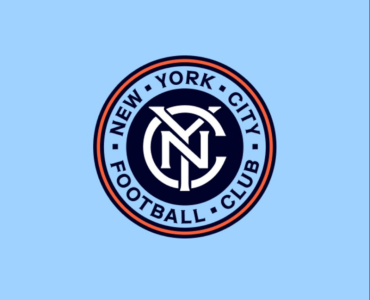
mannnn im still salty at the fact they were hyping it so much and all we got was that.
Question is will they replace it at the new stadium and what will it look like?
mannnn im still salty at the fact they were hyping it so much and all we got was that.
Question is will they replace it at the new stadium and what will it look like?
Question is will they replace it at the new stadium and what will it look like?
You reminded me of my favorite scene in Broadcast News where 2 consultants demo their fresh news theme music intro to the network exec.I'm imagining some marketing company coming up with a cool new logo and presenting it with a dramatic 30-second video where parts of the old logo fall away as it slowly morphs into the new logo. Only at the 2-second mark of the video when the ring drops away NYCFC leadership was like pause it, you've done it, this is perfect!
I'm not complaining, I like our logo so minimal change is good with me but I always think it's funny to think about the amount of design iterations and meetings that likely went into such a minor change.
is that banner even there? i think they moved the location and replaced it. its on right field side now.
Yes. I mean, I get it, updating the crest is common. But usually, it's something like what Arsenal did, going from an old and super busy design to something clean and completely new (and boy howdy, was there some howling about that at first -- it was a massive change).Was going to say, that you're suggesting they effectively keep it as is.

 www.hudsonriverblue.com
Good piece. And the new badge is fine. Seeing it on Facebook and other social media, it certainly pops more.Really nice writeup from Hudson River Blue on the original design, the update and the general world of crests in MLS. Makes the point that the Club commissioned a custom font, so it was only a matter of time before it hit the crest.

New font, who dis? New York City FC's updated badge
Some thoughts on New York City Football Club's updated badge.www.hudsonriverblue.com
Good piece. And the new badge is fine. Seeing it on Facebook and other social media, it certainly pops more.
And if I have the "classic" badge on my hat or Jonathan Sanchez has it tattooed somewhere, that's fine too. Before too long, it will be the retro look, and everyone will be happy again.
My no-consequence conspiracy theory is they delayed revealing the new badge until September even though the general redesign came in March, because of the 2024 kit. Its no-badge logo uses the old fonts and probably was well in the works by the time the design refresh was ready. They didn't want to release a new jersey and simultaneously render it dated, so the new badge reveal was held until now.In a few years when we open the new stadium, if you are wearing apparel with the old logo on it, you'll be seen as a long-term fan of the team, not just someone who showed up for the new stadium. You'll be seen as someone who was with the team during the tough times when they had to play home games at many different stadiums, even on the other side of the country.
That badge that leaked back in March was the exact same as this oneMy no-consequence conspiracy theory is they delayed revealing the new badge until September even though the general redesign came in March, because of the 2024 kit. Its no-badge logo uses the old fonts and probably was well in the works by the time the design refresh was ready. They didn't want to release a new jersey and simultaneously render it dated, so the new badge reveal was held until now.
Not the exact same one. This was the one that was leaked.That badge that leaked back in March was the exact same as this one

Not the exact same one. This was the one that was leaked.
Side note, doesn't it seem the NYC in the middle is just a little up than it should be? Like there's much more dark blue borders in the bottom that towards the top parts of the Y.
View attachment 13501
Looks like they originally were going to have 5 squares and opted to just go back to the pentagons lolglad they got rid of the little squares between the words.
the NYC looks fine to me. they are centered based on the center of each letter. the blue around the top parts of the Y are just a consequence of ensuring the Y doesn't get lost. personally, it doesn't look like it's off center.
Thank goodness for that. I think that's exactly what turned me off about the proposed design when it leaked in March.Looks like they originally were going to have 5 squares and opted to just go back to the pentagons lol
Because it’s not active yet. They just announced they’re going to rebrand next year. And even then the kit will still have the old badge.I know I’m knit picking, but normally when a club goes through a rebrand, it’s on the front page of mlssoccerdotcom. We are even mentioned. Obviously it’s a redesign and not a rebranding, but I feel like maybe it should be mentioned
I use my #88 Poke jersey for that.In a few years when we open the new stadium, if you are wearing apparel with the old logo on it, you'll be seen as a long-term fan of the team,
I don’t think that matters tbh. I feel in the past they have shown rebrands when they have been announced instead of when they began using the imageBecause it’s not active yet. They just announced they’re going to rebrand next year. And even then the kit will still have the old badge.