Can someone remind me what the deal is going forward with the picture numbers we were able to get last season. Will this be an every season thing for STH? If so, I wonder how they would look on the new away jersey, and may be a reason to keep it blank for now.
You are using an out of date browser. It may not display this or other websites correctly.
You should upgrade or use an alternative browser.
You should upgrade or use an alternative browser.
2016 Jersey Thread
- Thread starter sbrylski
- Start date
cle-->tpa-->nyc
Registered
I am just ready for it to be officially released, especially with a lot of other jerseys being shown this week. Overly optimistic its today?
So, we are either the center of the universe, the Earth, the epicenter, or the core. Any way, it's all good.
I hope they aren't used again - they were too shiny and looked glittery on TV.Can someone remind me what the deal is going forward with the picture numbers we were able to get last season. Will this be an every season thing for STH? If so, I wonder how they would look on the new away jersey, and may be a reason to keep it blank for now.
ktdNYCFC
Registered
The Left Nipple Ripples rolls off of your tongue much better than NYCFC. Make it happen Ian!
As genius as this is, I think you just gave NJ their next derby tifo.
I prefer simple, minimalist designs. If it were up to me, every kit would only have two colors.
Home: Light Blue and White
Away: Orange and Black/Navy
Keep the home kit simple. Change simple elements every two years. Use different templates like a sash or stripes, or go crazy and do the front of the kit in white with light blue text and back of the kit in light blue with white text.
The away kit can be bold, yet still simple. Black with light blue or orange stripes. Or go all orange with black stripes.
I think what I really want is for Adidas to lose their jersey monopoly. I think they're just bad at it if they stray too far from standard. Nike, for example, is brilliant at being bold and different (e.g. Oregon Ducks).
What I'd like to see is a group of Apparel Manufacturers all working with the League (Adidas, Nike, Puma, Kappa, Umbro, etc). There would be a minimum sponsorship participation value they'd have to pay to MLS to take part in this. After that, each company would get a minimum of 3 clubs to outfit, and they'd bid on the teams they'd want to sponsor for 3 year periods - that way if NIKE thinks they'd crush sales with LAFC, then they bid it up as much as they feel confident doing - likewise if Umbro says they want NYCFC as their flagship, they do the same. Win the bid, get the team. The last few teams bid on would likely not have a high ceiling, which is why there's the initial participation buy-in to be a league sponsor, and therefore would still have a minimum threshold for sponsorship. This would reward the marketable teams and bring some real diversity (dare I say parity) to the league because even a small market can get a lottery winning marketing campaign/jersey design by an eager and creative company..... Adidas doesn't necessarily care much about their 20th team, but X/Y/Z company would definitely care about their 2nd and 3rd clubs.I prefer simple, minimalist designs. If it were up to me, every kit would only have two colors.
Home: Light Blue and White
Away: Orange and Black/Navy
Keep the home kit simple. Change simple elements every two years. Use different templates like a sash or stripes, or go crazy and do the front of the kit in white with light blue text and back of the kit in light blue with white text.
The away kit can be bold, yet still simple. Black with light blue or orange stripes. Or go all orange with black stripes.
I think what I really want is for Adidas to lose their jersey monopoly. I think they're just bad at it if they stray too far from standard. Nike, for example, is brilliant at being bold and different (e.g. Oregon Ducks).
I bet Pirlo looks cool even when he's taking a shit.
Dude, no.
Dude, no.

Capt.Tsubasa
Registered
But are we also the center of the COSMOS?!So, we are either the center of the universe, the Earth, the epicenter, or the core. Any way, it's all good.
The City is the center of the Galaxy and the Kosmos.... Teams' Crews will Quake & Burn at the Sound of our Dynamo attack that Fires on all cylinders and is a Union of Vieira's ideas. It will be a United Revolution that Impacts beyond the confines of the league - All will Rapidly know how Real we are and that we take no Bull. It would be Sporting to say the Tree Falls Hard when cutting down Timber.But are we also the center of the COSMOS?!

LightTheLamps
Registered
if we really had to have as much orange as possible. could do worse than this umbro mock up. greatly prefer this to what we ended up with..
https://worldofumbro.wordpress.com/2016/01/10/nycfc/
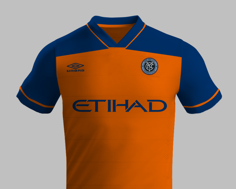
https://worldofumbro.wordpress.com/2016/01/10/nycfc/

I like some of those, LightTheLamps .
I mean really, how hard is this? I just did a quick potential home jersey with this tool: http://dyo.blksport.com/

I mean really, how hard is this? I just did a quick potential home jersey with this tool: http://dyo.blksport.com/

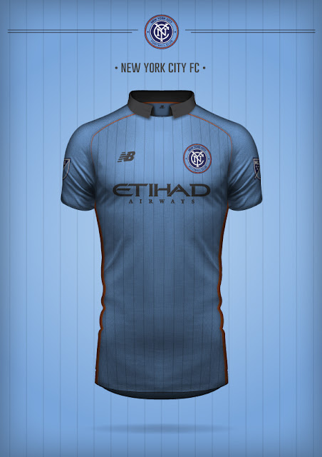
This is a lot less about New Balance and a lot more about the talent of Davide Lenave. He has a ton of spec jersey designs: https://www.behance.net/davidelanave
Also,
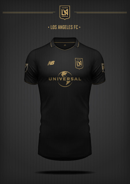
holy shit, if Universal Studios actually was going to be LAFC's kit sponsor (and the kit looked like this), I might have to buy one of their jerseys just for radness' sake.
Also,

holy shit, if Universal Studios actually was going to be LAFC's kit sponsor (and the kit looked like this), I might have to buy one of their jerseys just for radness' sake.
Oddly enough out of all those mock ups, ours was the one I liked the least.
I'm with you, there's plenty mock ups out there that blow this one out of the water, from regular fans using cheap programs even.
Similar threads
- Replies
- 137
- Views
- 14,174
- Replies
- 12
- Views
- 4,209
- Replies
- 213
- Views
- 26,351

