They don't look like practice shorts man. They normally wear the actual shorts or the tiro pants either long ones that been cut up or the 3/4 tiro pants. But we'll just have to wait and see.Pretty sure those shorts are only practice shorts.
They never sold the home white or away black shorts last year. Only the light blue and black practice shorts.
You are using an out of date browser. It may not display this or other websites correctly.
You should upgrade or use an alternative browser.
You should upgrade or use an alternative browser.
2016 Jersey Thread
- Thread starter sbrylski
- Start date
Anyone know when they have to have their official numbers in for the year?? Just curious what numbers players like Matarrita, Lopez, Martinez, (Brillant?) are going to have.
I hate the away kit, if it is the circles, but I also know myself and will probably end up getting one for shiggles. Why not have one of the new boys on it.
I hate the away kit, if it is the circles, but I also know myself and will probably end up getting one for shiggles. Why not have one of the new boys on it.
Anyone know when they have to have their official numbers in for the year?? Just curious what numbers players like Matarrita, Lopez, Martinez, (Brillant?) are going to have.
I hate the away kit, if it is the circles, but I also know myself and will probably end up getting one for shiggles. Why not have one of the new boys on it.
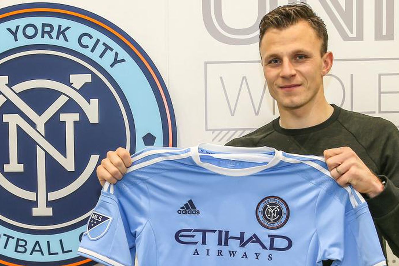
In the training photos I noticed that Ethan White is wearing #3. Haven't spotted numbers for any of the other new players though.
LightTheLamps
Registered
lol, well, the colonies won.. but i do see your point.Am i in the minority here where I hardly would like to see any orange on the kits? I know NYC has Orange as part of the colors but we're not exactly New Amsterdam anymore. The British won..haha
Dammit! Now we have to rename the Knicks, too.Am i in the minority here where I hardly would like to see any orange on the kits? I know NYC has Orange as part of the colors but we're not exactly New Amsterdam anymore. The British won..haha
BossNYC
Registered
Yeah, I'd say so.Am i in the minority here where I hardly would like to see any orange on the kits? I know NYC has Orange as part of the colors but we're not exactly New Amsterdam anymore. The British won..haha
I think a dark blue and orange uniform is fire and it's fairly unique compared to the massive amount of red/black, red/white, blue/red, blue/white uniforms that seem to dominate the sport.
Someone may have already pointed this out, but the assumed away jersey has the same scheme and color combination as the new Adidas navy/orange warm-up tops that we have been seeing the players wearing. You can get a much better idea of the likely colors of the assumed away jersey by looking at those pictures (I have copied one of JH and FL from instagram below) as compared to the grainy car bed picture of the away jersey. It looks like they definitely revamped the shade of orange to make for quite a striking contrast with the navy blue.
https://www.instagram.com/p/BA3Y0euSsyi/
https://www.instagram.com/p/BA3Y0euSsyi/
Someone may have already pointed this out, but the assumed away jersey has the same scheme and color combination as the new Adidas navy/orange warm-up tops that we have been seeing the players wearing. You can get a much better idea of the likely colors of the assumed away jersey by looking at those pictures (I have copied one of JH and FL from instagram below) as compared to the grainy car bed picture of the away jersey. It looks like they definitely revamped the shade of orange to make for quite a striking contrast with the navy blue.
https://www.instagram.com/p/BA3Y0euSsyi/
The dark blue with the orange accent is just so damn money. Too bad they ruined it with seismic waves. I guess we're the Quakes now?
The dark blue with the orange accent is just so damn money. Too bad they ruined it with seismic waves. I guess we're the Quakes now?
In my attempt to accept the "seismic waves" I have interpreted them as confirmation that NYCFC, just like most New Yorkers, and putting people on notice that NYC is the center of the universe. It is helping more each day.
I probably need to set a reminder each day too - the Rhinovirus pandemic hit our house (100% spread rate from Patient Zero in only 4 days) and my brain gets so fuzzy when sick that my modus operandi is to be semi self-destructive and eat nearly everything in sight to sooth the misery, and I'm to the point that if the new jersey was for sale I'd make the purchase in spite of myself..... I'd be so miserable knowing I actually spent money on it that hopefully I'd forget my current state of anguish.Just my daily reminder to myself that I hate the new secondary. ):
Mellemonster
Registered
I have been trying to figure out what I think about the new secondary jersey. So, I took to photoshop and decided to see what the jersey looks like not on a race-car bed. I still am not a huge fan of the circles, it feels a little bit 90s to me, but it is not as ugly as I initially thought.

I have been trying to figure out what I think about the new secondary jersey. So, I took to photoshop and decided to see what the jersey looks like not on a race-car bed. I still am not a huge fan of the circles, it feels a little bit 90s to me, but it is not as ugly as I initially thought.
View attachment 3906
I thought the circles were orange.
Navy testing or NYCFC marketing campaign??? You decide!
http://abc7ny.com/news/navy-says-ai...ve-caused-sonic-booms-ground-shaking/1177607/
http://abc7ny.com/news/navy-says-ai...ve-caused-sonic-booms-ground-shaking/1177607/
Hahah, brilliant.
Hahah, brillant.
Truthfully, I think that with this striking color combo, and even with the ripples, the jersey is going to look much better on the field than on the bed. To me, I think the ripples may simply be the attempt to overcompensate for the bland home jersey, like last year. I am still in the hopeful camp.
Similar threads
- Replies
- 137
- Views
- 14,188
- Replies
- 12
- Views
- 4,209
- Replies
- 213
- Views
- 26,354