2016 Jersey Thread

Is our team going to be wearing this abomination on 3/6 in Chicago? It is not a shirt for grown men.

I agree with Tom's thinking, though. My 10 year old will look good in it.

So glad I just got two black inaugural season away jerseys during the 50% off sale. I will never wear this new away jersey. It looks like spiderman pajamas.
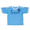
 
Its a guy who got a bunch of gear for his kids and posted a picture, do we all know that, and we are joking? Hard to tell.

To be fair, if this guy (whoever he is) knew that the photo was going to blow up all over the Internet, he probably would have made the car bed first.

I like the jersey. It's not everything it could or should be, but I do like it better than the black.
 
Is our team going to be wearing this abomination on 3/6 in Chicago? It is not a shirt for grown men.

I agree with Tom's thinking, though. My 10 year old will look good in it.

So glad I just got two black inaugural season away jerseys during the 50% off sale. I will never wear this new away jersey. It looks like spiderman pajamas.
I wear my Spider-Man pajamas every night, so what's wrong with that?

Hmmm, probably shouldn't really post that on here.

Oh, crap, wait!

Delete, delete, DELETE!
 
Is our team going to be wearing this abomination on 3/6 in Chicago? It is not a shirt for grown men.

I agree with Tom's thinking, though. My 10 year old will look good in it.

So glad I just got two black inaugural season away jerseys during the 50% off sale. I will never wear this new away jersey. It looks like spiderman pajamas.

Oh no, they DO look like Spider-Man pajamas.

The black jerseys were so frickin dope too. For shame.
 
look closely and its similar to the embedded rings on a vinyl record (the logo is the records center area where the album info would be) and they're kowtowing to the hipster crowd...... it's the only explanation I can come up with
 
From what I was able to piece together on Twitter last night, this guy is a friend of RJ and apparently RJ got him the hookup with the new swag.

As for the design, I hope it looks better in person and in the authentic adizero version. It also strikes me as something better used as a third shirt that rarely sees the light of day.
 
Last edited:
In addition to what others have already pointed out, I will say that even the home jersey looks a little odd in toddler/kid size, so I'd like to see an adult version before passing judgment

NF140730006_primary_lightblue.jpg
 
Ugh, I can't help but like it...... They got me good.

Because i'm a cheapskate and I only just bought two shirts, I won't be buying this (until it goes on clearance and I can get one for under 40 bucks :) )
 
Ugh, I can't help but like it...... They got me good.

Because i'm a cheapskate and I only just bought two shirts, I won't be buying this (until it goes on clearance and I can get one for under 40 bucks :) )
Which this year will be WELL BEFORE the end of the season!!!
 
Since nobody has yet mentioned it..... please allow me...... per MLS conventions of only replacing one jersey each year and alternating the replacement, unless Adidas & NYCFC decide to terminate this shirt after the season, we are going to be *stuck* with it for TWO SEASONS...... In 2017 we are slated to get a new Home Jersey...... Ugh.......
Not nessisaily true. The Quakes are going on three years with the same home kit. They've changed the away out every year.
 
I highly doubt that shirt with the circles is the away shirt for this year. They have been wearing navy blue shorts with City Blue stripes on the side while training. Don't see how they'll wear those shorts with orange stripes and shorts with City Blue stripes. Just my 2 cents.
 
I like it
I am going from the point that our crest and NYC are at the center of the universe and the circles represent others orbits
 
In all fairness, and all joking aside, you really have to see how it looks on a person rather than laid out on a bed, and how the colors work in real life. Objectively some would say that our black jerseys are a mess with the color combination, the strange shades of the colors (is it black or is it midnight blue?)the subtle lines, etc. But last season's away jerseys are striking in person, and are very cool and different. I will reserve judgment until I see the real deal. I will take crop circles over the Real Madrid dragon any day.
 
Back
Top