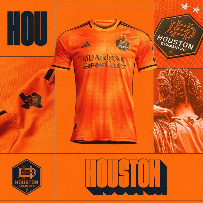
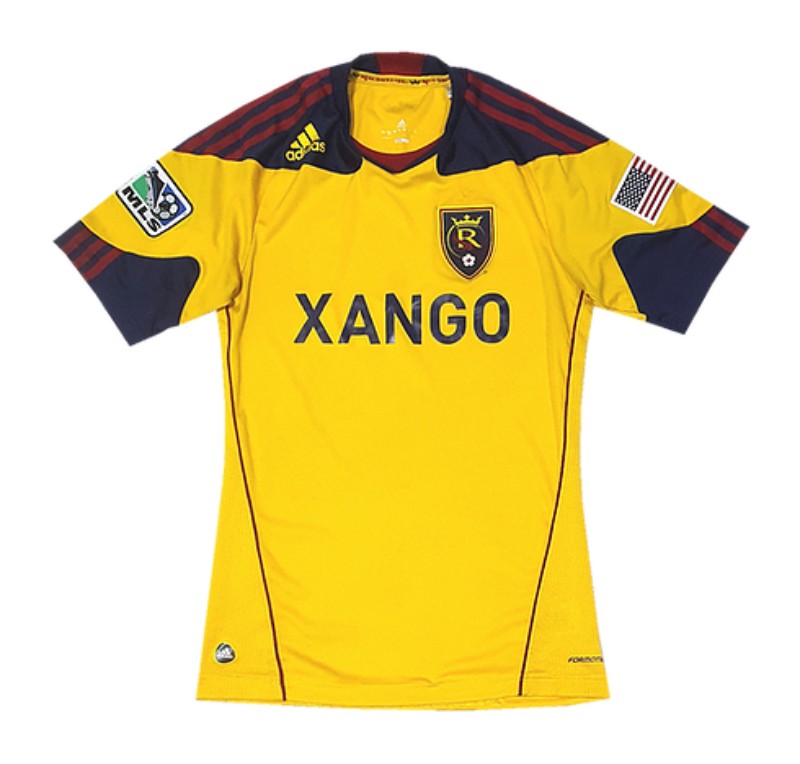
Houston seems to have achieved the impossible -
making their orange kits even more difficult to stare at directly. El sol indeed.
making their orange kits even more difficult to stare at directly. El sol indeed.
I love this unironically.Houston seems to have achieved the impossible -
making their orange kits even more difficult to stare at directly. El sol indeed.
Yeah. Worse, the year most the kits were just the national team World Cup warm up jerseys template from 2018 with an MLS crest on them. That was the ultimate And Deutschland Isn’t Doing Any Shit moment.i wonder what changed that it feels they actually tried with the degisns? remember that year when like 90% of the teams had a generic white jersey. i think the whole apple deal probably happened long after the designs of these jerseys were finalized, for them to have a say that they didnt want generic designs.
Their contract might be coming up too but not 100% sure. Probably trying to show full potential before possibly settling into a new contract and dispensing the 50% all white MLS kit machine again in 2025.i wonder what changed that it feels they actually tried with the degisns? remember that year when like 90% of the teams had a generic white jersey. i think the whole apple deal probably happened long after the designs of these jerseys were finalized, for them to have a say that they didnt want generic designs.

 www.mlssoccer.com
 www.footballkitarchive.com
Looking at LAFC, Dallas, and some from yesterday like Colorado and a few others (even ours), it's has become apparent to me that a general constraint they face is the need to avoid major contrasting colors or even really different tones of a single color because that would make it less likely that any given jersey contrasts with the opposing jersey. A monochrome shirt can only fail to contrast with a similar shirt. A shirt with 2-3 major color elements worn against another 2-3 color shirt probably has issues.Today's batch have been pretty eh.


your theory makes a lot of sense, however the only thing that i would counter with is that if a team has colors that don't cross over on their home and away, and their away kit clashes, why not just use the home kit in that scenario? would solve that problem, and you see it happen a bunch in other leagues. (or they do a third kit with completely idiotic colors for that purpose, too. See newcastle)Looking at LAFC, Dallas, and some from yesterday like Colorado and a few others (even ours), it's has become apparent to me that a general constraint they face is the need to avoid major contrasting colors or even really different tones of a single color because that would make it less likely that any given jersey contrasts with the opposing jersey. A monochrome shirt can only fail to contrast with a similar shirt. A shirt with 2-3 major color elements worn against another 2-3 color shirt probably has issues.
Compare the Colorado jersey

with any other work by the artist behind it:
That's a boring fvcking kit by an artist who knows how to use color. And it's because, I'm now certain, he could not use his usual color palette to make a usable kit. Honestly, I'm more impressed now that Adidas and Nike sometimes do something visually interesting given the constraints.
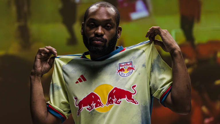
I also looked up the artist behind the RB kit. Oddly, their new jersey looks nothing like his usual fare which has a lot of simple monochrome items:
But I think my theory also explains why their tie-dye shirt is such a muted mess, which is again if it had large bold red and yellow elements and looked like an actual, good tie-dye job instead of puke, it would conflict with too many opposing shirts.
One last note is that Colorado hired a local artist for their shirt. Red Bulls hired someone born in Australia who grew up wanting to play rugby, now based in LA, with no regular NY (or NJ) presence or roots, and made him design something that doesn't look like anything else in his portfolio that I can find. It's really inexplicable.
Really harnessing your inner Anna Wintor there buddy. Better get off your phone and get to that class at FIT you’re the adjunct for. Now I’m scared you’re going to judge my outfit next time we hang out.Looking at LAFC, Dallas, and some from yesterday like Colorado and a few others (even ours), it's has become apparent to me that a general constraint they face is the need to avoid major contrasting colors or even really different tones of a single color because that would make it less likely that any given jersey contrasts with the opposing jersey. A monochrome shirt can only fail to contrast with a similar shirt. A shirt with 2-3 major color elements worn against another 2-3 color shirt probably has issues.
Compare the Colorado jersey
with any other work by the artist behind it:
That's a boring fvcking kit by an artist who knows how to use color. And it's because, I'm now certain, he could not use his usual color palette to make a usable kit. Honestly, I'm more impressed now that Adidas and Nike sometimes do something visually interesting given the constraints.
I also looked up the artist behind the RB kit. Oddly, their new jersey looks nothing like his usual fare which has a lot of simple monochrome items:
But I think my theory also explains why their tie-dye shirt is such a muted mess, which is again if it had large bold red and yellow elements and looked like an actual, good tie-dye job instead of puke, it would conflict with too many opposing shirts.
One last note is that Colorado hired a local artist for their shirt. Red Bulls hired someone born in Australia who grew up wanting to play rugby, now based in LA, with no regular NY (or NJ) presence or roots, and made him design something that doesn't look like anything else in his portfolio that I can find. It's really inexplicable.

Say we have a multicolor and our usual pale blue. Our opponent has a mostly blue multicolor and a white. Pale blue and white contrast poorly and our blue fails against their mostly blue as well. And we don’t do third shirts. Too risky. Keep it simple.your theory makes a lot of sense, however the only thing that i would counter with is that if a team has colors that don't cross over on their home and away, and their away kit clashes, why not just use the home kit in that scenario? would solve that problem, and you see it happen a bunch in other leagues. (or they do a third kit with completely idiotic colors for that purpose, too. See newcastle)
I think about color and light a lot since taking up photography. Contrast is very important, which is why a good black and white photo is more interesting than that Rapids kit.Really harnessing your inner Anna Wintor there buddy. Better get off your phone and get to that class at FIT you’re the adjunct for. Now I’m scared you’re going to judge my outfit next time we hang out.
I’m just teasing you budI think about color and light a lot since taking up photography. Contrast is very important, which is why a good black and white photo is more interesting than that Rapids kits.
ETA: and why I generally hate our flat pale blue home shirts.
 www.lafc.com
What a terrible organization. They actually need to Chivas USA that franchise, and re-sell the franchise rights to a new group in a few years with a completely new identity.
They were just sold to Joe Mansueto back in 2019. From the Fire fans I know, they do like MansuetoWhat a terrible organization. They actually need to Chivas USA that franchise, and re-sell the franchise rights to a new group in a few years with a completely new identity.
I like their colors and logo actually -- but for a hockey team. The blue looks like the blue line and the logo looks like a puck.
What a terrible organization. They actually need to Chivas USA that franchise, and re-sell the franchise rights to a new group in a few years with a completely new identity.
I like their colors and logo actually -- but for a hockey team. The blue looks like the blue line and the logo looks like a puck.