You are using an out of date browser. It may not display this or other websites correctly.
You should upgrade or use an alternative browser.
You should upgrade or use an alternative browser.
New York City FC Unveil a Refreshed Visual Identity Ahead of Club's 10th Season Home Opener
- Thread starter Shwafta
- Start date
Please spell the name of an NYCFC legend correctly...I use my #88 Poke jersey for that.
Yeah. Auto correct. Whaddayagonedo?Please spell the name of an NYCFC legend correctly...
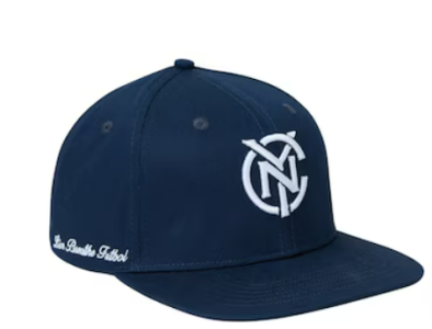
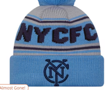
I must be honest: like a lot of other people, I freaked a little at first, but now the new monogram has grown on me. So has the new crest. They're bolder, stronger, more modern. They pop more on the kit, and it's not such a massive departure as to lose our identity.I think it's fine. I don't really get why this needed to happen, but I don't hate it.
I do hate the new monogram though. The thinner lettering just seemed so much better when everything else is stripped away
View attachment 13503
View attachment 13504
And the new monogram is going to absolutely rock on the 24/7 kit (and I hated the 24/7 monogram when the kit first dropped, until I saw it on gameday LOL). My stretch goal is to make it to the stadium opening in 2027. If you see a dude in a classic hat and new 24/7 jersey, say hello.
I don't think they will update the 24/7 kit with the new monogram, and if you plan to buy it do so before 2026 when they will drop a new Away kit.And the new monogram is going to absolutely rock on the 24/7 kit (and I hated the 24/7 monogram when the kit first dropped, until I saw it on gameday LOL). My stretch goal is to make it to the stadium opening in 2027. If you see a dude in a classic hat and new 24/7 jersey, say hello.
But I very much hope to see you in 2027, whatever you're wearing.
We will see you at the stadium opening in 2027.I must be honest: like a lot of other people, I freaked a little at first, but now the new monogram has grown on me. So has the new crest. They're bolder, stronger, more modern. They pop more on the kit, and it's not such a massive departure as to lose our identity.
And the new monogram is going to absolutely rock on the 24/7 kit (and I hated the 24/7 monogram when the kit first dropped, until I saw it on gameday LOL). My stretch goal is to make it to the stadium opening in 2027. If you see a dude in a classic hat and new 24/7 jersey, say hello.
RunningWise
Registered
Nobody tells me what to do or where to beWe will see you at the stadium opening in 2027.
I don't think they will update the 24/7 kit with the new monogram, and if you plan to buy it do so before 2026 when they will drop a new Away kit.
But I very much hope to see you in 2027, whatever you're wearing.
Thank you both! I'm a battler, so first round of snacks is on me.We will see you at the stadium opening in 2027.
Nobody tells me what to do or where to be
Revfugee
Registered
Yeah the old monogram is superior. Simpler and cleaner. Otherwise the new badge is better.I think it's fine. I don't really get why this needed to happen, but I don't hate it.
I do hate the new monogram though. The thinner lettering just seemed so much better when everything else is stripped away
View attachment 13503
View attachment 13504
These thoughts consuming you at night?You can't convince me otherwise, I know the new interlocking NYC in the new crest isn't centered within the dark blue circle.
You can't convince me otherwise, I know the new interlocking NYC in the new crest isn't centered within the dark blue circle.
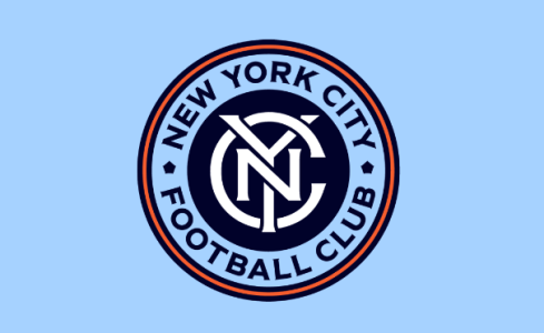
I played with it in Photoshop.
The distance between the top of the C and the navy circle is 25px, same on the bottom.
The Y extends 4 px above the C on top and also on the bottom.
Left and right is more complicated because the C is open on the right and flares at the ends. But it is 25px on the left, and 25px on the right when measured from the widest right-most part of the flare.
But if you mentally "correct" the C to be a pure circle with no flare, that puts it sitting off-center to the left by 3-4 pixels.
I give because I love.
Last edited:
I'm only noticing the left/right off-center-ness now. I was more concerned with top/bottom, specially the peaks of the Y to the corners reaching W and C (in New York City) as compared to the tail Y reaching the A/L (in Football). I think it needs to be lower like a couple pixels. And now even the N looks slightly lower than the line connecting the middle of the pentagons.View attachment 13670
I played with it in Photoshop.
The distance between the top of the C and the navy circle is 25px, same on the bottom.
The Y extends 4 px above the C on top and also on the bottom.
Left and right is more complicated because the C is open on the right and flares at the ends. But it is 25px on the left, and 25px on the right when measured from the widest right-most part of the flare.
But if you mentally "correct" the C to be a pure circle with no flare, that puts it sitting off-center to the left by 3-4 pixels.
I give because I love.
Among others.These thoughts consuming you at night?
It was a very interesting listen. It’s fascinating to learn that the new visual identity and the new logo were created together and rolled out separately. I think it was actually pretty smart to roll out in small stages like the did. And definitely I can see better now how it’s all connected. The little symbols and colors would have definitely been lost in the sauce if they also announced the logo at the same time. And I agree with the sentiment that I was iffy on the new logo at first, but now really like it more than the old. But I do like the old monogram more than the new one.
Just out of curiosity I started looking up Milo Kowalski and I found some original logo and design proposals he made for the team’s original launch in 2013.

 cargocollective.com
Damn that would have been so cool. Completely separate from Man City. It’s a Cincy-esque color scheme, but at that point we would have done it first. I do love the monogram.
Some of my favorite components:
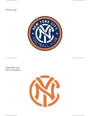
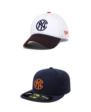
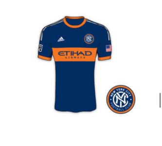

New York City F.C. Brand Proposal - Milo Kowalski
New York City will have a new club joining Major League Soccer in 2015, co-owned by parent club Manchester City F.C. and the New York Yankees. While the current lone "New York" area team, Red Bull New York, is wholly branded by the energy drink Red...
Damn that would have been so cool. Completely separate from Man City. It’s a Cincy-esque color scheme, but at that point we would have done it first.
Some of my favorite components:


Just out of curiosity I started looking up Milo Kowalski and I found some original logo and design proposals he made for the team’s original launch in 2013.

New York City F.C. Brand Proposal - Milo Kowalski
New York City will have a new club joining Major League Soccer in 2015, co-owned by parent club Manchester City F.C. and the New York Yankees. While the current lone "New York" area team, Red Bull New York, is wholly branded by the energy drink Red...cargocollective.com
Damn that would have been so cool. Completely separate from Man City. It’s a Cincy-esque color scheme, but at that point we would have done it first.I do love the monogram.
Some of my favorite components:
View attachment 14048
View attachment 14049View attachment 14050
I think this original looks good, but there's something a bit off on the color scheme with the white lettering that makes it look not as full. I don't know exactly how to explain what I'm thinking, but for example that orange monogram version looks better in my eyes
Similar threads
- Replies
- 44
- Views
- 1,089
- Replies
- 4
- Views
- 1,671
- Replies
- 5
- Views
- 1,361
- Replies
- 275
- Views
- 42,657
