You are using an out of date browser. It may not display this or other websites correctly.
You should upgrade or use an alternative browser.
You should upgrade or use an alternative browser.
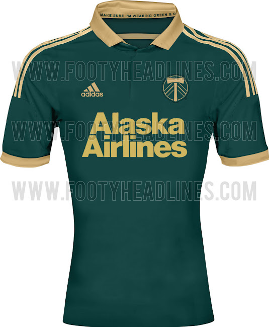
What's Your Favorite Mls Jersey- Past Or Present?
- Thread starter JCizzle
- Start date
LA Galaxy 2012 3rd jersey: http://aladdinbuy.com/image/cache/d...s-Galaxy-2012-Third-Soccer-Jersey-500x500.jpg
I liked the white galaxy and hooped SKC jerseys the best this year.
JCizzle
Registered
That's still less cheesy than the Red Bulls.
Ahab_Flanders
Registered
MagnusPax
Registered
FYI the Caribou died a long time ago in the NASL. The Rapids were an entirely new team that started with the MLS in 1996 and have absolutely no connection to the Caribou in any way, except they are in the same city.
The glorious work or art was an actual kit for The Caribou of Colorado. Which later became MLS expansion team Colorado Rapids.
My second favorite MLS shirt has to be either NYCFC away or Orlando home.
PS This was a April Fools picture. Pretty funny.
i guess that's what happens when you trust random sites from google searches. Thanks.FYI the Caribou died a long time ago in the NASL. The Rapids were an entirely new team that started with the MLS in 1996 and have absolutely no connection to the Caribou in any way, except they are in the same city.
PS This was a April Fools picture. Pretty funny.
JCizzle
Registered
Speak of the devil: https://www.jackthreads.com/thethre...-behind-the-world-s-10-ugliest-soccer-jerseys
1. CARIBOUS OF COLORADO, 1978 HOME KIT
Allow us to regale you with the tale of The Caribous of Colorado. The Caribous’ transient existence lasted for just one year (1978) in the North American Soccer League (the MLS before the MLS). They were the first, and subsequent last, professional sports team to employ leather fringes, inevitably going 8-22 and finishing their one season in last place. Legend has it, any team who wears leather fringes automatically goes 8-22, even if said team only plays 16 games. So what happened to the team? Stick with us, because it's about to get weird. Caribous are not, nor have ever been, native to Colorado. So, introducing a species to a habitat it isn’t equipped or adapted to survive in can and will only lead to one logical conclusion: death. The only other explanation is that the team was named after a abandoned mining town, Caribou, that burned down in 1879, OR 1978 WHEN YOU SWITCH THE NUMBERS. The dots are laid out, now connect them.
JCizzle
Registered
Dynamo 2011/12 home jersey. Like it because I'm a big fan of orange in general. Who's with me that the corporate sponsor takes up too much of the uniform? That's where the other American sports have it right, it's just the TEAM logo. Imagine a McDonald's logo on the Yankee pinstripes? For soccer, I love the international jerseys. it's just the colors and the team logos. If you have to have it, then make the team logo bigger than the sponsor. But that's just me. Any case, really like the Houston jerseys.


Ahab_Flanders
Registered
Dynamo 2011/12 home jersey. Like it because I'm a big fan of orange in general. Who's with me that the corporate sponsor takes up too much of the uniform? That's where the other American sports have it right, it's just the TEAM logo. Imagine a McDonald's logo on the Yankee pinstripes? For soccer, I love the international jerseys. it's just the colors and the team logos. If you have to have it, then make the team logo bigger than the sponsor. But that's just me. Any case, really like the Houston jerseys.
Before I really got into soccer I hated the sponsor logos, then once I started watching more and realized that sponsor logos allow the team to still make money without bombarding you with ads every 5 minutes I decided it is a much better system than other American sports. Now jerseys without a sponsor just look naked to me.
JCizzle
Registered
Funny, I've seen old mock ups of NYCFC jerseys from random people that look like that. Using the pinstripes of the Yankees and light blue of MCFC. If they add some orange, I'd be down for that for us.
I've always like Vancouver's. Imagine what this style would have looked like with a dash of orange here or there?
To cite a Great American philosopher: Of all the words of tongue or pen, these few are saddest, "what might have been."
JCizzle
Registered
See your point, but take American football, I'm not sure where the adds that bombard every 5 minutes come from. Soccer has the adds that line the perimeter of the field, even more than football. I know it's a mere difference of opinion, but like baseball, I'd like to see a look where the team name is writted on the front and maybe the sponsor a smaller logo in the upper corner of the kit. just a thought!Before I really got into soccer I hated the sponsor logos, then once I started watching more and realized that sponsor logos allow the team to still make money without bombarding you with ads every 5 minutes I decided it is a much better system than other American sports. Now jerseys without a sponsor just look naked to me.
JCizzle
Registered
Think that also applies to what your eye and brain get used to after some time. Hey at the very least, good thing kits don't look like a NASCAR driver.Now jerseys without a sponsor just look naked to me.
Similar threads
- Replies
- 29
- Views
- 2,160
- Poll
- Replies
- 332
- Views
- 23,223

