There are few things I love in this world more than Cherry Blossoms, so these are a big disappointment.
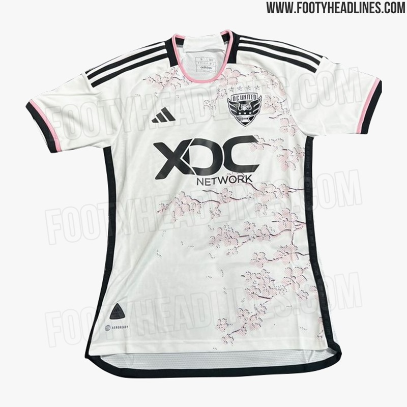
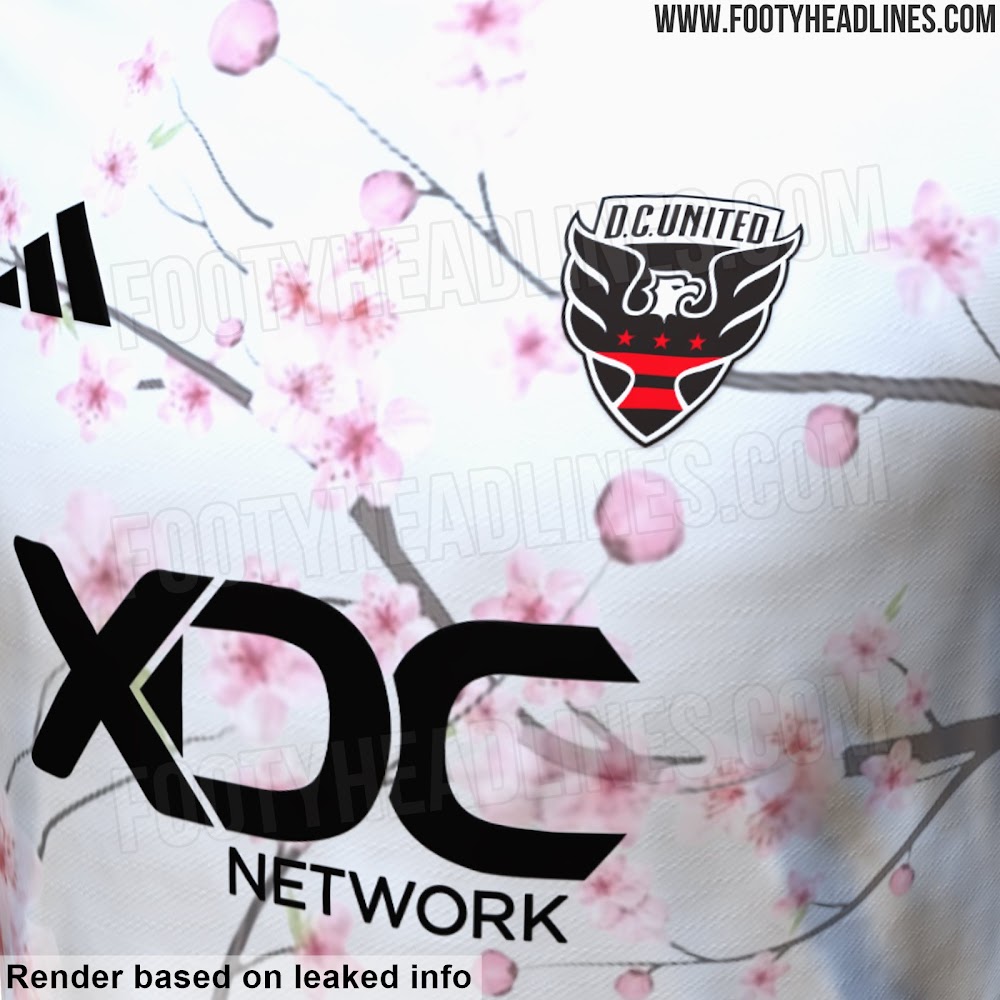

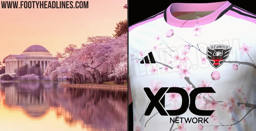
I could have sworn we’ve met in person & hung out before. But now I’m convinced you’re just a ghost writer for:I am fully underwhelmed with this and the Timbers rose jerseys. What's the point of kits with flower themes if you mute all the colors? The Timbers jersey is monochromatic dark flat pink on a pink-tinged off white background. You have to work to make roses look that boring. This DC United jersey is so muted it might as well not exist.
I'm not kidding or being facetious when I say they should have copied women's dresses:
Roses
View attachment 12532
Cherry Blossoms
View attachment 12531
There are even better examples on a dark background because the colors pop more, but I kept with the white background that is on on the existing jerseys because that might be needed for Away uniform contrast purposes.
I you go flowers, embrace it or don't bother.

My signature literally references gradient and flat colors, and you're surprised I have opinions about flower prints needing to be bold?I could have sworn we’ve met in person & hung out before. But now I’m convinced you’re just a ghost writer for:
Gotham, is this a cry for help?There are few things I love in this world more than Cherry Blossoms.
It's giving me wild berry pop-tarts vibes
Charlotte’s kit leaked
Charlotte’s kit leaked
Charlotte’s kit leaked

View attachment 12537
Okay, so let's start the forensic examination of this picture.
What am I missing?
- The background is the blue mosaic we had a look at earlier. This appears to be a background theme for the jersey.
- The announcement seems to use a different font for every character. Not sure whether this is meaningful or what it could mean.
- The date is circled in orange - seems to indicate orange accents will be part of the design.
")
good idea, but i'm not so sure. the vertical lines do not continue past the diagonal. there is no part of the monogram that does that... or is there? i don't see it anyway.Something you wrote helped me to notice something. In the background, there are the mosaic tiles and then there are some solid lines. The solid lines look like they're forming part of the NYCFC logo.

