JERSEY RELEASE???

The huge jersey lowering from the ceiling was cringe-worthy. It looks HORRIBLE blown up like that. Reminded me of the carcass of a skinned animal :eek:

Hahah, it was, and from where I was standing on the side, I couldn't even see it from under the overhang. Look at it, it's even tilted to the side like it's going to fall. They need a good event director.
 
I had the same initial reaction that 90% of people had: "Goddammit, we're Man City USA."

I've calmed down though. Light blue jerseys do not equal Man City. NYCFC, Man City, and 100 other clubs use simple light blue jerseys. If Man City didn't own us, there's a chance we still ended up with these.

Hopefully they evolve a bit over the years to give us a bit more character, but that will develop naturally.
I think that's my take, Eventually the club culture will develop; little touches will be added that make it NYCFC unique. CFG were always going to make the first kit similar to MCFC.
 
  • Like
Reactions: Malatesta
I don't think the people on this side of the pond expected an identical kit to MCFC.
It isn't identical, sure it looks similar but it was always gonna be light blue. For those who are against it, what did you expect? The first kit was always going to be similar, the club can now get it's own culture; it's the first kit fgs.
Not a dig at you, but many go on about finally having a NY football team, if you truly support the team, then the shade of blue shouldn't put your loyalty on the line.
 
The more I think about it, the less I think they say "we are Man City," because of how overwhelmingly basic they are. Rather, they scream "we are boring." Both annoying, of course, but the latter less so.
 
  • Like
Reactions: mgarbowski
What I think NYCFC should do,is to have 3 or 4 jerseys they would like to produce and then sell. Let the fans vote before next years Jersey Week and then, they sell the winning jersey. Maybe then they could contact of our fan made designs like (Drainyoo, sorry if I spelt your name wrong) and that could be our third jersey. That way it really is "For the Fans, By the Fans". Sorry if none of this made sense, I would love for some feedback. Thanks!
 
I would have preferred almost anything over the boring blue that is our kit.
 
It isn't identical, sure it looks similar but it was always gonna be light blue. For those who are against it, what did you expect? The first kit was always going to be similar, the club can now get it's own culture; it's the first kit fgs.
Not a dig at you, but many go on about finally having a NY football team, if you truly support the team, then the shade of blue shouldn't put your loyalty on the line.

Honestly, I expected exactly what we got. It's what they would have done with Melbourne if the league hadn't stopped them. But I was really hoping for some nod to a unique NYCFC identity. Does that mean that I wanted a crazy kit with the Statue of Liberty on the front? Of course not, but even the same kit with some orange elements would would have made me happy.

At the end of the day this kit isn't hideous, but literally any intern could have slapped the MCFC colors onto an Adidas template and come up with the exact same design. To me that doesn't look like the same dedication to team identity and fan culture that they've shown in the past.
All I'm saying.
 
Maybe they should launch their own club here too?

That would work. It adds to the game How much more debt can the Glazer family add to their fans? I honestly don't see that happening. Would love it if it did. It would help the rags circle to bowl faster.
 
Honestly, I expected exactly what we got. It's what they would have done with Melbourne if the league hadn't stopped them. But I was really hoping for some nod to a unique NYCFC identity. Does that mean that I wanted a crazy kit with the Statue of Liberty on the front? Of course not, but even the same kit with some orange elements would would have made me happy.

At the end of the day this kit isn't hideous, but literally any intern could have slapped the MCFC colors onto an Adidas template and come up with the exact same design. To me that doesn't look like the same dedication to team identity and fan culture that they've shown in the past.
Whilst I agree with you in that It could have been better, because it obviously could have. But I just think some have over reacted, hopefully as the club grows etc the kit will get its own touches that make it unique. If I could add my old post to this I would but I don't know how, It's on page 28, I think that basically sums up what should have happened.
 
You know the weird thing about jerseys is that the team redesigns them every couple of years. So maybe NYCFC can learn from their "mistake" and design a better jersey in the near future.
 
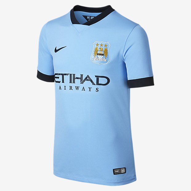
Only difference I see is the white stripe across the shoulders. Anything else? Is that the MC '15 kit?

No, that's last seasons. This is the 2015 NCFC kit. Other than the sky blue and the sponsor, they're different. Look at the detailing on the sleeves of the NYCFC jersey. Different style collar. NYCFC uses white and not navy.

2014-15-Manchester-City-FC-Stadium-Kids-Soccer-Jersey-611056_489_A.jpg
 
o_O Come on drain. Really?

What? It's clear that they took inspiration from MCFC's kit, but to say it's identical is ridiculous. There are clear difference that people are ignoring. Folks are just fixated on the color and sponsor. You can easily say the Inter kit is identical as well then.

I won't sugar coat it and deny that the two kits look very similar, but there are differences as well. Besides, what is the problem if it does look just like MCFC? No one has explained this yet. Will this make them play worse oj the field? Nope.

in14004.jpg
 
  • Like
Reactions: grandsolo