2023 NYCFC Kit Thread


Philly putting out a camo kit to hide the shame of their city’s losses last year
I like the snake in place of the usual crest. Interesting touch.

FpBSnOvX0AEoZSn
 
Some thoughts on the new kit:

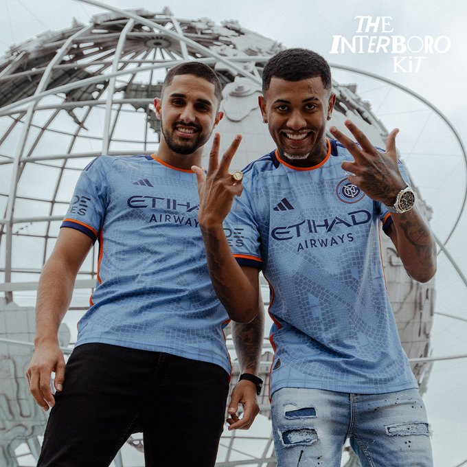
1: I really like the piping on the sleeves and collar. The orange and navy really make the authentic worth the money over the replica
2: the light blue and orange touching works for me. Thought it wouldn’t but it does.
3: I think there are two different hues of orange. One is more pumpkin orange vs. Mac and cheese orange. I definitely prefer the pumpkin orange. And now that I’m looking at it again. It may be just one color. The leak from earlier today seemed to have the two but the Live Photos on players looks like just one, and the pumpkin orange no less!
4: I appreciate Adidas listening to fans from a couple years ago. Stop doing plain white kits and templates. They understood the assignment and deserve props for this jersey in particular.
5) I like the motif of the NYC logo in the subway tiles. But my critique is maybe do something else nyc. Like the island of Manhattan or something. I don’t care for doubling the logo on the crest and the main body of the shirt. But I will say that I think they did an excellent job and I love the extra added detail that some of the tiles are missing. It really shows some nyc character. It’s a 10 for me!
 
  • Like
Reactions: Schwallacus
Some thoughts on the new kit:

1: I really like the piping on the sleeves and collar. The orange and navy really make the authentic worth the money over the replica
2: the light blue and orange touching works for me. Thought it wouldn’t but it does.
3: I think there are two different hues of orange. One is more pumpkin orange vs. Mac and cheese orange. I definitely prefer the pumpkin orange. And now that I’m looking at it again. It may be just one color. The leak from earlier today seemed to have the two but the Live Photos on players looks like just one, and the pumpkin orange no less!
4: I appreciate Adidas listening to fans from a couple years ago. Stop doing plain white kits and templates. They understood the assignment and deserve props for this jersey in particular.
5) I like the motif of the NYC logo in the subway tiles. But my critique is maybe do something else nyc. Like the island of Manhattan or something. I don’t care for doubling the logo on the crest and the main body of the shirt. But I will say that I think they did an excellent job and I love the extra added detail that some of the tiles are missing. It really shows some nyc character. It’s a 10 for me!
the kit is very cool. it falls short from a 10 for me with the weird squares. (I guess plain tile? Some thing to do with NYC "blocks") The mosaic is very cool and the square/block area ends up taking away from what makes the kit good. Keep the mosaic theme for unity. (see the Bruce lee kit) What's awesome about the mosaics in the subway are all the different images, people, flowers, places, animals...
I'm close to loving this kit, just baffled by the blocks.

the empty blocks, i think, is supposed to represent the plain white square title that surround the mosaics in subway stations. the mosaic in this case, being the NYC monogram
 
  • Like
Reactions: Gotham Gator
It’s average for me. I’m not a fan of rounded necks. Don’t mind the orange down the side but not a fan of the sleeve and collar. It’s a kit I would purchase to wear to games but not out and about.
It just looks like a third kit. I prefer clean.
 
  • Like
Reactions: sbrylski
It’s average for me. I’m not a fan of rounded necks. Don’t mind the orange down the side but not a fan of the sleeve and collar. It’s a kit I would purchase to wear to games but not out and about.
It just looks like a third kit. I prefer clean.

As far as "busy" kits go, this one is pretty good. But it looks like a graphic t-shirt to me, not my category. I also like V-necks and collars, block colors and clean lines, very throwback styles.
 
  • Like
Reactions: NYCFC_Dan
It’s a little busy for me. But I do like it and I like the neckline, the tag on the back of the neckline and Lady Liberty’s torch. I’m a fan. But I’m going to sleep on it
 
I like the snake in place of the usual crest. Interesting touch.

FpBSnOvX0AEoZSn

Seeing lots of clubs in Europe not ditch the crest entirely, but start using a logo to be catchy. Arsenal has the cannon. Everton has Prince Rupert’s Tower.

I wonder what ours would be? The pigeon I assume.
 
Seeing lots of clubs in Europe not ditch the crest entirely, but start using a logo to be catchy. Arsenal has the cannon. Everton has Prince Rupert’s Tower.

I wonder what ours would be? The pigeon I assume.

those are all part of their respective crests.

all we have is the monogram.
 
  • Like
Reactions: Higgs1 and Kjbert

Philly putting out a camo kit to hide the shame of their city’s losses last year

Counting our blessings right now…