So, the sleeve sponsorship will start in 2020: https://www.mlssoccer.com/post/2018...s-additional-jersey-sponsorship-opportunity-1
You are using an out of date browser. It may not display this or other websites correctly.
You should upgrade or use an alternative browser.
You should upgrade or use an alternative browser.
2019 NYCFC Kit Thread
- Thread starter LionNYC
- Start date
So, the sleeve sponsorship will start in 2020: https://www.mlssoccer.com/post/2018...s-additional-jersey-sponsorship-opportunity-1
good, this way i can get a discount authentic away jersey end of 2019
Always wanted a tramp stamp. MLS fulfilling dreams here and beyond...If it's bringing in $1 million per team, let's get ads on the lower back too.
I like it on first look. Let's see how it holds up! I wonder what the short combos will look like, I'm thinking classic white will look odd, but I'll have to see.
Any other teams drop? Curious if the new kit template has the three stripes down the torso on all or if they’re on the sleeves.
Also, that image doesn’t have the jock tag, climacool/climalite tag, or the MLS badge(s). So......
Edit: also missing the interior neck text.
I haven't done an audit or anything, but generally FootyHeadlines is pretty on point in my experience. Sometimes they share tech packs or designs in development.Any other teams drop? Curious if the new kit template has the three stripes down the torso on all or if they’re on the sleeves.
Also, that image doesn’t have the jock tag, climacool/climalite tag, or the MLS badge(s). So......
Edit: also missing the interior neck text.
As for the design, it does feel a little lazy, like they just took the sleeve ribbing off the 2017 home kit and arbitrarily decided to make it align horizontally with the badge. Ok. But I love the dark blue and orange combination and it's featured more prominently here. It's also sharp, minimal and distinctive. I'll take it.
I agree, they’re usually pretty good about accuracy, but this one is missing so much of the detailing that I wonder if it’s a final product or something from the early stages.I haven't done an audit or anything, but generally FootyHeadlines is pretty on point in my experience. Sometimes they share tech packs or designs in development.
As for the design, it does feel a little lazy, like they just took the sleeve ribbing off the 2017 home kit and arbitrarily decided to make it align horizontally with the badge. Ok. But I love the dark blue and orange combination and it's featured more prominently here. It's also sharp, minimal and distinctive. I'll take it.
Could be early stage. Apparently an earlier draft was totally different so it could yet still change.I agree, they’re usually pretty good about accuracy, but this one is missing so much of the detailing that I wonder if it’s a final product or something from the early stages.
What was the earlier draft?Could be early stage. Apparently an earlier draft was totally different so it could yet still change.
Allegedly something like the City away kit (the one they are playing in right now) with a light blue base, dark blue and orange stripes.What was the earlier draft?
Design team really pushing the boundaries and demonstrating their MacArthur Award levels of talent & ability [face palm/head shake]Allegedly something like the City away kit (the one they are playing in right now) with a light blue base, dark blue and orange stripes.
Tbh the lack of originality doesn't bother me that much. There's a fine line between classic and dated, inspiration and appropriation. And when originality means the onion kit, I think I prefer appropriation. Not that it's wrong to hope for original and classic, it's just that the solution space hasn't really grown much and is pretty much covered by centuries of tradition.Design team really pushing the boundaries and demonstrating their MacArthur Award levels of talent & ability [face palm/head shake]
The onion kit definitely wouldn’t win a MacArthur...Tbh the lack of originality doesn't bother me that much. There's a fine line between classic and dated, inspiration and appropriation. And when originality means the onion kit, I think I prefer appropriation. Not that it's wrong to hope for original and classic, it's just that the solution space hasn't really grown much and is pretty much covered by centuries of tradition.
I think it's a B/B- right now. This looks like the replica version as there are no MLS patches and no special tag on the bottom right corner that the authentic versions have on them. I would like the stripe to do further up the kit and possibly around the shoulder and down the other side. And this is the most orange we've received on a primary kit to date.
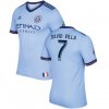
They essentially took the 2017/18 primary kit armband stripe (blue, thin orange, blue) and put that vertically down the side of the shirt. Here's the comparable...
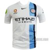
The blue looks more turquoise than the current iteration of the kit which I think has been the nicest color of blue...
Could be early stage. Apparently an earlier draft was totally different so it could yet still change.
This is the earliest we've seen a leak of the kit. Could it be Adidas/MLS are gauging fan reaction and maybe will swap it out for another design before going to production?
I like it. I’m not a fan of orange, but it works as long as it’s paired with dark blue and not sky blue.
Footyheadlines is extremely reliable. I’ve been following them for years. Keep in mind that they generally create a mock-up based on info they get. This isn’t directly from adidas or anything.
Usually if an incomplete mock-up looks good, the real thing is going to look good, so I’m pretty optimistic. Also excited that kit leaking season has come early this year
EDIT: bumped the white balance a bit to move it away from teal.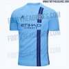

Tbh I'm a little concerned about how the Adidas three stripes are going to look with the new vertical strip, so I hope for some tweaking.I like it. I’m not a fan of orange, but it works as long as it’s paired with dark blue and not sky blue.
Footyheadlines is extremely reliable. I’ve been following them for years. Keep in mind that they generally create a mock-up based on info they get. This isn’t directly from adidas or anything.
Usually if an incomplete mock-up looks good, the real thing is going to look good, so I’m pretty optimistic. Also excited that kit leaking season has come early this year
EDIT: bumped the white balance a bit to move it away from teal.View attachment 9334
https://www.footyheadlines.com/2018/11/new-york-city-fc-2019-home-kit.html
Another image provided by Footy Headlines...
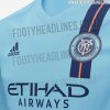
Another image provided by Footy Headlines...

Similar threads
- Replies
- 226
- Views
- 28,264
- Poll
- Replies
- 332
- Views
- 35,681
