The star should be on there for the authentic once it’s released.Also where’s the star?!
Edit: I see now probably shot before playoffs.
You are using an out of date browser. It may not display this or other websites correctly.
You should upgrade or use an alternative browser.
You should upgrade or use an alternative browser.
2022 NYCFC Kit Thread
- Thread starter Shwafta
- Start date
Yeah the sleeve thing is wrong. Still like the rest.
looks like some teams got unique designs this year. its not terrible but in a way i feel it should of been half orange and half that navy blue. not just a piece of the front.
edit: feels 90's early 2000's in terms of wild designs. i probably wont get it but still the effort i guess appreciated. the hypno kit grew on me.
Last edited:
Not sure why all the hate. They seem to have gone away from super cookie cutter templates for some kits this year. I’m a fan.What a peculiar design! I like it and I think it'll grow on me as I see more of it. Waiting for some better shots of it before I make a final judgement
It’s awful looking
This was my initial impression as well. but it might look different in person. If the sleeves are different shades of orange then that's just bad. Had that on the 2019 home kit and it's all you can see once you notice it. I will wait until I see it at the team store before I pass final judgment. Otherwise i'll just get a sky blue kit with the star...
i don't love that they went with the lightning bolt. I get it's the 3rd rail but Philly has already made that symbol their own. It remains on their new kit even despite their mascot being a snake (which i never understood).
I would have preferred a more geometric design or if they were going with a unique print, something that screams NYC. maybe the subway map in some abstract way across the front. just the subway lines (unlabeled) in blue on a solid orange jersey. take the old vignelli-ish nyc subway map and throw it on the jersey. that would have looked cool, been unique, and screamed NYC. you wouldn't know what it was unless you're a new yorker.
This looks wack. Gonna need to see it in person for sure but it seems like a no for me
I really want to like it… they went for something… unfortunately, I think Kjbert and Mkadam have both summed it up fairly poignantly
my daughter who I consider fairly bold fashion wise and having pretty good taste gives it the
but I’m glad for other people if they dig it and wear it.
my daughter who I consider fairly bold fashion wise and having pretty good taste gives it the
but I’m glad for other people if they dig it and wear it.
Major miss, but I'm a minimalist. This doesn't look like a design so much as someone hit "randomize" on a custom jersey tool. There's like six different colors/shades, gradients and color blocks, random lines...
Bold doesn't mean power clashing, it can be simple.
I literally haven't liked any of our kits ever pretty much.
Bold doesn't mean power clashing, it can be simple.
I literally haven't liked any of our kits ever pretty much.
i don't love that they went with the lightning bolt. I get it's the 3rd rail but Philly has already made that symbol their own. It remains on their new kit even despite their mascot being a snake (which i never understood).
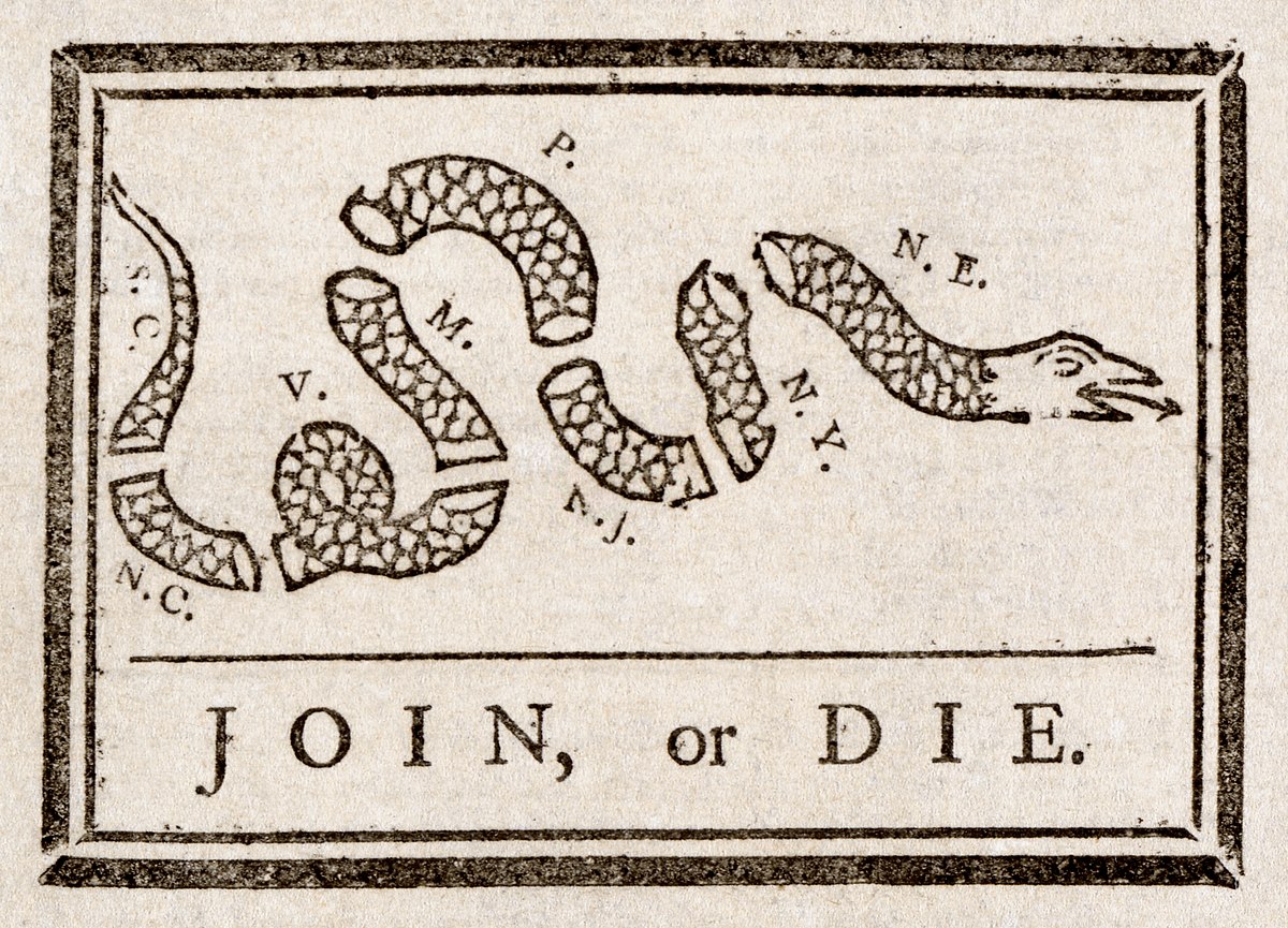
Join, or Die - Wikipedia
 en.wikipedia.org
.Join, or Die - Wikipedia
nice. thanks.
ZYanksRule
Registered
Slightly off-topic: Will they be releasing versions of the blue jersey with the star on it?
At some point they’re supposed to. If you look at any team that’s one a cup their authentic jerseys all come with a star or stars if they won multiple. It’s all a matter of getting the stars out to adidas so they can add them to the jerseys. Or even to shops like Upper90 and Pele Soccer to add at the request of fans.Slightly off-topic: Will they be releasing versions of the blue jersey with the star on it?
Not a fan, and I usually really like things that have lightning bolts.


Oooooh can we please call it “the Bowie kit”?Not a fan, and I usually really like things that have lightning bolts.
View attachment 11865
View attachment 11867
Uhh....can we go back to the templates please?
Brooklyn Blue
Registered
There may be different oranges since the 8-year-old had to use a second crayon.
Similar threads
- Replies
- 10
- Views
- 2,295
- Replies
- 226
- Views
- 27,846