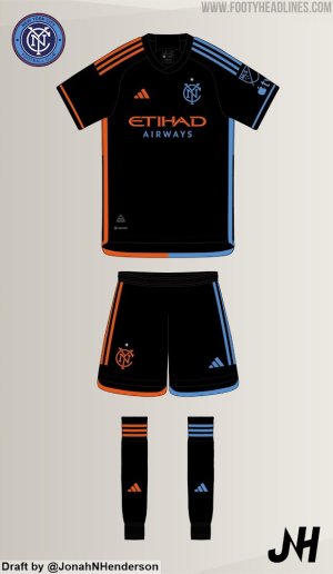
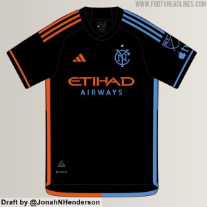
Now wouldn't that be interesting. I'd be surprised if we didn't do it at least once.Wonder if we wear that black kit for all the Citi Field matches?
You are using an out of date browser. It may not display this or other websites correctly.
You should upgrade or use an alternative browser.
You should upgrade or use an alternative browser.
2024 NYCFC Kit Thread
- Thread starter LionNYC
- Start date
ZYanksRule
Registered
Now wouldn't that be interesting. I'd be surprised if we didn't do it at least once.
My guess is we use the new jerseys a lot early in the year, which seems to be the normal operating procedure with a new jersey. They use it a lot early in the year to try to goose sales.
Higgs1
Registered
I didn't notice the right/left orange/blue split from the other leaks. I'm not a fan of that aspect. It's not hideous, but not good either IMO.
We'll see how it does in real life, but I'm going to get a headache watching on my phone seeing our boys with blue accents at times, and orange at other times depending on the angle. It might even look like a third team is on the field at times.I didn't notice the right/left orange/blue split from the other leaks. I'm not a fan of that aspect. It's not hideous, but not good either IMO.
I didn't notice the right/left orange/blue split from the other leaks. I'm not a fan of that aspect. It's not hideous, but not good either IMO.
what bothers me more is they didn't split the sponsor logo too.
I don't know about the stripped-down badge. I love our badge. I think it's the best in the league, just an excellent design.
But I think I'll snag one of these regardless. I no longer have one foot on a banana peel and the other in the grave, so I'd like to be stylin' a little and represent (even though I won't be leaving the house much). For sure I want one to wear on game days.
But I think I'll snag one of these regardless. I no longer have one foot on a banana peel and the other in the grave, so I'd like to be stylin' a little and represent (even though I won't be leaving the house much). For sure I want one to wear on game days.
I didn't notice the right/left orange/blue split from the other leaks. I'm not a fan of that aspect. It's not hideous, but not good either IMO.
Gets sillier when you see the entire kit
I would've done all the piping in blue with Etihad Airways, crest and adidas logo in orange or vice versa.
The blue/orange split looks sloppy imho.

Last edited:
I was slowly scrolling down the image totally fine with this until I got to the mismatched socks LOLGets sillier when you see the entire kit
I would've done all the piping in blue with Etihad Airways, crest and adidas logo in orange or vice versa.
The blue/orange looks sloppy imho.
View attachment 13154
I mean, I get it, keep the theme going, but if I was on the team I'd be trading them around so that each player had either a blue pair or an orange pair.
Brooklyn Blue
Registered
The half and half is different - and great. The socks are the perfect touch.
I didn't notice the right/left orange/blue split from the other leaks. I'm not a fan of that aspect. It's not hideous, but not good either IMO.
Interesting. To me that’s what hooked me. Along with the monogram with the star
I could be wrong but the mock up of the full kit (with shorts and socks) was just someone at FH taking liberties and mocking up based upon the shirt video game image. At least that was my take.
I am a fan of the split shirt - the template elsewhere is catchy - for example Fulham home and some others. We went even further and I like it.
I am a fan of the split shirt - the template elsewhere is catchy - for example Fulham home and some others. We went even further and I like it.
I feel like this is a kit that I'll need to see in person to decide whether or not I like it. When the hypnokit came out I hated it. When I saw it in person, it started to grow on me and I ended up really liking it.
I don't love this kit at first glance (don't hate it either), but I think it has the potential to look better in person than on a mini xBox screenshot or MS Paint duplicate.
I don't love this kit at first glance (don't hate it either), but I think it has the potential to look better in person than on a mini xBox screenshot or MS Paint duplicate.
Only real question to me is which players will be first to wear the socks on the opposite (wrong?) sides?
Lol, that would be a fun thing to track along with positive/negative performancesOnly real question to me is which players will be first to wear the socks on the opposite (wrong?) sides?
who could resist?Only real question to me is which players will be first to wear the socks on the opposite (wrong?) sides?
I like it better here than what's been posted.
Similar threads
- Replies
- 137
- Views
- 14,140

